(5 years and 3178 days ago)

(5 years and 3761 days ago)
Favorite artist perhaps? Interesting take on the theme 
Howdie stranger!
If you want to rate this picture or participate in this contest, just:
LOGIN HERE or REGISTER FOR FREE

(5 years and 3912 days ago)
Hmm..... interesting!! Good luck!
nice and good use of source, but it will be better with stp by stp, good luck
I'm still working on the step by step guide. I'll post it soon!
nice image!
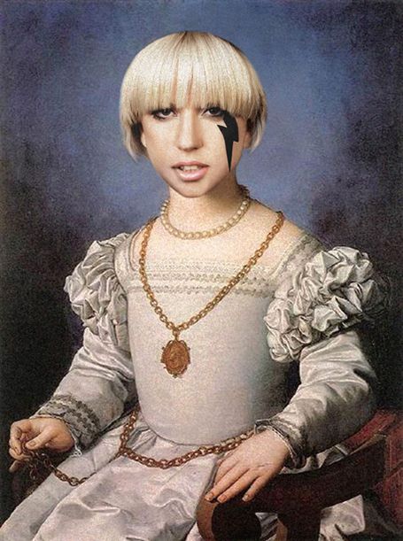
Nice...but the nose has way too much shade.
mariosilva, why didn't you just write "step by step" with the E's?  kidding
  cool image
nice work.. what a very peculiar performer.. like Hannah Montana all grown up.. on a street corner  .. good work
OK guys so I added the SBS guide.
Howdie stranger!
If you want to rate this picture or participate in this contest, just:
LOGIN HERE or REGISTER FOR FREE
You need to source the original painting as well!
Uppss!..thanks for telling me that..I'll do it right now
I would say that the head looks to big, but this is Lady Gaga so the image should be a bit out of the box like herself
HEAD TOO BIG!
Fixed the head..
i think make it a little more small, would be unreal..
but there it is.
Good choice. The black values on Gaga's face are too dark for the rest of the image though. If you lighten them slightly (Image>Adjustments>Selective Color>Blacks) to better match the darks of the painting, it will be more consistent.
Thanks...MossyB
made that change,its much better!.
The black lightening bolt is still the darkest, least noisy element in the image and thus does not seem part of the painting. More problematic is that a Renaissance Lady Gaga would change not only her hair but also her clothes. Wearing male military attire, for example, would no doubt have seemed outrageous at the time.
head too big???
Howdie stranger!
If you want to rate this picture or participate in this contest, just:
LOGIN HERE or REGISTER FOR FREE