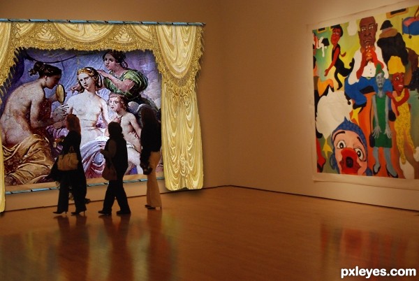
LOOK CLOSE
Curtains, Drapes, Blue border and Art from original picture (5 years and 3137 days ago)
- 1: Gallery
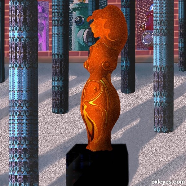
Sculpture, columns, background all made from the source. No outside sources used. Please see detailed SBS. (5 years and 3372 days ago)
Smart idea, it would have looked far better with more time invested by:
-arranging the composition so it would be a simmetrical perspective vs the assimmetrical statue.
-Insisting on highlights of the sculpture like the light was comming from above, vs a general light from the left.
- columns having a base.
- color pallete including complementaries : blue vs orange statue, or red vs green columns.
I'm sure you already know all these, that's why i wish you had more time.
I see you edited the color, nice 
Nice work.. Good luck..
nice work...gl
Howdie stranger!
If you want to rate this picture or participate in this contest, just:
LOGIN HERE or REGISTER FOR FREE
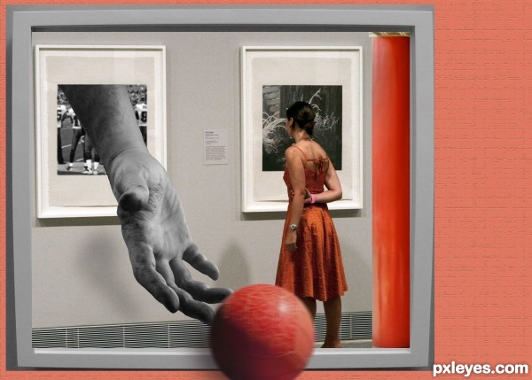
I would like to thank the following: lusi for the ball, yourdon for the football players, sechipul for the picture frame, sanbeiji for the red column, and gallery by Ed Schipul. (5 years and 3549 days ago)
interesting
Nice! But why is the ball behind the picture, not in front of that?
Technically pretty well done, but as erikuri already mentioned I dont get well why the ball is behind the frame. The shadow from the frame that falls on the ball makes the ball also more flat. Is it an option to let the ball go out of the frame instead? Good luck!
Thanks for the comments Erikuri and wazowski. I tried it both way, will be guided by your advice - thanks! 
very very cool work author...i like the improvements...good luck
Now the ball makes sense!  GL, author!
Howdie stranger!
If you want to rate this picture or participate in this contest, just:
LOGIN HERE or REGISTER FOR FREE
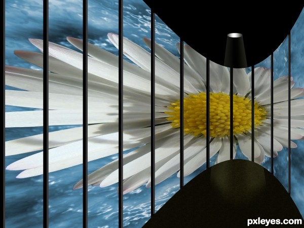
Art gallery viewing. Source image only. (5 years and 3662 days ago)
sbs?
OK Noop, there it is. 
I think you should wrap the background as well so it follows the curved wall. Right now I get a little confused and also I think it is hard to feel the flowers wrapping. IMO... Otherwise - good job
I agree with you sunzet (I got a bit lazy!). I fixed it now. 
Better 
Howdie stranger!
If you want to rate this picture or participate in this contest, just:
LOGIN HERE or REGISTER FOR FREE
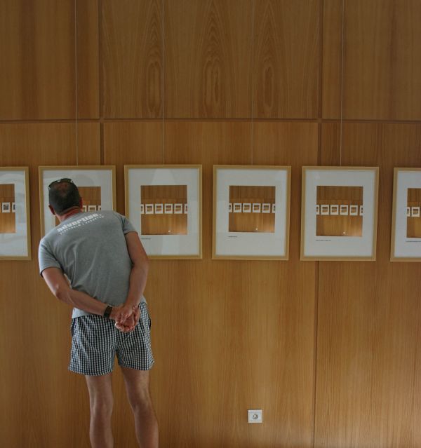
(5 years and 3688 days ago)
This is cool. Please upload the high res so that we can see the gallery images better.
I really like it but I would have liked to see the man repeated in the photos on the wall. I think I understand why you didn't do that. But the angle at which he is standing is very interesting and gives the image personality that I think would have been neet if it were repeated. But it's cool the way it is, too. I like how it's a little different than the way the others are set up. The movement being horizontal instead of moving away from the viewer. Nicely composed.
Not sure if this fits into the category, sun is shining on the left side of his body but the light is coming from the right bottom side of the gallery :S
it would have been better if he was in the picture
Howdie stranger!
If you want to rate this picture or participate in this contest, just:
LOGIN HERE or REGISTER FOR FREE
Love it, would really like an SBS
Love it, would really like an SBS
That's very creative image manipulation - and the source image an the final image blend very well. Thumbs up
add more shadow for the creases to the curtains... the two faces of walls should have more contrast

nice idea
Howdie stranger!
If you want to rate this picture or participate in this contest, just:
LOGIN HERE or REGISTER FOR FREE