dual till the end (5 years and 3319 days ago)

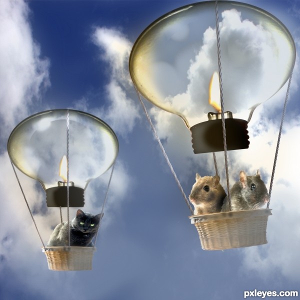
rope thx to Miguel Saavedra
Basket thx to Josep Altarriba
candle thx to qc85
cat thx to Maciej Perek
cloud thx to abcdz2000 via sxc
rope thx to Miguel Saavedra
thx to Microstock Photography for the two mouse used in the picture.They can be found at: www.LockStockPhotography.com (5 years and 3329 days ago)
cute idea author but the hamsters are a bit to big...GL
Oh so cute, well done, love the little mice.
Love your concept, but the cat is distorted.
Thx erathion and CMYK46 will have a look at the big hamsters,and the slightly disorted cat.Thanks for your comments.
This caught my eye. Nice job author...perhaps soften your edges overall and you'll have a primo image. 
Thx pixelkid will have a look at it.
Howdie stranger!
If you want to rate this picture or participate in this contest, just:
LOGIN HERE or REGISTER FOR FREE

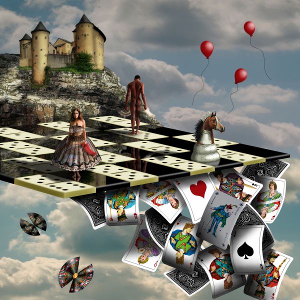
Thanks to Zela and Marcus Ranum (http://www.ranum.com/)
king - http://www.sxc.hu/photo/603938
man - http://mjranum-stock.deviantart.com/art/Violince-146480074
metal texture - http://www.cgtextures.com/texview.php?id=19965&PHPSESSID=f923850c30bb6b9b8f26ba86ba7727df
queen - http://www.sxc.hu/photo/1213775
woman - http://mjranum-stock.deviantart.com/art/Art-Nudes-S-8-96652070
(5 years and 3699 days ago)
Beautiful entry... this is surrealism at its best!
this is great, love it! cool work on the horse. 
That's pretty surreal image, author. I'm quite impressed with so many external sources you put them together so well. Gl to you 
I like this, a lot of great detail, and quality, great job.
Very good image, well done, GL 
Terrific work!!! great composition and love the splashes of red.
the reflection is really nice, reflecting in black, but not in the domino's, really realistic!!
perfect
Fabulous work,one of the best ever...Good luck author
Beautiful stuff here. In my opinion if you warm up the playing cards to more of a variance of sepia it would make this even classier. Not all the same values though...

Stunning, and i never say that! (the cards seem a LITTLE to white though)
Love it all except the silly butterfly things, but then it's surrealism...(cough). 
stunning image -- great blending of the images
awsome image author... your an inspiration in this contest 
I really cant fault this one - just beautiful
excellent job....
Thank you for the comments. They're appreciated. The silly butterfly things (cough) in the lighter, smaller corner represent the feminine, while the balloons in the larger, darker corner represent the masculine. I left the cards bright for a couple of reasons. The image starts dark in the upper left corner and gradually brightens as it flows to the bottom right corner. Plus, I wanted to draw your attention to the story being told by the cards. Does that make sense in a, ya know, surreal kind of way? 
this is a top entry....good luck author
fantastic + fabulous + spectacular + perfect = My favourite.....!
Beautiful,
Oh, wow, this is great!!! stunning! GL
weeeeeeeeeeeeeeeeeeeeeeeeeeeeeeeeeeeeeeeeeeeeeeeeeeeeee
I understand what you're saying with the light and dark, masculine and feminine, but I don't really see much difference in the lightness and darkness from one part to another. And if there was, those elements aren't really placed in such a way that I would see how they give the image ballance in such a way that making one element darker than the other hopes to achieve. That being said: This image is absolutely FANTASTIC and NOTHING that I said even matters. High HIGH marks from me.
i can honestly say that this is about the best chop i have ever seen...good match of the sources and everything else...A+
Absolutely beautiful entry.....Amazing work...Brilliance and hard work.....blended with great imagination and creativity....Too good...
my fafourite succes!
good work
I knew this was gonna be a tough and super interesting contest and your absolutely amazing creation proved me right....! Fanatastic imagination, awesome technique and great concept! Great choice of title and superb colors and clarity...! Your vision and attention to detail are absolutely remarkable....! All down to one word: SENSATIONAL!
Oh, this is incredible! 
? ... ! ... =:0)
Thank you for using my cloud file Annie. Here is the url to the file: http://www.rgbstock.com/image/mhzgUbS . Your entry is wonderful!
Board part and cards part looks great.Rest of image,little less.
Congrats on first!
Congrats on 1st, deserved!
Thank you so much for your votes and comments. 
Congrats for your first place, IDt8r!
As expected.... Congrats....
Congrats!! 
Extremely creative..  Congrats..
Awesome work. Great imagination  . My fav.
Howdie stranger!
If you want to rate this picture or participate in this contest, just:
LOGIN HERE or REGISTER FOR FREE

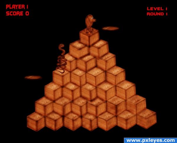
Primitive stages of the making of Q-Bert
All items made from Source image only (5 years and 3897 days ago)
aww man i was planning an entry like this.. oh well!! You beat me to it fair and square xD good luck!!
that's the name of the game!!! thanks!!! that was the first came to mind! good luck!
nice 
Oh man. that game ate tons of my quarters.. and I always jumped off the edge in a panic LOL good job
awesome idea!
great idea!
i like this game... so i like your image... 
cool idea.
First thing I thought when I saw the source too!
Howdie stranger!
If you want to rate this picture or participate in this contest, just:
LOGIN HERE or REGISTER FOR FREE
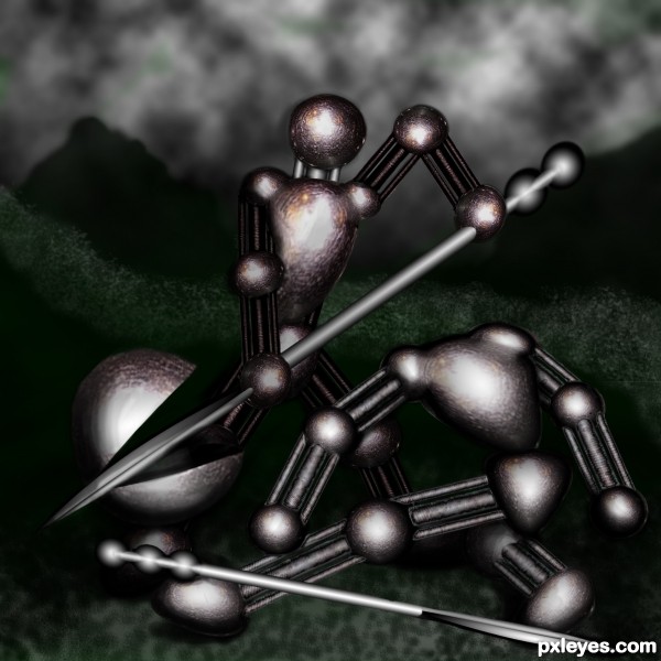
It's too dark. The viewer cannot easily make out what your focal point is, or how it relates to the title. Bring up the lighting so it's a full image, not just some light spots.
k, i tried to lighting it up some and put a litle green in the back to contrast the red...
Better, although still a bit too dark to tell much of a "story." The green does a good job of helping the color contrast, which improves the overall composition. Good luck!
Thanks - one of these days I may figure out photoshop
Howdie stranger!
If you want to rate this picture or participate in this contest, just:
LOGIN HERE or REGISTER FOR FREE