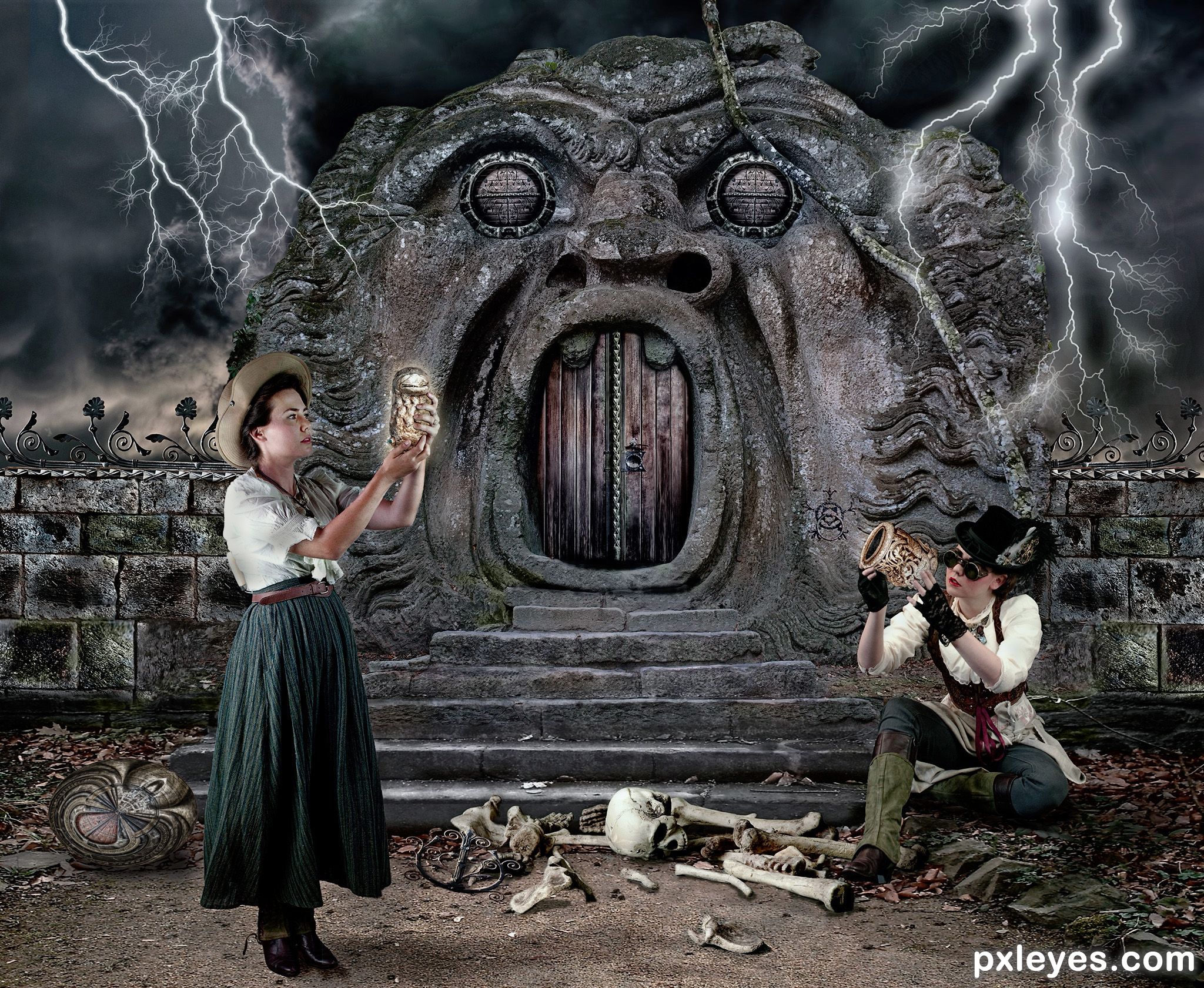
Hunting for treasure is a dangerous business. It could get you killed, especially if the treasure is cursed. Lightning could strike you at any time without notice. (5 years and 851 days ago)
7 Sources:
I don't really hate STAR WARS. I like it but I like manipulating its photo more. (5 years and 1645 days ago)
Pink doorknob? Really. PINK? I'M JUST KIDDING! great job 
Nooo... it's not pink... fuchsia maybe? Lol... thanks.
Darling, I dated a drag queen, believe me that is pink.
From Steel Magnolia's:
[Referring to her daughter's many pink wedding decorations]
M'Lynn: That sanctuary looks like it's been hosed down with Pepto-Bismol.
Giggle snort.
Source is unrecognizable. This image could have been made from anything.
Yeah. Anything.
Thanks for the feeback.
I have to agree with CMYK46, not much point to a source contest if the entry is totally CBR IMHO.
Thank God I didn't know what it meant by CBR.
Anyway, thanks for the feedback.
No offense meant just my opinion on the purpose of a source contest.
I like the Image. I also like CBR´s! Pxleyes somehow dont  even if it says "manipulate it in any way you like". May some people think it´s easy to create such an Image. To me this kind of manipulation is more creative than montages since you create something compleetly new out of any source. Shure you can create something like that out of any source, but you didnt. You used this source and this usage created this Image.
Good job!!!
Thanks for the kind words.
Just Gallop right in there like a "Knight in CBR'd Armor" there huh, Solaris?
man crush...maN crusH...mAN cRUSH...MAN CRUSH...
Oh I'm just TEASING
I kind of like seeing other members stepping forth to defend (All in good Heart) other people's work. Makes me all gooey inside.
(Yikes, this entry got me quoting Steel Magnolias and Giggle Snorting again)
I do declare, I have the Vapors. Where's my hand fan?
Gosh I'm blushing...
complex stuff...
Hmmm... thanks?
Even if the image is CBR, the author is showing in his SBS what he selected from the image. I do not see in the contest rules something that says that we have to stick to the image and use it, not that CBR's are not allowed. That is what Pxleyes is asking you:
Download the provided image and manipulate it in any way you want. Good luck!
And you did just that....you did a good job. Good luck. I like creativity, not only copying and pasting images.... like I do some times, your entry looks nice, colors and shapes... Good luck.
Thanks.
Congrats!!
CBR wins! WOOT!
Congratulations...!!!!
Howdie stranger!
If you want to rate this picture or participate in this contest, just:
LOGIN HERE or REGISTER FOR FREE
(5 years and 2785 days ago)
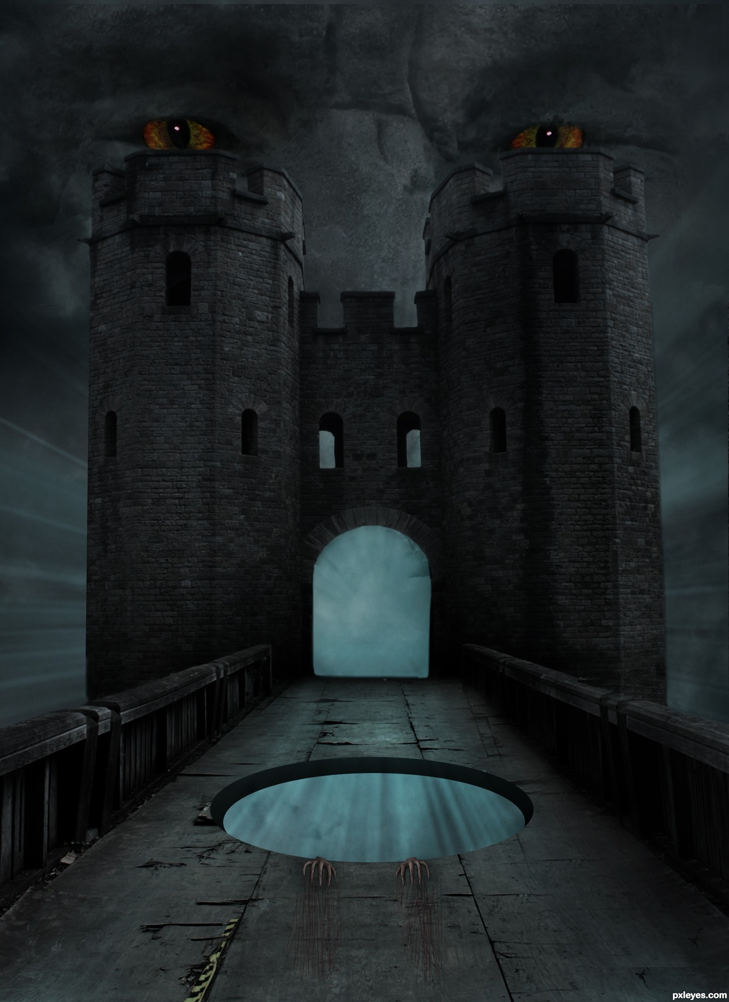
Movie poster style. It just needs the title of the movie and the credits for the actors. The edge of the hole is too smooth compared with the rest of the image.
Congrats!!
congrats
Congrats, should have won!
Howdie stranger!
If you want to rate this picture or participate in this contest, just:
LOGIN HERE or REGISTER FOR FREE
i still have to work on it i know but wanted to post fast so i can encourage you to do the same thing :) (5 years and 2849 days ago)
You spend just enough time to come up with a rough sketch, but lack finishing it. This could turn out interesting, but right now, there are too many rough parts for me to judge it well. Take your time, work out the details, and finish it...you will be much more happy with the results.
Howdie stranger!
If you want to rate this picture or participate in this contest, just:
LOGIN HERE or REGISTER FOR FREE
(5 years and 2985 days ago)
Howdie stranger!
If you want to rate this picture or participate in this contest, just:
LOGIN HERE or REGISTER FOR FREE
Photography and photoshop contests
We are a community of people with
a passion for photography, graphics and art in general.
Every day new photoshop
and photography contests are posted to compete in. We also have one weekly drawing contest
and one weekly 3D contest!
Participation is 100% free!
Just
register and get
started!
Good luck!
© 2015 Pxleyes.com. All rights reserved.


Good job....
Thank you George.
Good work. I like the whole scene and it makes the eyes wander around to soak in the "story". I tend to nit pick what I think are the better chops, so here we go. Not a big deal but there is just something odd about the blending of standing girl's feet into the ground - more on our left side than the right. The object in her hand does not look like it's "glowing". If it were, parts of the woman would be reflecting that light more (for example see her far arm/shoulder are dark). IMO the lightening should not be in front of Ugly Rock Monster or maybe manipulated more to look like it was. As it is, the lightening starts thick in the sky, and narrows at the end. If it were coming towards us, it would be at minimum thicker than it is towards the bottom (and I believe less "branches" . There would also be mass amounts of light and would cast light reflections on the rocks monster and surrounding areas. The wrought iron work on the wall is an exceedingly nice touch and made me say to myself "Wow that was a real good use of the source" because the wrought iron stuff in the source image was just a minor detail. The people fit in wonderfully into the "feel" of the Chop. The bones are awesome and well done. The shield doesn't look much like a shield. PS mahalo for the SBS. I would not have known that was a shield otherwise.
Thanks BWR. Your critique is greatly appreciated.
 It might be some kind of fancy plate or even some symbolic emblem which holds "the curse". The imagination can have some fun with it.
Not sure what you see as odd about the feet? Too much dark shadow maybe? I will lighten it later if I get time, or if you have any other suggestions as to what to do about it, I am all ears.
The lightning is supposed to look like it's aiming for the women. That's why it's in front of the rock monster and aiming toward their heads. Not sure how to make it appear more "in front" than it already is.
It's all part of the curse. That's what happened to the last treasure hunter. Hence the bones on the ground and the wrought iron thingy near the bony hand.
I just used the lightning brushes as they were and didn't bother altering them. It never entered my mind to erase some branches.
The shield thingy doesn't need to be a shield. That's just the first word that popped into my head when I was explaining it in the sbs. It is just some kind of treasure. The treasure hunters can always do some research to find out what it really is since it doesn't appear to be have been used as a shield.
Anyway, I might not have time to fix it today because I need to go out in 5 minutes and by the time I get home, it might be too late, so what will be will be.
I am very honored that you think it is a good chop in spite of the mistakes.
Thank you again for taking time to critique it so thoroughly.
I think that "odd" was too strong of a word. Her shoe on our left looked like it was copy/pasted and not too well blended - it was very minor and I was just nit-picking. The other shoe looked OK and I think it may have looked better before you just changed it.

Lightening when it's far away looks like tree branches that can be tapered to a point.
https://www.zarebasystems.com/media//articles/images/557/zs_us_lightning_strike_855.jpg
https://www.telegraph.co.uk/content/dam/Travel/2017/March/Lightning-plane-getty.jpg
Lightening when it's close to you, looks different. It is much thicker with less branches.
https://cdn.fstoppers.com/styles/large-16-9/s3/lead/2015/08/lightning-strike-fstoppers-hankschyma.jpg
https://astroengine.files.wordpress.com/2009/06/lightning_strike.jpg
Also if you notice these lightening bolts are all not a single color, so maybe using something like Outer Glow, Inner Glow, or Shadows, etc in your Layer Styles can spruce them up.
Just another idea.. since they are about to die because of the curse, how about a vulture waiting for a meal. haha. Up to you. Mostly joking and trying to be funny, but it may work, may not.
Oh, since you asked, one more nit-pick. The residual branches/leaves on our left of the rock monster, above the lady's hat, looks out of place. And finally check this out https://image.ibb.co/fBL7QH/eye_critique.jpg
Hi BWR, Nit picking is good because it helps me refine the minor details and improve the overall effect. Not many people bother to take time to help like that let alone make sample images to show the author where the problems lie. Your help is greatly appreciated.
Sadly I was unable to fix them because I was too tired when I got home last night but I will definitely remember the tips for any future chops.
Thanks for the lightning references. I will keep in mind to add a purplish outer glow to any future lightning I put into chops.
The vulture idea is great. I wish I had thought of that.
Anyway, I can always improve on it for my own satisfaction since it's too late to change it now.
Oooh such a close race for 1st 2nd and 3rd...
Sure was BWR. I consider that an equal first between the three of us when there is less than one point difference.
Congrats Angel, nice work
Thank you madamemonty.
Howdie stranger!
If you want to rate this picture or participate in this contest, just:
LOGIN HERE or REGISTER FOR FREE