(5 years and 3665 days ago)
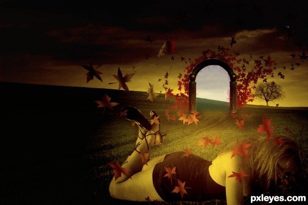
nothing but sorrows now..wish there was a gate to skip this time..
entry is edited with a valid source....and...try...to fix the dimension (5 years and 3669 days ago)
nice idea .........  ........ gud luck
Pay close attentions to dimensions. Good luck.
I agree with Matteo about dimensions,girl is to big,but everything else is great,mood,colors,idea...best of luck author

Howdie stranger!
If you want to rate this picture or participate in this contest, just:
LOGIN HERE or REGISTER FOR FREE
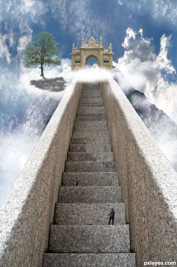
Well, this one took me quite a long time.. But it was quite simple to make..
I gave the stair a right side by copying and then transorming into shape..
I then took the gate and cut that out using the pen tool, did the same for the mountain.
I put it all together and at the end added some clounds and people which I cut out using the quick selection tool.
I also added a tree but I'm sorry but I cannot find the link to the image anymore..
Hope you like it and Thanks to asifthebes for images 1 and 2. (5 years and 3683 days ago)
GO WEST!!! pet shop boys.. hehehe.. 
I think if you move move the gate over to the left a little more and lighter the tree shadow it will look much better. Imo it feels like something is missing but I can't put my finger on it. Overal it is a well thought out entry. gl
I agree about the tree shadow. Maybe give it a gaussion blur and bring the opacity down. I'm a little confused at the clouds that follow the steps to the right? Also, I would get rid of the top guy that looks exactly like the bottom guy. Fix those and this will be very nice!
Thanks for the advice, it was taken on board 
I agree with the shadow, but instead of lowering the opacity the shadow should be broken up with the texture of a cloud. I would also finish masking the arch way and soften the edge of the "mountain" on the right side. Great entry. Good luck!
The brightness of the right front of the tree seems inconsistent with a light source coming from behind the tree. There's an inexplicable notch in the right railing near the top. (Using the Clouds filter to create a mask for the tree shadow might help 'wispify' it.)
This looks great
not to many people getting into heaven lol... nice work author 
lol @Keiley22 I wish I could favorite your comment 
beautiful .... 
Very nice job, only thing that I think of is that the person further up and away is taller than the stair, with perspective in mind, that person must be huge comparing to the person standing closest to us. IMO...Otherwise - really nice job!
sunzet, you are very correct, thanks for the notice ill change it 
GL
Howdie stranger!
If you want to rate this picture or participate in this contest, just:
LOGIN HERE or REGISTER FOR FREE
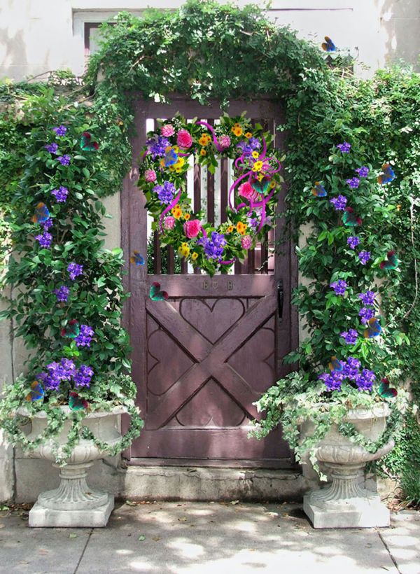
Thanks to robenmarie at morguefile for the garden gate photo; Flowers were all from my own photos. Heart butterfly was created from
photo by katmystiry at mf. Thanks so much. (5 years and 3747 days ago)
Nice arrangement! 
very Hallmark 
nice one...gl author
Howdie stranger!
If you want to rate this picture or participate in this contest, just:
LOGIN HERE or REGISTER FOR FREE
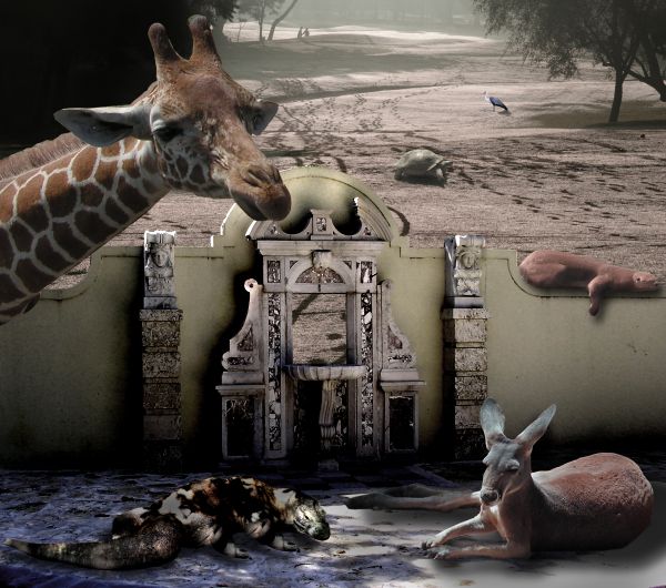
Noah left the gate open and the boys went out to play
Source and my Photos (5 years and 3768 days ago)
Gate only looks half open...wonder how the tortoise managed to jump over it...3 different light sources.
Yeah I agree with cmyk, Nice image, it seems you put lots of time and work into it but the shadows dont ad up, also, one would imagine the turtle in the distance would be tiny, nice image apart from those annoying factors. Good luck author 
I'm going blind (third up grade of glasses in the last six months) so I really don't see things the way others do (when I work in these colors it's all very blurry to me and I can't really make out things very well) but I do try and that's all I can do...
as to the shadow work... while they may make people crazy on the tech aspect, I did arrange the animals so that they were all on the same angles... as to the shading I really like to SEE the images I place so you'll see me highlight a lot of faces to see their features (especially the dragon)
As to the Tortoise.. he's about the size of rider lawn mower and he always comes up to me to be petted (actually he likes my Mother and she loves to pet him through the fence)
We get yelled at all the time (I have a year pass to the zoo) but they are vegetarian...
I'm pretty sure I won't win... (actually I'm sure of it now) but the picture was made for my Mother and that's what I'm most proud of...
Thank you very much Barnacle... always love the advice.. but in these colors I have a snowballs chance in hell trying to fix it... but it is cute though,,, smooches
Besides it's fun to see you know who pitch a fit.. it used to upset me now it just flies off my back.. like the Tortoise that has super powers and can fly 
Hey, I am sorry to hear you have sight problems, It is difficult to believe after seeing your portfollio, congrats. If there is one thing i learned since being here it is that "shadows make an image", without them, nothing blends. If they are wrong, the image just doesn't feel right. I am sure you know this but I'll mention for newcomers benefit  . The stats say you are the most talented artist here and I am not going to agrue with that, so congrats on that too
  . Now down to business.... The shadow from the Komodo is going a different direction to the tree's shadow, the shadow above the gate/door goes in a different direction too, without any obvious difference in light sources. The turtle may be a giant turtle, but in the distance, can he be as big as the; up-close sloth on the wall ?

Hey Geoffry the giraffe say's, big legged turtles make this "Rockin' World Go Round" lol the tone on the giraffe is alright by me.
Fixed the shadow on the lizard.. try to get to the tortoise tomorrow if I get time (the tortoise weighs about 700lbs and is about 3 1/2 feet off the ground and the otter (sloth) is only about 4 feet in length but I'll see if I get time... You were a great help Barnacle.. thank you for allowing me to borrow your eyes...) I'll try to work on it more if I have time 
Don't let the komodo dragon go out, it's very dangerous!!! 
You get surprising me ever! 
fun image! too much burn and dodge used... none of the elements come together as one whole... the lizard appears to be floating off the ground slightly... GL!
Great Creativity, and I can definitely understand sight problems. I seem to have more and more of that myself. Good Luck to you on this creative usage of the source image.
Howdie stranger!
If you want to rate this picture or participate in this contest, just:
LOGIN HERE or REGISTER FOR FREE
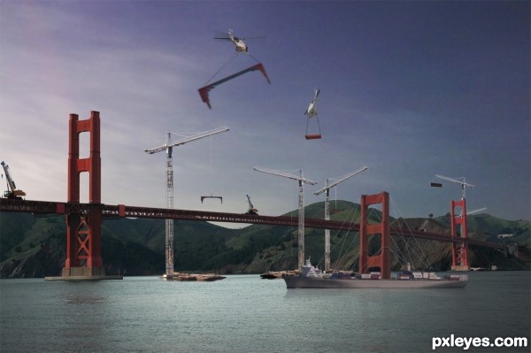
It´s very nice. Though the choppers are much brighter than everything else.
Very nice image author,but this could only be some never reconstruction of Golden Gate,because when the bridge was finished chopper's like this was belong to the far future...any how,best of luck
yea this is a version of the bridge being built in our life time, i doubt they had the same cranes we use now or even built it in enormous sections already painted red that outweigh the helicopters carrying them....i guess its more of a cartoonish method of construction...but i'm just having fun with photoshop i guess...thanx for the comment
Yes fun is what this is about good luck Author nice job
I love the idea since this is where I am from. (a little more south). The blur isn't needed on the piece hovering above because it's not off in the distance, it should be the same focus as the actual bridge. The middle structure is not in place, and wouldn't be "moved" The vertical supports go in first. Sorry for the nitpicks, because blending wise you did a great job! (I will ignore the time warp, and weight issues w/ the helicopters as there is no way that the helicopter could lift what you depict, so yay fantasy! heheh)
nice idea, gl
Very good idea. Good job. GL !
Howdie stranger!
If you want to rate this picture or participate in this contest, just:
LOGIN HERE or REGISTER FOR FREE