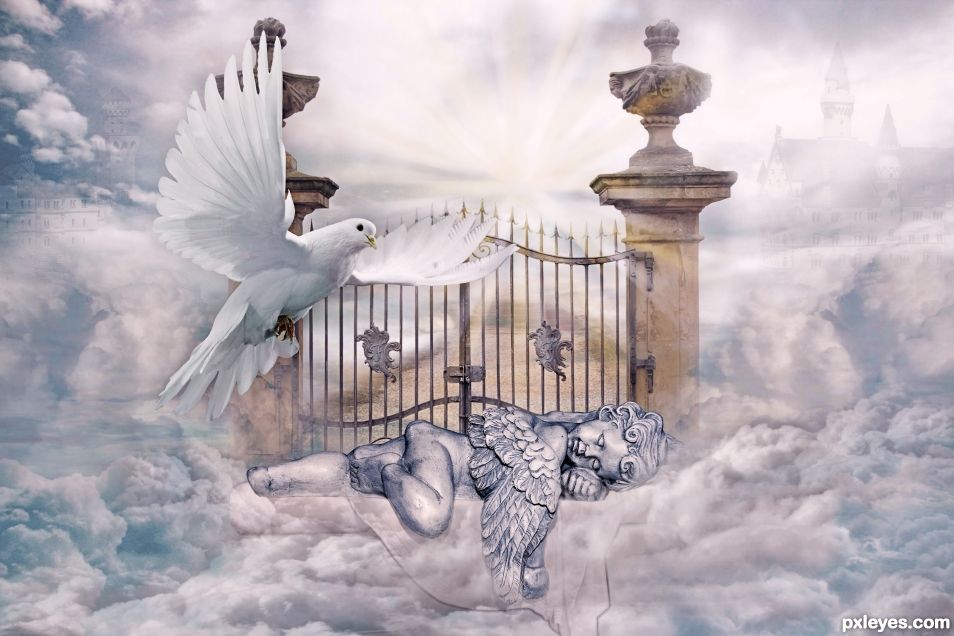
An angel peacefully guards the gates of heaven where all angels rest in peace. (5 years and 1295 days ago)
- 1: clouds
- 2: more clouds
- 3: more clouds
- 4: gate
- 5: dove
- 6: bed
- 7: castle
- 8: path

An angel peacefully guards the gates of heaven where all angels rest in peace. (5 years and 1295 days ago)
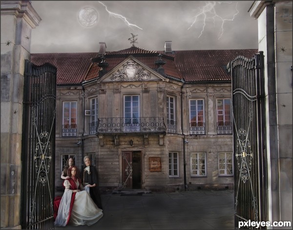
Betty's Brothel is in need of some repair and perhaps has a bit of eccentric clientele. (5 years and 3358 days ago)
Sara Barth and Lies Meirlaen have both been notified of their image being used, by note thru Stock.xchng.
I like the overall colours of this image, it suits the elements in the image so well. Good work!
I like it overall however I think it could have been straightened up to make it look level.
I thought of straightening the right entry post, but decided it added to the state of decay. Therefore, I left it as it is, to be fitting of the theme.
This is nice entry author and with few tweaks this can be even better...Sky image and the overall mood don't go with each other...U have day light for the house and people but rainy dark sky...U have to made image darker or to find some other sky for this image...I think that some other sky would be better in this case...Also IMHO spiders are to big..For better blending u can use some color layers in different blend modes..There is slight difference in resolution of provided source image and images that u used so some color layers would fix that difference...sorry for this nit picks...
Erathion, all the changes you requested have been made, with the addition of a nicer weathervane and lightening.
Cool concept. The fairly uniform lighting makes it all rather blah, however. A lot more shadows would make it a lot more dramatic. Some green (for example) interior lights might convey both "open for business" and "eccentric."
it looks loke a painting, very nice good luck!
It's sort of scary, really like it!
Howdie stranger!
If you want to rate this picture or participate in this contest, just:
LOGIN HERE or REGISTER FOR FREE
http://youtu.be/qCQrrQ3R8as (5 years and 3387 days ago)
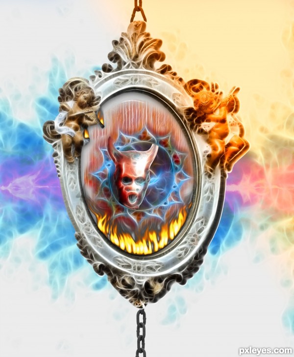
Too heavy a use of the Fractalius filter.
Funny song, lmao!
When I try to visualize the video, i see something darker with red vines of lava , many broken chains, etc, etc. Oh, and WIND en masse !
I'm not sure what you originally visualized and the entry looks pretty positive here, anyways thx for sharing the song.
Very very nice piece author...gl
Howdie stranger!
If you want to rate this picture or participate in this contest, just:
LOGIN HERE or REGISTER FOR FREE
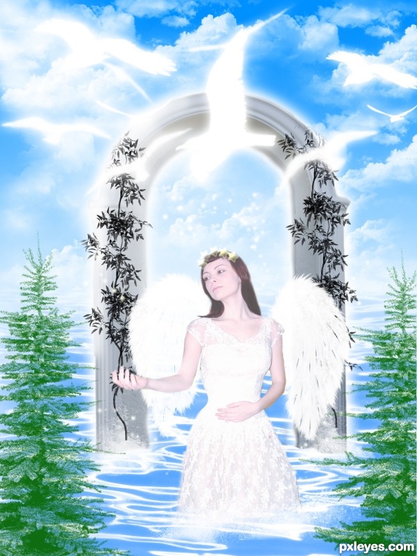
This image has some good and usefull sources and I cant live with out crediting them so firstly I would like to thank CHULLI STOCK, from deviant art for providing us the castle door image. Then I will like to thank Fallin stock the creator of the beautiful tree brushes from Deviantart. Thanks also to Falln-Brushes of Deviant art for nice feather brushes.Then I would like to thank the creator of water brushes from Osidian dawn of which I will provide the source link. Thanks to cyber-stock for providing this lovely angel. Then I would like to thank JavierZhX of Deviantart for providing lovely clouds brushes. Special thanks to Obsidian Dawn for providing beautiful star brushes. I would also like to thank FrozenStarRo of Deviant art for providing superb water brushes which are used in this image. Another thanks to Obsidian Dawn for providing beautiful birds brushes and lat but not the least thanks to Obsidian Dawn again for providing beautiful light beam brushes which are used in my image as rays. (5 years and 3415 days ago)
very good......
Thanks saman.......
very nice
Thanks...
Work is very nice author but i am sure that u cannot use image of this girl...cause this girl is Emma Watson actress, Hermione Granger from Harry Potter saga...So if u don't have legal source link your work will be removed probably...My advice is to change Emma with some other source usable image of the girl...Best of luck
I like the overall look of this, but a few things come to mind. I agree with erathion about the source of the actress not being useable...but you have nearly stark white areas around the arms. There's no shape at all. Hands nearly look to appear from nowhere. Maybe allow some tone back into those areas. 
Thanks pixelkid I appreciate that
I hated to replace Emma Watson, but it is against the rule of Pxeleyes. Thats not a problem I am back again with this image.
The wings are unevenly lit, with the one on the left brighter than the one on the right. The overall values are too high contrast, almost looking washed out with the whites too bright. The birds are losing their shape from it.
U did very good thing author with changing the picture of Emma cause this cool entry stay's in the competition...best of luck author
Thank you Erathion,,,,,,,,,,,,,,,
Author...I know you liked Emma....but this fix is far better in my opinion. Nice chango fixo...you actually improved the whole thing. I also like the way the new figure's positioned with the arm. 
Howdie stranger!
If you want to rate this picture or participate in this contest, just:
LOGIN HERE or REGISTER FOR FREE
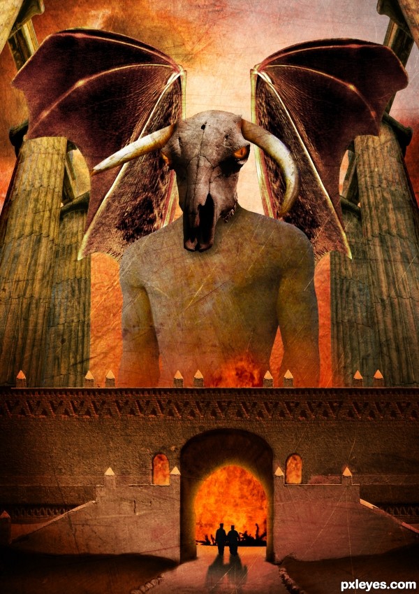
Thanks to Tilemahos Efthimiadis, Joyrex, Dave Hamster, Scallop Holden, Zeusandhera, Night_fate, Thomasje, Iversonic and Mimiliz for the lovely stock images ;-)
I found the inspiration for this work in a photoshop magazine of a friend. The name of the artist who describes a tutorial of something similar to this one is Adam Smith. Thx ;-)
comments are most welcome... (5 years and 3643 days ago)
Dunno why the wings are transparent, but it's a good idea & mood. IMO a bit texture heavy, but that's just me...good luck. 
Thx Cmyk46, i'm going to leave it like that for now  but like i said, comments are welcome. I spend a lot of time on this one
woohoo, love it author  its out there for sure :p
The scale is fantastic.. you can really tell you spent a while working with this one. I personally don;t like using textures much but i think you used them very well on this occasion. The silhouettes are a nice touch, but the building should cast the same strong shadows as they do.
Great overall work  Good luck!
Pretty nice scale on the things. But I would make the wings a lot bigger and work with the edges of the wings, as well as making them non-transparent. Could add some bones/veins or something on them to make them more realistic. They look pretty much cut/copy/paste/too big pencil when cleaning the edges now. Or you could try inner shadow effect for the wings. There are also some bit careless masking of the edges. Work with the windows and there is a major left-over from a colour mask on the right edge of middle part.. some dark trash there. Nice colours and eye sockets, worth working a bit more..
Very nice entry, that reminds me an illustration about mythic creatures. GL!
wow, awesome!
Thx Widiar, i will do something about those problems 
Good job with the wings, looking so much better now..
Thx for the nice comments 
great concept author...good luck
Thx 
Wish nobody to get to that gates 
Yep, it won't be a lot of fun 
Howdie stranger!
If you want to rate this picture or participate in this contest, just:
LOGIN HERE or REGISTER FOR FREE
Oh Lord... bwhaa haaa haaa haaaa... JUST KIDDING..

Very very pretty
Thanks Ernest. Your jokes are always amusing.
This has a lot of work put into it, and I mean a LOT. I've been scouring the page for margin errors, and any errors at all and can't find anything except to learn from your work and for that I thank you. I'm pressing the heart at the right, not sure what it will do but I hope it is something positive.
Thank you still26 and welcome to Pxleyes. Pressing the red heart puts works into your favourites. Thanks for that.
Congrats Angel!!
Congrats !!
Congrats for your Angel, Angel!
Thank you very much everyone.
Howdie stranger!
If you want to rate this picture or participate in this contest, just:
LOGIN HERE or REGISTER FOR FREE