check out high res too... :) (5 years and 3474 days ago)

(5 years and 3541 days ago)
nice.a bit scary..
nice feel...
Great texture
Very eerie. Nice work 
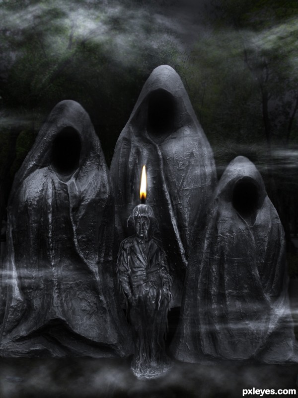
Creepy image indeed the three back statues would be receiving some ambient light from the candle flame.....
Very well done - love it!
The flame makes no sense.
creepy looking :P gl
Great dark mood-ed image...best of luck
Howdie stranger!
If you want to rate this picture or participate in this contest, just:
LOGIN HERE or REGISTER FOR FREE

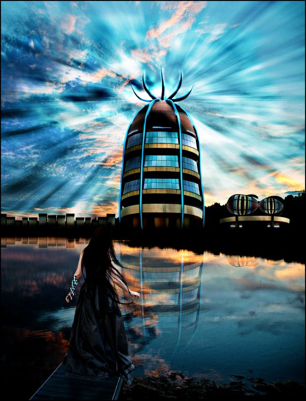
A sci fiction scene... the main building is sucking energy from the enviroment around it.
Credits to:
http://faestock.deviantart.com
http://falln-brushes.deviantart.com
Effects made with filters.
(5 years and 3717 days ago)
Now it looked like a painting. Wonderful!
Very good, GL 
Thanks for the nice comments 
Very powerful message, and very well created, Good job 
wow this looks amazing great job 
Looking realistic....
Simply beautiful image 
Pretty surreal image. 
great,gl
Love this work so much,sky is fabulous,reflection too...good luck author...
Fabulous work.....The image looks a bit supernatural and spiritual....Too good...
Her head dies against the dark background...fix that, and you've got a good image...
WOW i do believe you alomost got a postiive response from CMKY46, almost !! . Awsome job.
Looks like a winner! 
very nice work,and colors! 
Beautiful image and cute reflections. The lighting effect on her left hand looks amazing 
congrats 
Congrats for your second place, Akassa!
Congrats!
Congratulations for 2nd, nice one.
grats =)
Congrats on 2nd place Akassa...wonderful image!
Congrats! 
Howdie stranger!
If you want to rate this picture or participate in this contest, just:
LOGIN HERE or REGISTER FOR FREE

all source and my picture (5 years and 3950 days ago)
Hey, this is super! Would make a great cover for Information Technology handbook. 
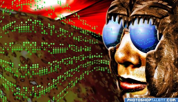
Is it a man, a woman or a fly?! Funky! Love the green dots!
Awesome idea! Well done!
very creative 
Creative work 
great
good
u have talent G:L
Awesome!
For some reason I think this is kinda cool. In the superhighres version there are some rough edges and all. You could make them more smooth with the pentool or brush, on the other hand maybe this way it fits more with the whole image. Good luck!
interesting use of source )
Howdie stranger!
If you want to rate this picture or participate in this contest, just:
LOGIN HERE or REGISTER FOR FREE
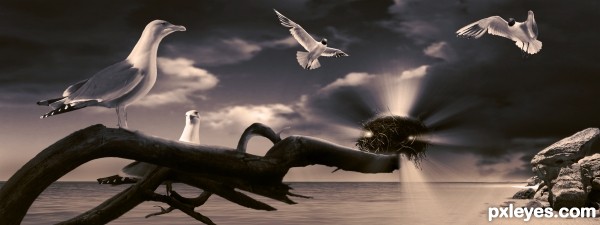
Beautiful... If it wasn't a seagull, I'd say it was the Holy Spirit.
Nice concept, for some reason the nest seems to be off perspective to me, the first thought i got was that i was really far away, then i noticed it was on the branch, maybe you should remove from of the intense light placed on the bottom part.
awesome entry!
I really like this but I have to agree with akassa the composition makes it look as if the branch is heading miles out to sea (unless thats the intention), maybe a little blur could be used on the parts of the image in the distance to bring the nest back.
thanks for the comments guys...
I have to disagree with the perspective issue. I think it depends on how you're looking at it... but I have made changes to the light on the bottom of the nest, and fixed a few issues with the actual nest re the placing i.e. the bottom left corner... was infront when it needed to be behind the branch...
as always your comments are much appreciated
very nice...
great job, love the color and the mood
very... very nice job. I realy like it ;D The color balance is perfect and it looks so mythical. Congrats!
Your light sources are all over the place. The bird is lit from the left, there is a sun on the right behind the rocks, the clouds are lit from above right, and the light rays coming from the nest aren't illuminating anything...Good concept, CLEAN lines, but you need to consolidate the lighting and make it consistent.
MossyB: I think you are getting your left to right mixed up... the rocks are lit from the left hand side with the shadows on the right hand side exiting the frame... the sun is highlighting the central part of the clouds, highlighting the left rim ... assuming the sun is slightly off to the left also... so the lighting direction with regards to the rocks is fine...

so based on the sun being on the high left it's safe to assume that there would be a light source illuminating the birds on the left... if you look at SBS I added light to the face side of the gull as light from the nest... the rocks needed no adjustment as the light from the nest is also on the right... and as for the nest not illuminating anything... its illuminating the branch the gull and the two gulls hovering above... please refer to the sbs guide... step 6 explains the gulls
Thanks for your comment
Howdie stranger!
If you want to rate this picture or participate in this contest, just:
LOGIN HERE or REGISTER FOR FREE