Just a pop art kind of thing. (5 years and 3363 days ago)

Am really having a artist or creative block this week... Can't think of anything...
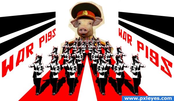
So made a simple collage depicting the song "War Pigs" by "Black Sabbath"... I really didn't go full at it... Coz if I go full length into it, it will really be political... And I didn't want that...
"Generals gathered in their masses
Just like witches at black masses
Evil minds that plot destruction
Sorcerers of death's construction
In the fields the bodies burning
As the war machine keeps turning
Death and hatred to mankind
Poisoning their brainwashed minds, oh lord yeah!
Politicians hide themselves away
They only started the war
Why should they go out to fight?
They leave that role to the poor
Time will tell on their power minds
Making war just for fun
Treating people just like pawns in chess
Wait 'till their judgement day comes, yeah!
Now in darkness, world stops turning
As the war machine keeps burning
No more war pigs of the power
Hand of god has sturck the hour
Day of judgement, god is calling
On their knees, the war pigs crawling
Begging mercy for their sins
Satan, laughing, spreads his wings
Oh lord yeah!"
Edit: Added sbs and also added source link for the old paper texture... Kinda forgot that last night lol... (5 years and 3931 days ago)
Fix the perspective on the letters. They should get larger toward the front of the pic, not smaller...might be better to either extend the paper texture on the general to fill his area, or get rid of it. Right now it looks like you forgot to mask it out. Not putting down your idea, though...I like it!
NEAT
Oh damn forgot bout the letter( skewed it only forgot to do perspective damn) lol... Will fix that... Well as for the general it's on purpose, like some one cutting it with scissor... Will fix the letter, but will keep the general's cut out...
Edit: Fixed the perspective on the letter... It's fixed now... Actually before it wasn't smaller but of the same size, but coz of the army near it and the stripes above it, it looked smaller... Kinda a lil optical illusion...
I hope it's better now...
Classic song!
very nice! 
Looks good...I get it about the General. 
i think you have done enough to represent the song  well done, i like it
Love the song, love what you have done with it
Howdie stranger!
If you want to rate this picture or participate in this contest, just:
LOGIN HERE or REGISTER FOR FREE
I think that Photoshop requires a little more imagination, a little more creativity, no point to set anything !

let this be a guide :
cut - layer it - transform - insert - create - adjust - and prepare for critics
And welcome to the photoshop contest site
GL
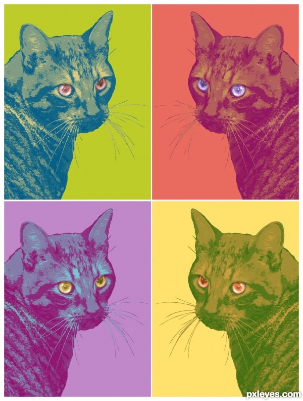
I like the "Warhol Pop Art" effect. Nicely done! Sometimes, simpler is better.
I think there is creativity in treating the eyes differently and in making the great color choices, not to mention the overall concept. However, having all the images facing the same way would be more Warholian and compelling IMO. (BTW is the title an allusion to Warhol's 'Mao'?)
Love it ... I have to agree with Mossy and Dan ... nice replication of AW's work. Love what you have done with the eyes as well.
very Andy Warhol.. and very well done (this would look great on a side of a building.. or a floating center piece in a restaurant less is often more....good luck
Howdie stranger!
If you want to rate this picture or participate in this contest, just:
LOGIN HERE or REGISTER FOR FREE