Please check out High-res version too!
I also used 2 own photos, so check out SBS too. (5 years and 2655 days ago)
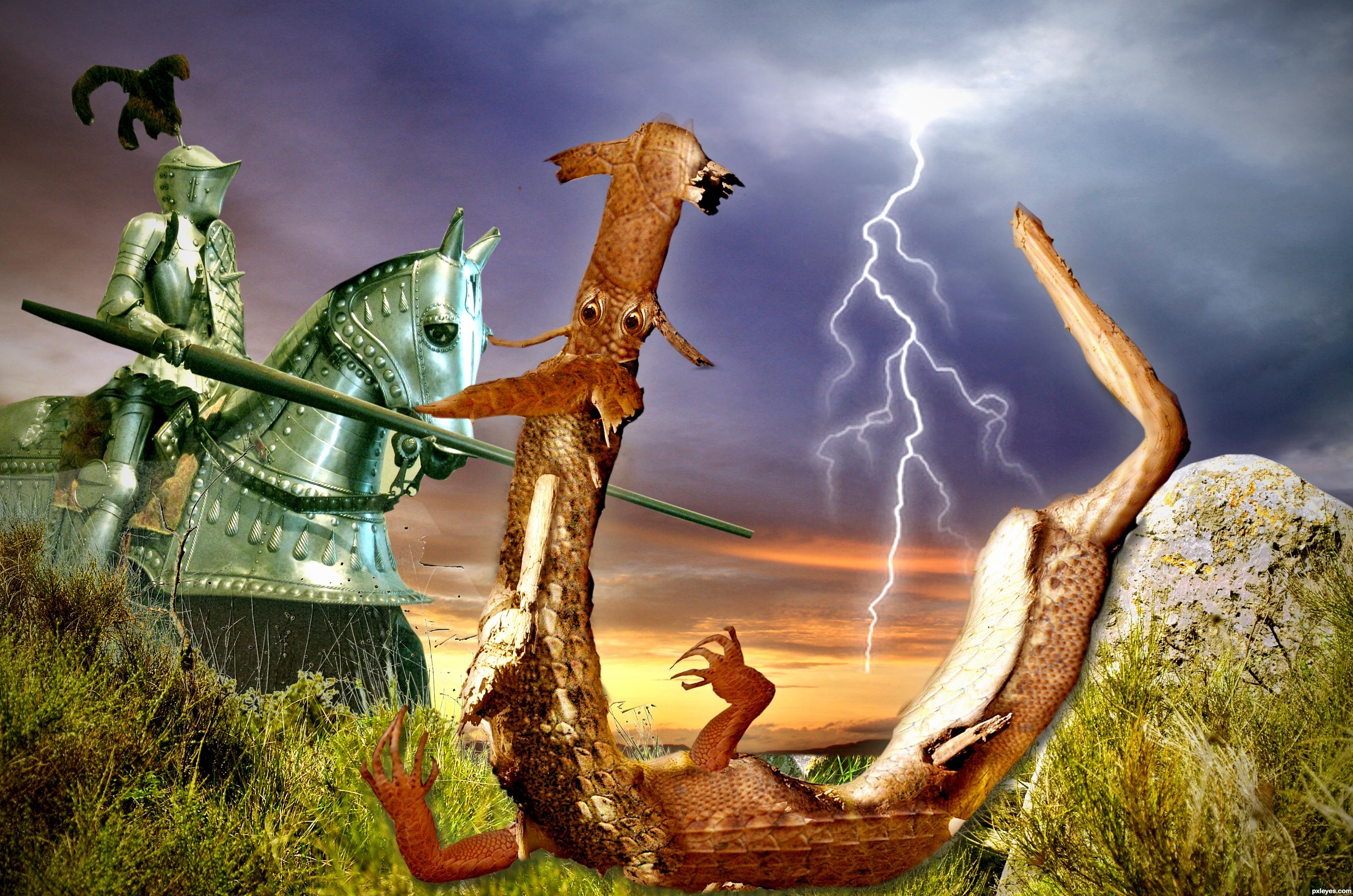
The image of St. George and the dragon has been recreated in many ways, but I believe it is the first time that the dragon was designed from a dead tree ...
GL4U (5 years and 3024 days ago)
It's a nice idea and the execution is pretty well done. Personally I'd skip the PS generated texture though, imo it's a bit distracting from the actual image. If you chose for it to give the image an older look, I'd recommend to use a photo of an old paper/fabric texture. More subtle and perhaps with better "old" result. Good luck!
I took the texture completely, wazowski, what did you think? thanks for your help 
I think this way the image is way better to see, author  . Good luck!
The stark highlight on the knight suggests that maybe the tree 'dragon' might have a more pronounced highlight on it's face and front. Nice job!
let's say that the lighting in the armor of the horse is a reflection of lightning illuminating the belly of the dragon
Howdie stranger!
If you want to rate this picture or participate in this contest, just:
LOGIN HERE or REGISTER FOR FREE
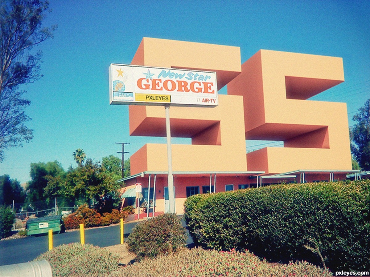
• This piece of art is my entire dedication to Mr. Jorge (by the username of George55). It’s simple a symbol of gratitude towards him. Not a very special one I admit, but it’s also has a special meaning to someone I really cared for. This tiny little present from me was created because of his wise words, his nice comments to others, his talents and also his ‘fights’ to this cruel world with his strength to face the illness. I really want to have a nice uncle like him. We don’t really know each other; it’s just me read his life experiences through The Eye #5. And I decided to take one of his stocks and manipulate it with Cinema 4D and Photoshop the other day.
• Hope you guys like it, and I apologize if I made any mistakes. Feel free to leave a comments and suggestions. Appreciated so much. Thanks! (5 years and 3026 days ago)
George55 is a good friend and a true gentleman well deserving of a tribute like this and it's very nice of you to dedicate your work to him! Nicely done...in more ways than one!
Thanks, spaceranger. It's all I can do if I had a plan in mind and also a compassion through my art. = )
Hope Mr. Jorge don't mind if I used his nickname into the sign.
Wow! I really appreciate your dedication to me. What can I say, I am just a regular human being, trying to do my best through difficult times. I think the comments and support of people who love me here in Pxleyes, make me stronger and a better person. I love to share, and help others to learn. I was taught here, many beautiful ways to make my work better.
Seeing your work, makes me proud of being a part of this community of talented artists, like yourself. Thanks and good luck. No, I don't mind using my nickname in your work, I am George55 for you and for all.
Spaceranger: Thanks for your nice words too.
Congrats  very nice work
congratz on the win...i thought i had it for a while..good job
Congrats!!
Wow, thanks guys for the votes and the nice comments. It's all my pleasure and it's my dedication to uncle Jorge. I don't really expect to come into this first place. But really, I'm glad. = )
this looks so real! nice manipulation and congrats! nice tribute to a great artist
Howdie stranger!
If you want to rate this picture or participate in this contest, just:
LOGIN HERE or REGISTER FOR FREE
(5 years and 3393 days ago)
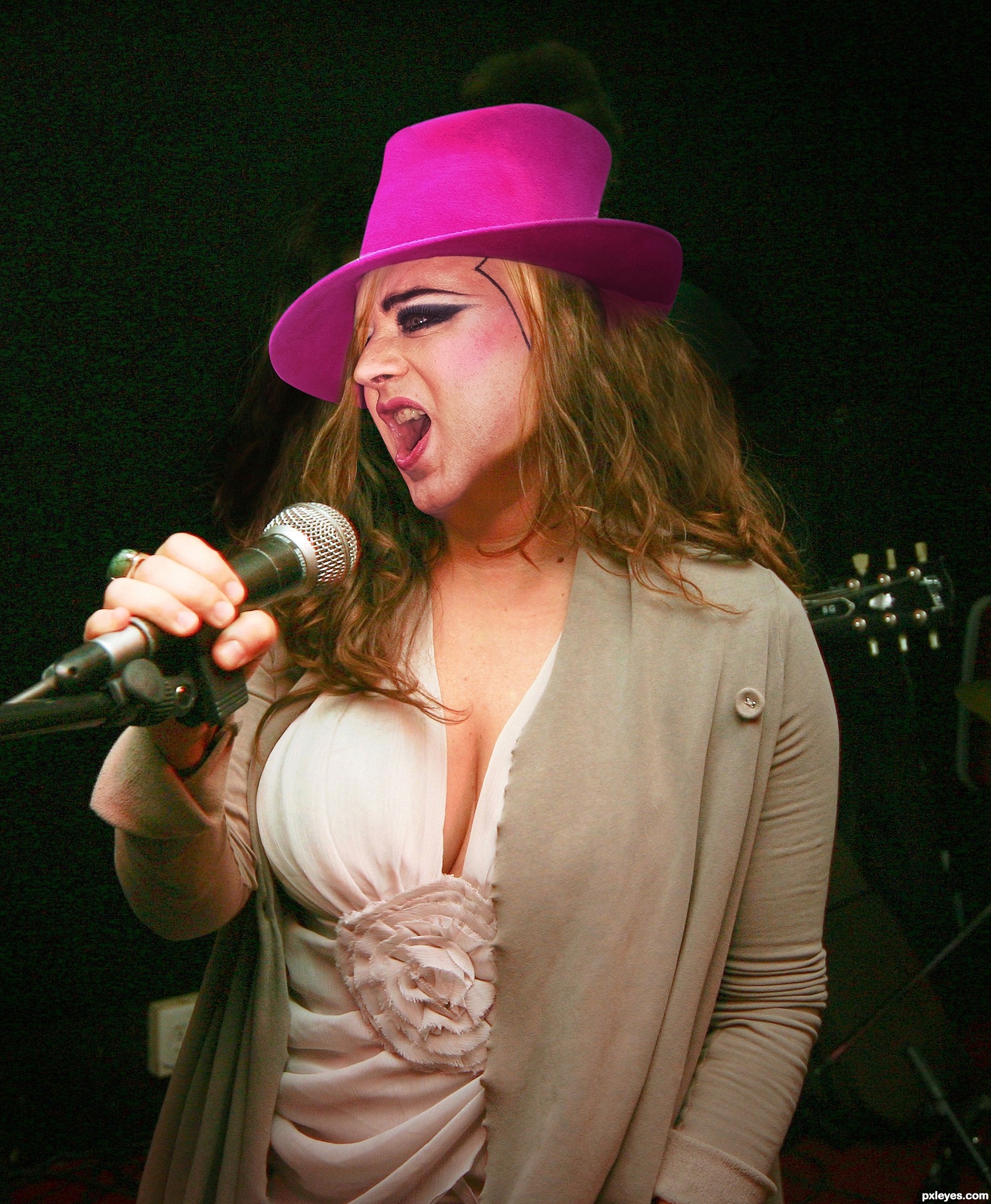
I liked the effect on the hair ^ ^, good luck.
The edges of the hat are too sharp compared to the rest of the image. If you feather them by about .5 px. it should blend better. Nice chop!
There's hair on the left side of the hat that shouldn't be there. The hat color might be toned down a bit too, but this is still a good idea. GL author.
This is hilarious! great entry
Very convincing work author...and damn this is big crime IMHO to ruin this body (air bags) with head like this...
funny!
Howdie stranger!
If you want to rate this picture or participate in this contest, just:
LOGIN HERE or REGISTER FOR FREE
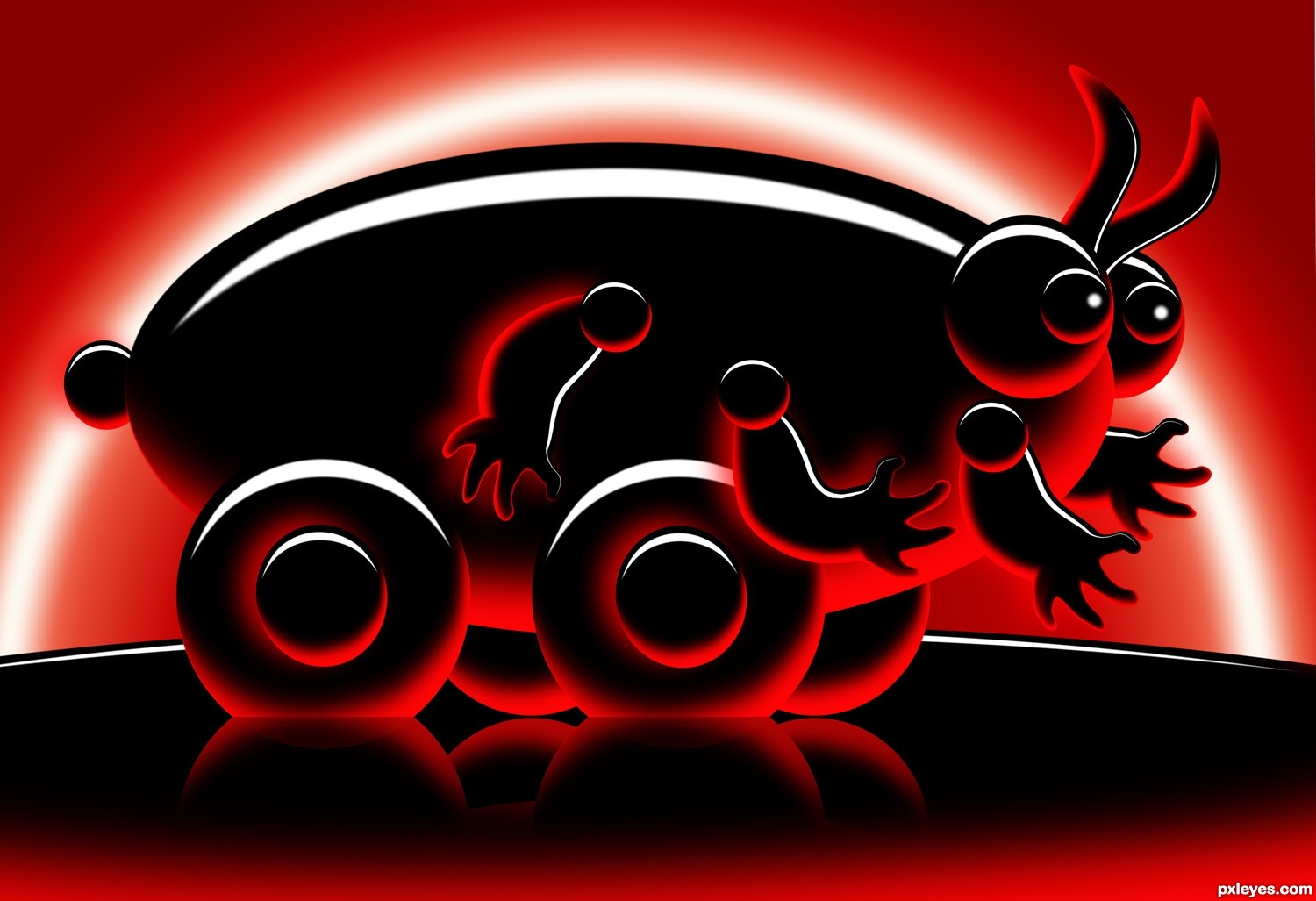
built in PS (5 years and 3513 days ago)
Hello, Sir ! Pleae suggest me that how to create the entry with pure black, pure white & tones of red.(No tones of black).
Is there pure Black in this entry ? I am asking this question all the entire entries. Please tell me if there is pure black & tones of red not black.
Well, I wanted to use gray so bad I could taste it!, What I did was only use PURE black background, then used a very soft brush in RED and painted on top of it. Then I used an Oval marquee tool set very HARD EDGE to cut an arch and fill it with white. I used a TINY BIT of Gaussian Blur so I wouldn't get gray edges but at the same time softer edges. and only used a white/red gradient for the back ground... the trick is to not allow any FADED white to come in contact with the black or you'll get shades of gray.. (And I got LOTS of gray while I practiced.. hope that helps)
I also used only RED drop shadows (if they hit black or white they stay shades of red) It's tricky but I figured it out after awhile..good luck
Awesome entry, imo. Some reflections are above those wheels, check that out. The rest it's really cool.
THANKS FOR EXPLANATION SIR !
Aaaaaahhhh! I love the little bug on wheels...buggie!
In my opinion this entry goes the extra mile. The Author has stayed on theme and created a wonderful image with depth and humour (not easy when working with such a strong/dark colour as red). IMO one of the best images in the contest as they did not resort to any diversion from the theme!
Well done. I like this creation = )
Great job author...He is a cutie...well done
Congrats on third place!
congrats!
congrats!
congrats my friend!
Congrats!
Howdie stranger!
If you want to rate this picture or participate in this contest, just:
LOGIN HERE or REGISTER FOR FREE
Photography and photoshop contests
We are a community of people with
a passion for photography, graphics and art in general.
Every day new photoshop
and photography contests are posted to compete in. We also have one weekly drawing contest
and one weekly 3D contest!
Participation is 100% free!
Just
register and get
started!
Good luck!
© 2015 Pxleyes.com. All rights reserved.


Well done!
Thank you!
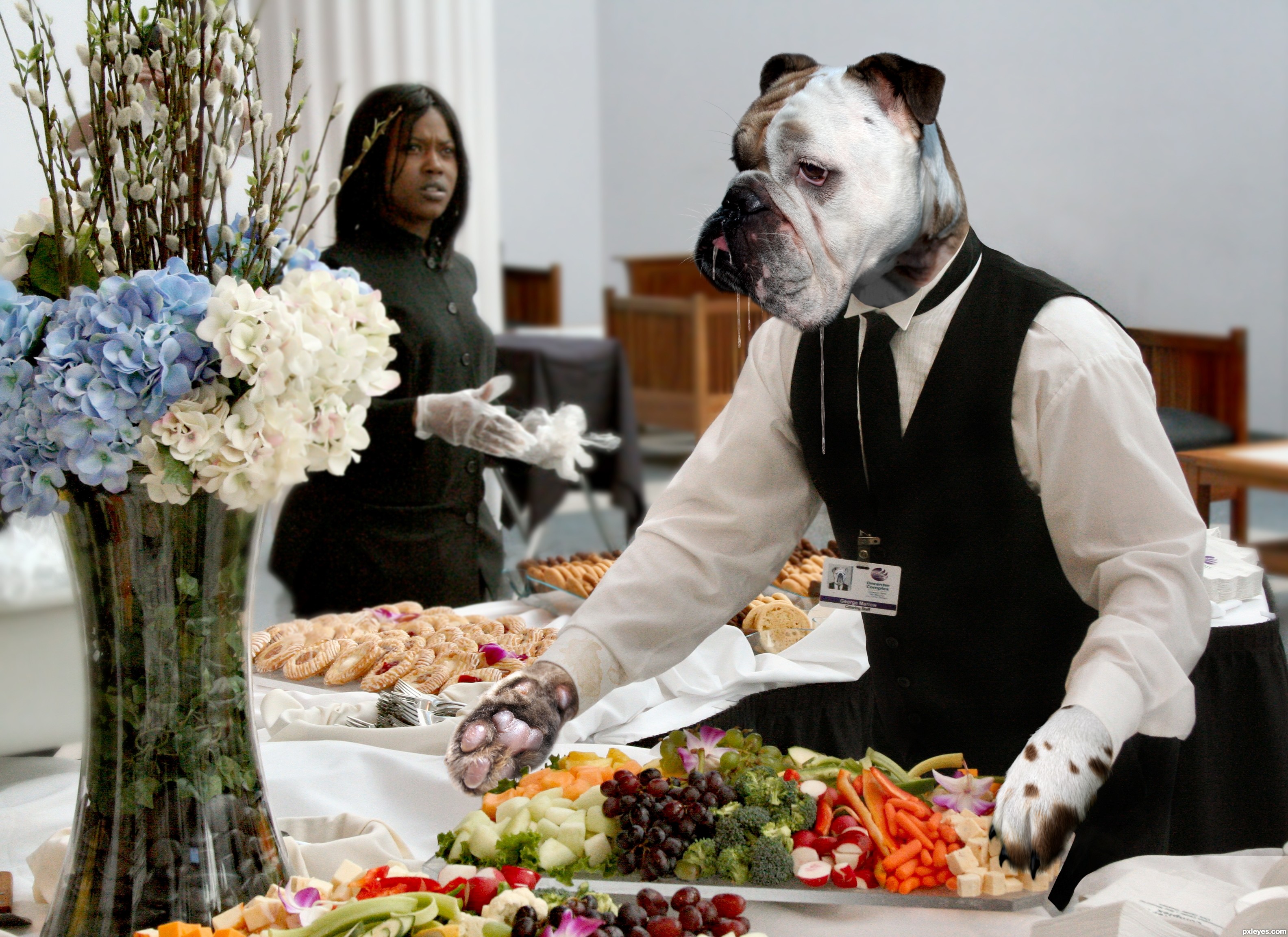
heh heh Like the drool
Good one, nice detail in the employee card, well done! Good luck!
Pretty cool stuff!
good,job on the drool...very realistic
I was a bit frustrated because I didn't find any good pictures of drool on the internet. I tried out really many ways to create it, so I'm really glad to hear that it looks realistic.
Nice work. The expression on the woman is perfect. Great job on the dog server!
Congrats!
Thank you! I'm so happy about the first place!
Congrats Anne terrific work, sooo slobbery.
Thank you!
Congrats!!
Congratulations Nönny
congrats for the win...well deserved
Thanks!
Howdie stranger!
If you want to rate this picture or participate in this contest, just:
LOGIN HERE or REGISTER FOR FREE