Photoshop Pictures: Get


results 1 - 5 of 32

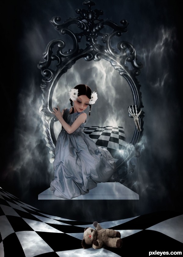
Come And Get It - created by TwilightMuse


Come And Get It
Favs: 4SBS: 14Hi-resRank: 3/15Score: 70.6% (31)16283 views

Tried to create a story with the various elements. Rabbit might be my favorite stock find ever! Used my own photograph for the white smoke stuff and created the checker board in photoshop. Thanks to the stock artists, all from deviant art. (5 years and 2626 days ago)

5 Sources:

avatar nimeshjohri

Beautiful..

author says:

Thank you! I'm quite pleased with how it turned it

(5 years and 2628 days ago)


avatar SHIPLEYGIRL

that is really cool photo manip great job

author says:

Thank you! It went together very nicely once I started.

(5 years and 2628 days ago)


avatar pixelkid
pixelkid says:

Really like the flooring and smoke. I only wish the platform had more texture and shape. Possibly a shadow or reflection. Nice work, author!

avatar pearlie
pearlie says:

Good point about the platform, otherwise very nicely done. Don't see any rabbit, though.

avatar pearlie
pearlie says:

Congrats, nice chop!

avatar spaceranger

Congrats!!

Howdie stranger!
If you want to rate this picture or participate in this contest, just:

LOGIN HERE or REGISTER FOR FREE


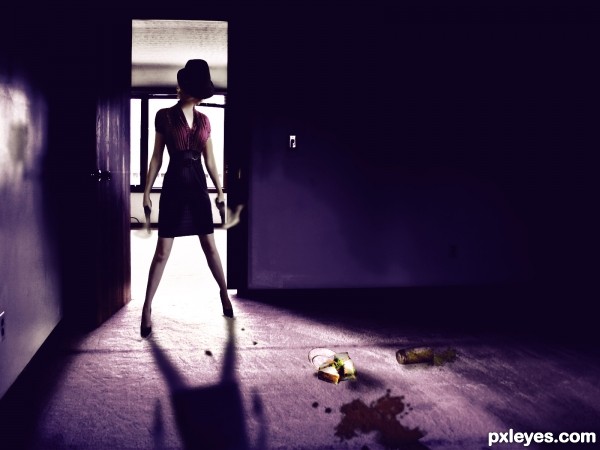
Last Meal - created by detractor


Last Meal
Favs: 0SBS: n/aHi-resRank: 8/15Score: 57.1% (0)14885 views

(5 years and 2743 days ago)

3 Sources:

avatar solkee
solkee says:

For such a strong light source at the back, she is very bright at the front. I'm struggling to see where the source was used, maybe a SBS would help. And the floating balls/lens flare doesn't really do it for me. Wait until CMYK sees it

author says:

keep struggling. what if CMYK see it.

(5 years and 2743 days ago)


avatar solkee
solkee says:

Looks better with the adjustments that you made. I presume the source is the plate on the ground?

author says:

Thank you that was helpful! Yes the plate and juici glass

(5 years and 2742 days ago)


no avatar
Tosimos says:

HA i see it, tho it is easily overlooked. also not much use of the source, tho thats my personal opinion. gl author

author says:

You are right i add one more item from the source xD

(5 years and 2742 days ago)


Howdie stranger!
If you want to rate this picture or participate in this contest, just:

LOGIN HERE or REGISTER FOR FREE


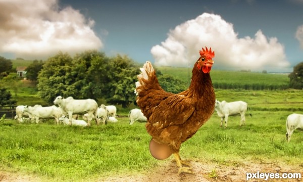
Can't get it out!!!.... - created by jordyponce


Cant get it out!!!....
Favs: 0SBS: n/aHi-resRank: 13/15Score: 61.7% (0)7775 views

Uuggrrrr...what did I eat? this is too big..why me??.. whyyyyyyy?!!. (5 years and 2872 days ago)

5 Sources:

avatar Drivenslush

EW! LOL

avatar jeaniblog
jeaniblog says:

Love the smile on chicken's face..

Howdie stranger!
If you want to rate this picture or participate in this contest, just:

LOGIN HERE or REGISTER FOR FREE


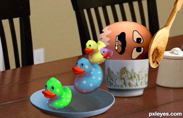
Get OUT !!! - created by sdaniela


Get OUT !!!
Favs: 0SBS: 7Hi-resRank: 15/15Score: 60.3% (0)7132 views

(5 years and 2876 days ago)

4 Sources:

avatar Drivenslush

Duck Poop? Poop Duck? hehehehehehe

Howdie stranger!
If you want to rate this picture or participate in this contest, just:

LOGIN HERE or REGISTER FOR FREE


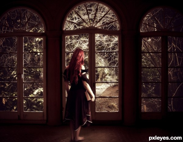
Hoping you get... - created by DanielaOwergoor


Hoping you get...
Favs: 1SBS: n/aHi-resRank: 7/15Score: 64.3% (0)19206 views

Thanks to: http://mizzd-stock.deviantart.com/
&
http://januarystock.deviantart.com/

(5 years and 2877 days ago)

2 Sources:

avatar fatz8016
fatz8016 says:

Great job author..i really like this one..GL!

author says:

Thank you, I`m glad you liked!

no avatar
Keiley22 says:

its a very lonely and longing image to look at, its almost like she is trapped. I love the costumes of mizzd stock on DA, she is a beautiful woman and one of my favourites to watch on there

nice work author.

avatar gleizzable

very classical

avatar Drivenslush

butt just clenched.. hehehe.. good luck

avatar jeaniblog
jeaniblog says:

Lovely..

avatar Eladine
Eladine says:

i love the image you did a good job but what is it that she is looking at? i am somehow hoping to see an answer in the image but thats whats in my head, this is your image so its a good work cause the pictures story continu in my mind a little

avatar CMYK46
CMYK46 says:

IMO the forest should not be so desaturated because of all the whites on the window & the figure. Less white in the background would create more contrast & depth.

author says:

Thank you guys, for the comments!!

Howdie stranger!
If you want to rate this picture or participate in this contest, just:

LOGIN HERE or REGISTER FOR FREE