(5 years and 3289 days ago)
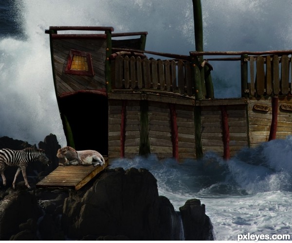
The Flood is coming and the lazy donkey does not want to move away....!
Thanks to mqtrf for the pics of the wave, donkey, and the zebra. (5 years and 3331 days ago)
The focal point is too small, and is overdominated by the waves...A bit of judicious cropping would help convey the focus much better.
Thank you Mossy, I made the ark bigger. Hope it looks better.
Show!
Howdie stranger!
If you want to rate this picture or participate in this contest, just:
LOGIN HERE or REGISTER FOR FREE
This is my first entry so I'm looking for that constructive criticism :)
(I edited it so it looks a bit better now, if anyone else has suggestions, LET IT RIP!) (5 years and 3350 days ago)
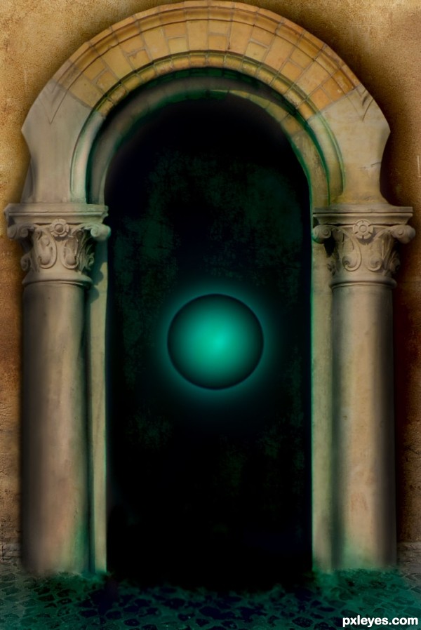
very good first entry ...... i think the greenish shadow should emanate from the door (not over the columns), and the columns look a bit flat on the pavement.
i would play more with the orb too , since is the centerpiece of the title.
overall looks pretty good.... and good luck
The 'classic' columns in conjunction with the 'modern' green orb is very intriguing. Gornats has good advice. Try varying up the idea a bit. Maybe make a brighter glow behind the orb and then a larger, less bright glow behind that. Maybe lighten the top portion of the dark doorway a bit with a soft transition to dark. These are merely small ideas. I like what you've done author. Nice first entry! 
Thanks for the comments guys, I will end up re-posting it probably then. Do I leave this one or do I delete it?
How do I delete this?
you can replace it with a blank image, redflag it and ask mods to remove it, or just switch it with a new updated version if you are planning to change it. Go to "My Stuff" at the top and click on "my contest entries" then find your entry and "edit" and replace it with the new one by clicking on "browse" and then "submit" at bottom.
Thanks
This looks cool! like the entrance to a magical castle  good job!
Howdie stranger!
If you want to rate this picture or participate in this contest, just:
LOGIN HERE or REGISTER FOR FREE
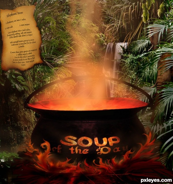
Jungle foliage source photos by Acretian Disc, Intrepid Flame, and blue' at flickr.com; The cooking pot for the Elephant Stew is by Taking leave at flickr.com; and wood structure for firewood by Kethera at flickr.com; the elephants are from a source photo by Stephen and Claire Farnsworth at flickr.com; Thanks to you all.
Here is the recipe which is also on the tree in the image:
Elephant Stew
1 elephant 2c. salt 2c pepper
Cut elephant into 1 inch cubes, frequently adding pinches of salt and pepper. (This should take about 12 days.) Add enough brown gravy to cover. Cook over a very hot fire for about 4 weeks.
If more than 3,800 guests are expected, 2 rabbits may be added. Do this only if necessary, as most people do not like to find hare in their stew!! Incidentally, you will need a big pot for this!
Sabu
This was in an old cookbook which I remembered when I saw the contest category. Thought it would be fun, and hope it doesn't offend anyone. (5 years and 3374 days ago)
"people do not like to find hare in their stew!!" hahahaha great funny entry 
Nice!
Howdie stranger!
If you want to rate this picture or participate in this contest, just:
LOGIN HERE or REGISTER FOR FREE
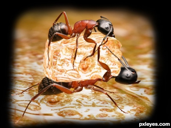
Aaaaaoooooohhh!! My LEGS... #$%&@#.. Hey!! What are you doing up there.. It's MINE. I found it first.. Get LOST !!!
Comments and guidance are most welcome. Happy New year :-) (5 years and 3470 days ago)
have you met my brother?... LOL.. great idea
just love fighting about butter LOL
SBS is mandatory for source only images.
Nice idea, but work on the shadows, and the one under looks flat at the head area. Good luck
Nice concept
Thanks for all the comments. Thanks hoore10 for the fav.
It's a great idea but I think the border is not necessary.
Howdie stranger!
If you want to rate this picture or participate in this contest, just:
LOGIN HERE or REGISTER FOR FREE
my own photo
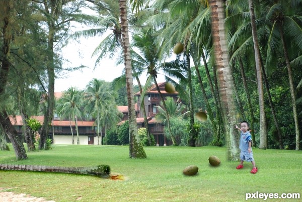
Scale of the boy to the background seems a little off. Seems like he should be slightly smaller. Good idea for your entry, goodluck.
The shadows look a a bit fake to me try to make separate layers, one with higher opaque black and other with a more soft brush.
try changing the blending mode of the shadow layer to multiply... and experiment with the layer opacity... Gl
Howdie stranger!
If you want to rate this picture or participate in this contest, just:
LOGIN HERE or REGISTER FOR FREE