(5 years and 4034 days ago)
- 1: woman

I had fun making this one, just the thought of it made me laugh.
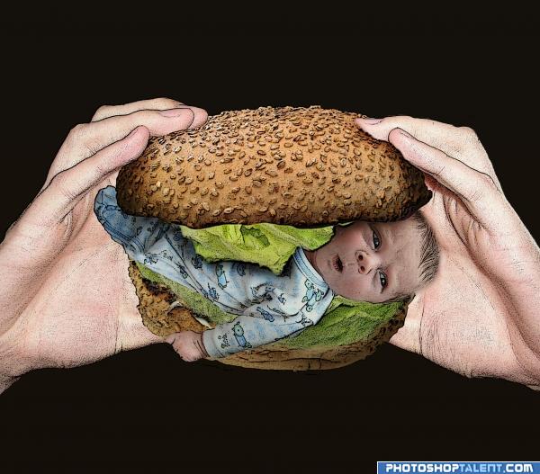
Baby in a bun, yummy :-p
Sources for the bun, baby and lettuce.
The hands going in a SBS from my own collection.
Edit: For the Benefit of those asking about filter, I have added to the SBS and with and without filter, I think its much better with the filter. (5 years and 4049 days ago)
Please check out in High Res, comment and stuff like that 
Nice idea good luck!
noooo..not the baby  very funnny i like it nice work though
imo, it would look better without the filter in this case  Though nice idea xD
Oooh noo, 
 Perfect sources, an the expression on baby's face is just right for what is about to happen!
Damn , they do??
OMG don't eat him!!! 

ummmm... yum??? lmao, good work author 
haha very funny, i want one with extra babies
eww...lololol.. good job
Please don't eat innocent babies. Too much filter work.
Funny! But I agree that the filter should be eliminated (makes it look dirty).
For the Benefit of those asking about filter, I have added to the SBS and with and without filter, I think its much better with the filter.
good
I like it better without the filter  gl
gl
gl
Funny! 
Nice idea!!!
Not the right filter...
Nice idea. Two small things though. The knuckles seem cut off on his hand, and thetop of his head should have a line around it similar to the other shapes in the picture....good luck author.
nice job 
NOO! Not the baby! Funny idea!  haha! yummy!?
  Well done!
well, you made an entry, but oh my, this is unbearable.
Oh my GOSH! Creapy stuff! I really like drawing effect. I would probably add giant open mouth with thousands of teeth! GL
nice entry
Howdie stranger!
If you want to rate this picture or participate in this contest, just:
LOGIN HERE or REGISTER FOR FREE

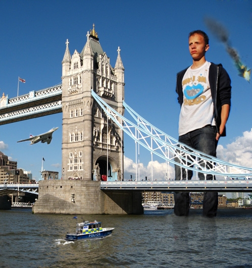
Bridge used from sxc.hu (5 years and 4054 days ago)
He seems mad! Watch out :P Nice idea!
good luck and welcome back!
Nice..If i do that i dont make reflection.
nice work, i would love to see a plane heading towards him, that way he would have a good reason to look so mad lol
@CSevrip: The bridge has reflection on water surface. Why he shouldn't?
Nice integration...what's the red bit in the water where is leg reflection is?
Nice - yes i agree that there should be some reflection in there.. But as you say, use the bridge as a guide.. Your leg reflection is way to defined. Straight edges?? Break them up a bit more.. GL.
Very well done.
Nice work
Yeah,you should work on Lodd's reflection a bit more(to make the reflection more realistic,use a water displacement map,google it!It may take a while to make the map but it's definitely worth it)
very cool idea and well done good luck!
maybe darken the bottom of the jeans as if the were wet !!!! 
Now that would just freak a man out. 
Following OliviasArts: add a plane toward him. ReapRevenge: darken lower jeans. And from many comment: break the reflections. Another comment please.
The boat in the foreground is way too small
@lchappell: I've change the boat to a bit larger. Another suggestions please.
how about some people jumping off the bridge??  nice one.. gl
Make the police boat bigger and add reflection under it. Bigger F16 and bigger exploding plane behind him.
Looking better!
good job and good luck
interesting idea
Howdie stranger!
If you want to rate this picture or participate in this contest, just:
LOGIN HERE or REGISTER FOR FREE
LOL. Perhaps it would be funnier if...No it can't be funnier. That is awesome! Work the shadows.
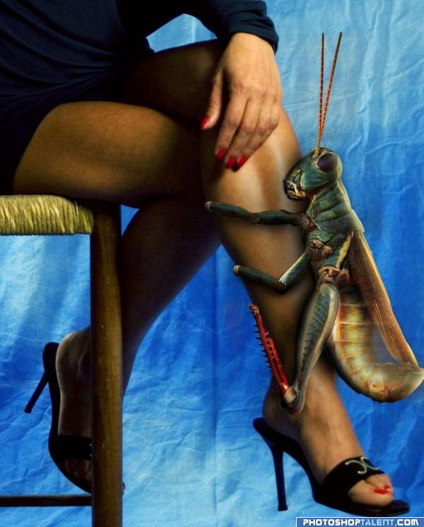
Really funny, but she sure wouldn't just be sitting there, she'd be whacking the bejeezus out of it!
I know I would be whacking the bejesus out of it I am scared to death of grasshoppers! I don't know why, they just creep me out!
imagine the fish you could catch if you used that thing as bait.. LOL
haha, very funny. shadows need work. i know this isnt your fault but isnt that hand a tad bit manly? good luck
Really great work ! Really good shadows and blending...
Nice work really funny stuff humor of the scale!!
Minimonst, I don't mean to pick on your comment, but there's only a bit of shadow I have a problem with, and that's the one at the top of the head which shouldn't be there (Pay attention, author! ) If you want to comment that something like shadows need improvement, please be specific so the author can improve. Thank you, my friend.
High Vote for the funny factor...LOL Good Luck
getting him some leg...great job in the humor and the PS skills departments
Ohh man.... they don't have a creepy bar-cuz that just creeping me out----GL
very neat
lol!!! really well done and funny! hahaha!!!
nice work
LOL!!good luck
@ Nator: Motion blur!! Hahahaha.. It would be too noisy? Arent they like a cricket? Plus at that size would be deafening!! Very funny Author: my only thing is that is a touch blurry - but thats probably from the source?
Nice, work a little bit on the shadow just above the hoppers head, and the little piece between his body and wings. When you use multiply tool(with color same as object but more towards black/gray or blue) for the shadow instead of the black brush you get a more realistic effect.
haha!!
A leg-humping hopper for a pet? She doesn't seem to mind... Good luck...
lol good luck
ololo )))) nice idea! gl
Yuck, i would faint with that for sure lool funny idea!
Howdie stranger!
If you want to rate this picture or participate in this contest, just:
LOGIN HERE or REGISTER FOR FREE