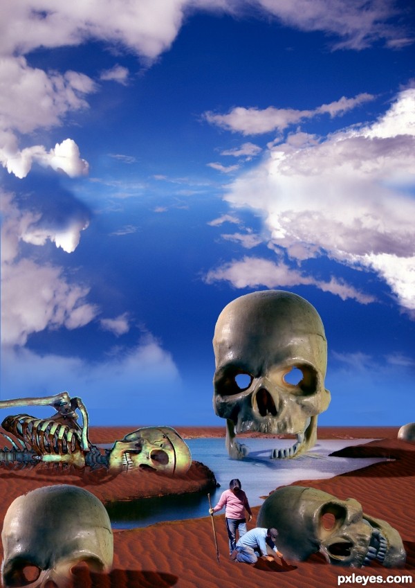
may be the anunakis ???? (5 years and 3243 days ago)

Thanks Wikipedia (5 years and 3375 days ago)
Great idea...GL author! 
Agrees with the eggman 

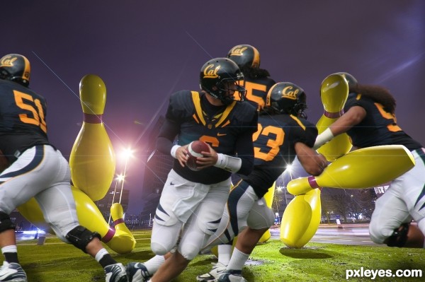
Very nice; better with Auburn helmets on pins. 
OMG, this image is full of energy. Like it. GL 
wauw totally agree with locale .. it's so energetic !!
keep up the good work  !!
!!
GL
nice job .gl
Great work author...Its fantastic how long haired player tackle the pin...very cool and super funny...well done
hahah you did exactly what i was thinking.. although i was gonna use the steelers :O)
WOW!!! 
Really nice idea! Only suggestion would be to add more depth to the image. The buildings are sharper than the source of players. Good luck!
Thank you for the comments.
Howdie stranger!
If you want to rate this picture or participate in this contest, just:
LOGIN HERE or REGISTER FOR FREE

check sbs for original source image used in background
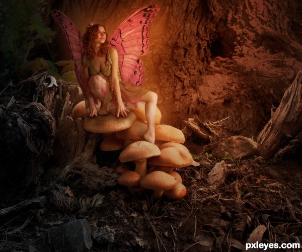
changed some shadowing and replaced the wings with a new set. i wasn't happy with the original source's wings either, and after all the comments, i decided to change it up.
(5 years and 3457 days ago)
Very well blended! Her edges look a little soft in contrast with the rest of the image.. but overall it's great! Well done and good luck 
The wing on the LH side is too dark. It looks like she is leaning against some sort of "shadow wall," and is visually confusing. The wing on the other side needs a bit of work, it looks like a curtain, rather than a wing.
Other than the wings, this has beautiful lighting and blending. Really nice work!
Spots on the wings is not corresponding with tucks 
I understand that the girl is magic creature but even magic creatures need to have a shadow. Especially under the fingers... especially her rigth hand... looks like it hang in the air but not like it leanes on a mushroom.
nice job 
****Updated image****
thank you all for the critiques. i worked with some suggestions and am happier with the image now.
Nice improvement, these wings look much better and more natural (if wings on people could look natural). Has a lovely storybook quality!
Fairytale worthy and well crafted piece. Good work!
Now this this I was surprised to see it was you but still impressed. GL!
Howdie stranger!
If you want to rate this picture or participate in this contest, just:
LOGIN HERE or REGISTER FOR FREE
If you could somehow make all the parts share the same light source...that would be really cool. The people need to have their left sides light and right sides darker. This is very surreal and cool...and with the suggestion I've made it might help it be even better. Just a thought. Nice job, author! I like your thinking.
ok thanks pixelkid im going to work on it
Howdie stranger!
If you want to rate this picture or participate in this contest, just:
LOGIN HERE or REGISTER FOR FREE