Only source (5 years and 3685 days ago)
Thanks to pepo (5 years and 3747 days ago)
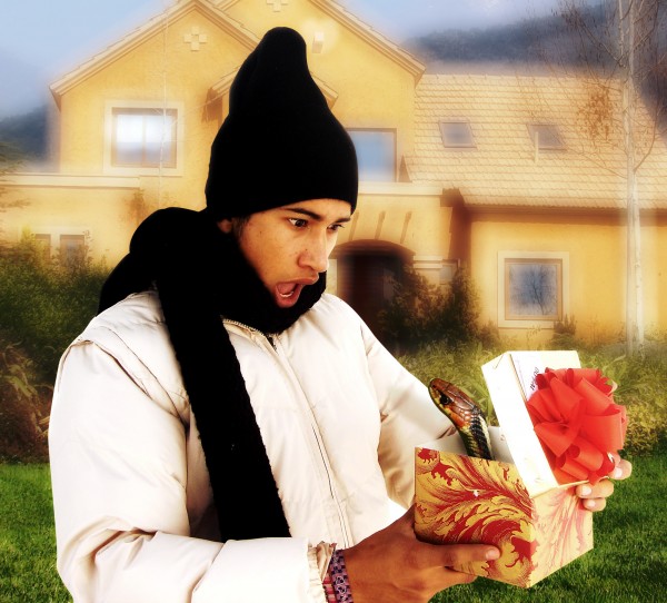
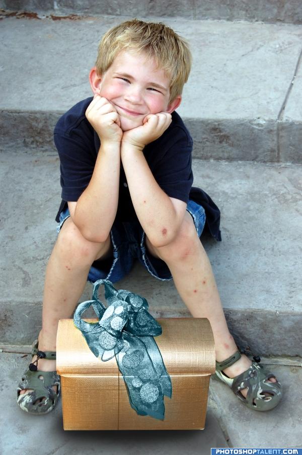
I'd cry if this happened to me. Nice entry! 
lol 

Hey, I have had the same face when I received a tarantula for my birthday present....ha ha....good luck
nice blend, good job
Congrats,
congrats
And again! Congrats for your third place!
congrats 
Howdie stranger!
If you want to rate this picture or participate in this contest, just:
LOGIN HERE or REGISTER FOR FREE
(5 years and 3747 days ago)
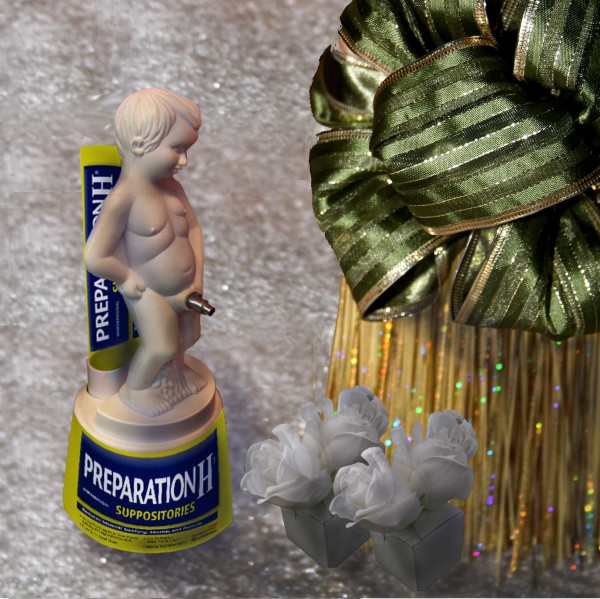
huh?
Howdie stranger!
If you want to rate this picture or participate in this contest, just:
LOGIN HERE or REGISTER FOR FREE
(5 years and 3859 days ago)
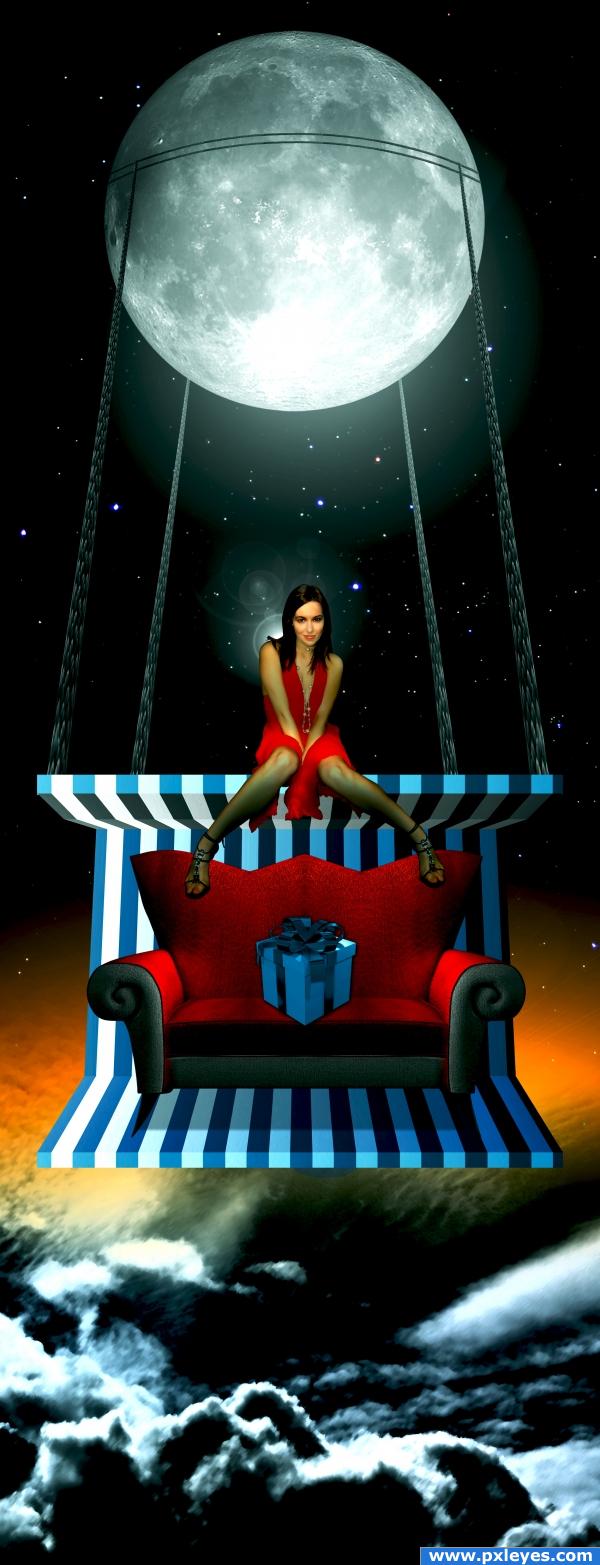
A little more blending and this would be near perfect 
Very nice idea but her legs look weird to me o.o
Interesting concept...the underside of the part she's sitting on would be in shadow, the perspective on the gift box is wrong, and why the lens flares behind her head?
The lightsource should be coming from behind the woman, not from in front of her. In fact, none of the lightsources and shadows match at all. Other than that though, great concept and great use of color.
hey i didnt c this one b4,neways its really different.i like it.good job
Howdie stranger!
If you want to rate this picture or participate in this contest, just:
LOGIN HERE or REGISTER FOR FREE
credits and thanx
LilGoldWmn
(5 years and 3922 days ago)
simple, but nice
 ....loove the kid.....but why so dark below box.....GL
Line from a song by Jane Siberry (every thing reminds me of my dog)
the blank expression of the little boy
with thick glasses who picks
himself up from the sidewalk
and stands there blinking in the sun
ho oh!
Don't know why, but when I look at this pic I can hear her song LOUD AND CLEAR.. LOL
Very Sweet image.. good luck on this
Nice clean work -- maybe just clone out the red color from the edges of the box
it kinda looks like its floating..try maybe adding a dhadow only on the edge of the gift, and maybe pull it back a little seems a bit bright.
wow
nice work 
nice match but the shadow is a little too big..it looks like the box is floating..try using the spot healing brush to get rid of all those skeeter bites
Howdie stranger!
If you want to rate this picture or participate in this contest, just:
LOGIN HERE or REGISTER FOR FREE
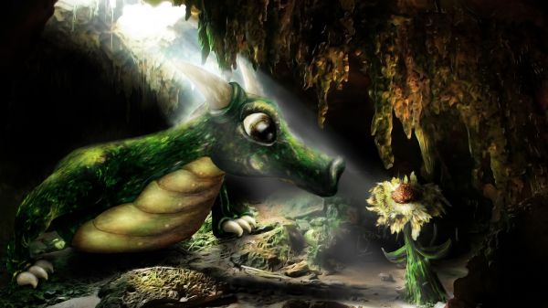
Light & shadows need work, ie: no shadow behind plant, etc.
He's all squishy

Cute!...
Great work...very well done author
from this PoV i disagree with cmyk about the shadow on the flower, esp with the rock in the way. i really think this is the best one so far. i think the lighting could use a little work though, seems a little too bright on the head, but it's better than i could do
Great!
waaaaawwwwwww.............
Lot of apreciation instead of comments....
this is so nice, would make a great illustration for a children's book.
Cool dragon and flower
great
That's so cute : )
Beautiful dragon!
beautiful job
Great and very well done.......G/L Author.
Congrats, he's so cute
Congrats for 1st
Congrats, great stuff!
wow this is cool congrats Cutie; )
congrats !
Congrats mqtrf! too cute!
Congrats!
Congrats for your first place, Mqtrf!
congrats
Howdie stranger!
If you want to rate this picture or participate in this contest, just:
LOGIN HERE or REGISTER FOR FREE