(5 years and 3616 days ago)
- 1: source1

(5 years and 3825 days ago)
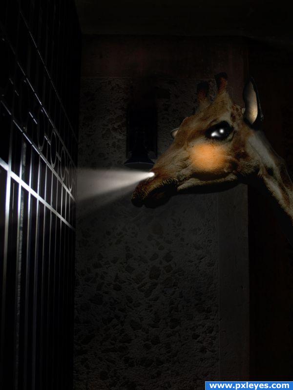
Great idea! Try to show 2 light beams, since there are 2 nostrils...
hahhhahaha very funny
thanks for advice, cmyk, I have changed


lmao
funny idea.gl
hehehe.. the expression looks like he's chewing bubble gum hehehe  great job
Howdie stranger!
If you want to rate this picture or participate in this contest, just:
LOGIN HERE or REGISTER FOR FREE

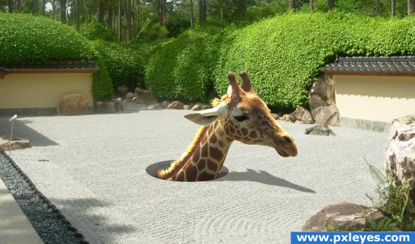
emergency escape hole :) (5 years and 3869 days ago)
interesting - but more work is needed on your hole. The rock texture is leaking through. Maybe select part of it and rotate it to vertical rows, then layer that with a little warp for curvature for the inside of the hole?
Fun image
Shadow is not correct. See tree and wall shadow at left side of picture and create shadow in this direction with less blur.
i liked. good luck!
fixed... SOME more
Checking the hires - you might want to refine the edge under the chin? it looks like some grass?? also maybe at the ear also? Hole is looking better, maybe a touch more shading darker the further down you go?
Reminds me of the dying holes in the movie Madagascar 2 Escape to Africa. I have 3 kids and for a while it was the only dvd we had in the car. So everywhere we went they watched. Even to the store.
Very nice
nice nice nice
hahhhahhahhahaaaaa
boy that must be some huge underground tunnels  Cute!
Cute!
Howdie stranger!
If you want to rate this picture or participate in this contest, just:
LOGIN HERE or REGISTER FOR FREE

http://www.photoshoptextures.com/terms-of-use.htm liscense for texture (5 years and 3874 days ago)
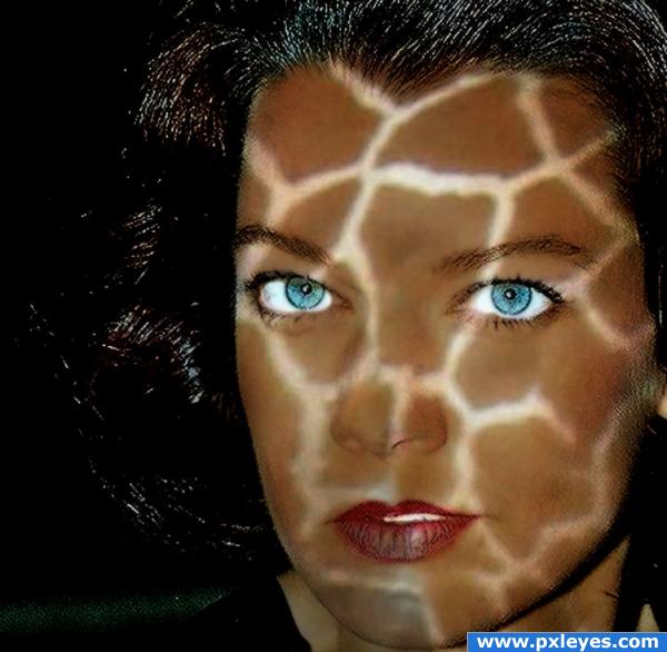
You need to try and work on the layer mask, the texture is missing around the lips and conotuing the eyes
Good change, but now her neck is missing the texture, just enlarge it over her face a little. Good luck 
it almost looks as if a pool is reflecting off of her face--I couldn't do as good as you did though.
Howdie stranger!
If you want to rate this picture or participate in this contest, just:
LOGIN HERE or REGISTER FOR FREE
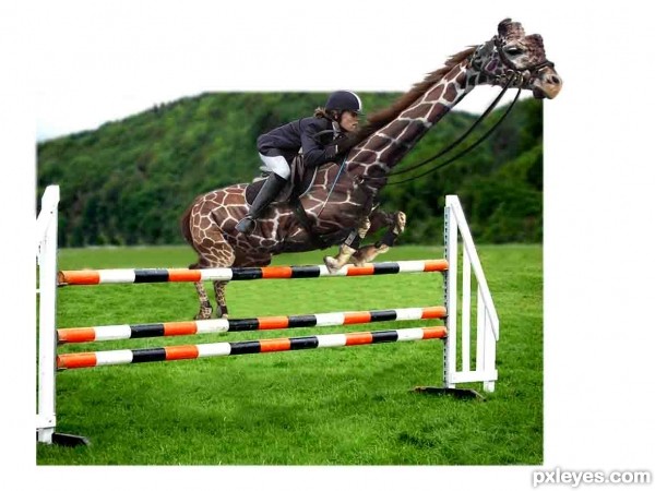
Why is there a white border around the picture? and I can see the pxleyes mark 2 times, did you take an image from the site and changed it? Anyway, you need to add some shadows, the jockey isn't on the giraffe right now but floating above it
Not a bad image, maybe try to smudge some of the fur on the giraffe so that the borders aren't so sharp. Good luck!
Upload it in hi res to show us the details, pls...
nice idea
different idea for the source.......gl
A different ride......... i like it... all the best..........
Howdie stranger!
If you want to rate this picture or participate in this contest, just:
LOGIN HERE or REGISTER FOR FREE