(5 years and 3875 days ago)
Photography and photoshop contests
We are a community of people with
a passion for photography, graphics and art in general.
Every day new photoshop
and photography contests are posted to compete in. We also have one weekly drawing contest
and one weekly 3D contest!
Participation is 100% free!
Just
register and get
started!
Good luck!
© 2015 Pxleyes.com. All rights reserved.

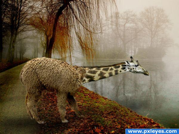
The transition from Alpaca to Giraffe is really sudden. It looks more like you brutally killed the Alpaca and stuffed it with a giraffe than the giraffe is part of the alpacca. Also the transition between the leaves/moss and water is too sharp as the water is very unsaturated while the ground is very saturated color.
umm...I am not sure what you comments on the background are about. If you look at my source you can see that the background is all one image. I didn't think i should change nature As far as the alpaca and giraffe go i guess i wouldn't thinkt that the fur from the alpaca would come up much further on the neck than what it does. The shoulder from the aplaca is actually the giraffe with the fur on it.
Author.. the main issue with this image is a simple HIGH RES (it's a way photoshoppers can see detail.. it's very important to them).. if you up load a HIGH res image so the detail work can be seen .. you'd be surprised how responses increase) ( I SUCK at photo shop.. and I admit it.. but love the idea you achieved with this.. very odd.. but very magical.. good luck)
I agree with GolemAura, whenever you have a high res, upload it, it's relly worth it and it give voters the possibility to really judge and honor your work.
looks great
Howdie stranger!
If you want to rate this picture or participate in this contest, just:
LOGIN HERE or REGISTER FOR FREE