(5 years and 2784 days ago)
- 1: african_fi notified
- 2: source2
- 3: dyet

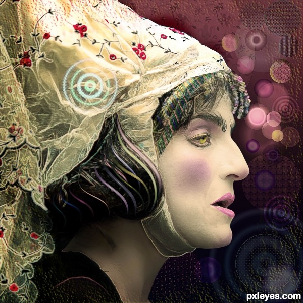
See SBS and hi-res for "painted effects". (5 years and 2793 days ago)
No Pregnant Snooki? bwhaa haaa haa haaa  great job
Howdie stranger!
If you want to rate this picture or participate in this contest, just:
LOGIN HERE or REGISTER FOR FREE

Used Photoshop and Illustrator to create the image. Would like to thank to Mqtrf for the wonderful source image (5 years and 2796 days ago)
She's a MAN baby LOL.. really different 
Congrats!
Congrats!!
Congrats my friend.... good job again!
Howdie stranger!
If you want to rate this picture or participate in this contest, just:
LOGIN HERE or REGISTER FOR FREE

(5 years and 2796 days ago)
Great use of the source image. Love her bangs too...
Howdie stranger!
If you want to rate this picture or participate in this contest, just:
LOGIN HERE or REGISTER FOR FREE

Thanks to Faestock, Zigabooooo, gd08 and emilyemilybeth (www.estherandemily.org).
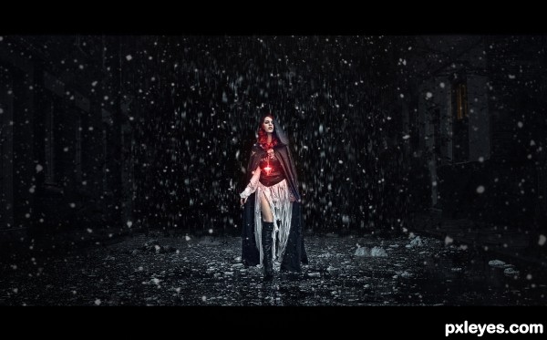
At first my idea was to create a kind of scene "where the girl passed, everything seemed to be 'devoured' by the darkness of night and in the snow" behind her.
A personal friend saw this work, liked the idea, and said "could have snow falling in front of the girl, too", so I was with this in mind and decided to add to the work! I hope have gotten more interesting with the snow. Thank you! (5 years and 2798 days ago)
Too much empty space on the sides, which lessens the impact of your subject. I would suggest cropping off the empty space and making your subject occupy more of your picture plane.
Thank you for your comment Mossy, but if I cut the sides, my work will flee the proposal is that it look like she is walking on a street. If I cut, the houses will disappear and she would be in a 'somewhere' without definition.
I understand your point of view, but the work is to be seen as "a scene" and not just the model itself.
Once, thank you for your observation!! 
this is wonderful would you mind if i use it as desktop wallpaper i love it great job
The black framing around your image already has destroyed any "scene" you may have attempted, by removing the viewer from the area. While I can appreciate your desire to create an environment, the fact that the snow basically stops where the houses begin already places her "somewhere" that is not connected to the background. Judicious cropping of the excess darkness - even if only to the edges of the window frames, approximately 1/3 of the way in, would give your subject much more dominance in the image, and minimize the awkward juxtoposition of the snowy street with unsnowy buildings on either side, even if you retain the black framing.
Thank you so much, Mossy.
Looks like the Previews at the movie theater.. good luck author 
Thank you very much, Driven!
The framing of the image should be vertical rather than horizontal, and to me there is nothing chaotic about a night scene with a gentle snow fall.
Thank you so much, CMYK, you're right, the title FAIL, I changed. 
Awesome!...
Thank you so much, Jordy!
Love it!
Thank you!
Thank you!
Glad you liked! Thank you!
Awesome. Love the dark mood 
Glad you liked, dear. Thank you!
Congrats!
Thank you so much!!
Congrats very nice work 
Thank you very much!
congrats i told you it was the best
Thank you so much for the support, sweets!
Congrats Daniela!!
you are creating better and better chops..
love your ideas, keep it that way..Congrats again!.
Thank you so much for your kind words, Jordy. Always lovely!
Congrats Daniela, well done!!
Thank you so much Rein!!
Congratualtions my friend....good job!
Thank you so much, dear!!!
Beautiful and moody, love it! Congrats
Thank you very much, sweets!
Howdie stranger!
If you want to rate this picture or participate in this contest, just:
LOGIN HERE or REGISTER FOR FREE
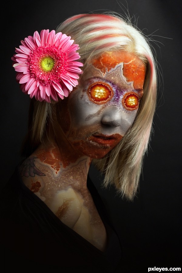
This is creepy, but really well done. Nice job! Ha! It all makes sense why this is so good.
Nice stone work! Good job!
Howdie stranger!
If you want to rate this picture or participate in this contest, just:
LOGIN HERE or REGISTER FOR FREE