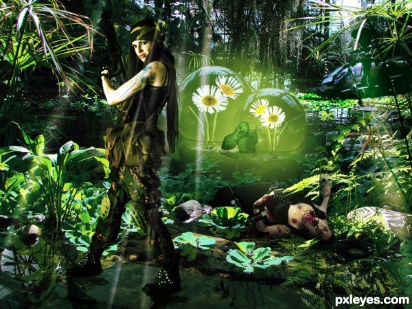
Edited,changed contrast colors and copypasta.
Specials Thanks to Angela R. Sasser ladydove7 at DA (5 years and 2995 days ago)
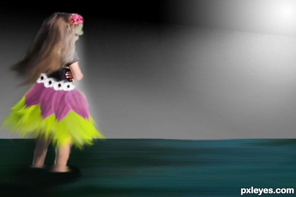
i do the background , just coloriing. Thanks to stacyjo for the source of the girl and thanks to rlady for the sources of white flowers and green petals. (5 years and 3002 days ago)
Please post your source links.
Howdie stranger!
If you want to rate this picture or participate in this contest, just:
LOGIN HERE or REGISTER FOR FREE
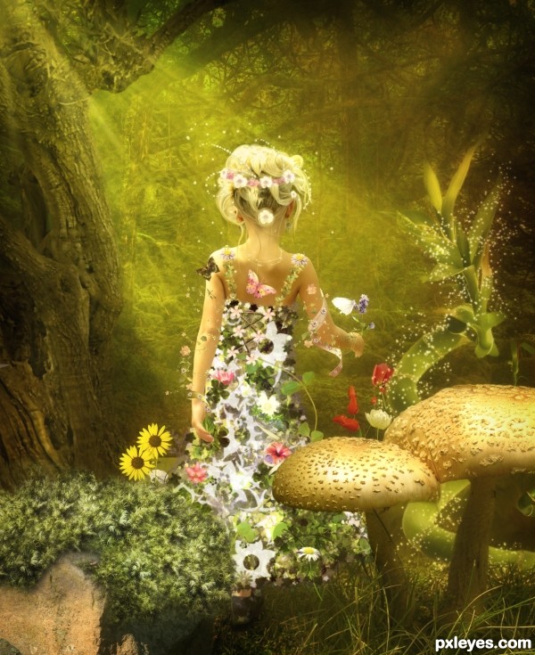
This is the second version of the Queen of the Spring work.
I updated the image according to the rules of the contest. I deleted the 3D elements.
Having no source of many items I had to find new resources and adapt to the image.
Hope you like. Read carefully any feedback to improve
----
Other elements I used:
Thanks to gvalkyrie:http://browse.deviantart.com/?qh=§ion=&q=flower+brush#/du7dwu
Brushes:http://paranoidstock.deviantart.com/art/Flower-Brushset-81726746?q=boost%3Apopular%20in%3Aresources%2Fapplications%2Fpsbrushes%20flower&qo=46
Butterfly:http://www.sxc.hu/browse.phtml?f=view&id=1370062
Flower-2: http://www.sxc.hu/browse.phtml?f=view&id=1182344
Flower-3: http://www.sxc.hu/browse.phtml?f=view&id=993351
Flower-4:http://www.stockvault.net/photo/128117/red-poinsettia (5 years and 3003 days ago)
Beautifull ! Magical ! Good luck author 
please add the used pictures in the step by step and the drawn items cause im pretty sure i saw that beanstalk before http://www.daz3d.com/i/shop/itemdetails/?item=3585 http://yaymicro.com/stock-image/beanstalk/933550 http://browse.deviantart.com/resources/?q=beanstalk#/d2icng5 http://browse.deviantart.com/resources/?q=beanstalk#/d2ritjp
Its a 3d image so the direction of the picture can vary depending how its placed and rendered.
I like your image a lot but you have to make sure you can use all the sources you have used and place links to all brushes that are not standard and the source pictures.
If you are not familiar with the contest rules then please read these. because its a shame if your work is removed because of things you didnt know. http://www.pxleyes.com/guidelines/photoshop/
I'm so sorry. I did not know they could not use 3D elements
Many of the brushes and elements used in this work are part of my stock that I have been collecting for months and years.
I have no source of them all, why not include them.
For these reasons I am compelled to withdraw work from the competition.
Future contests will read the rules well
regards
first off, i truely like the feel of this image, its so magical!
The smaller mushroom is placed behind the skirt of the girl while it should be in front of the skirt. You can tell by looking and comparing the grass distance between the other mushroom and the bottom edge of the image and the grass distance between the bottom edge of your image and the dress.
I dont see where you used your second source, the part of the road, u sure u used that?
Your sxc.hu source should be linked to the thumbnail page so we can see author information. (tree source)
the last 4 sourcelinks from sxc.hu in ur comments dont work, i think theres a mistake in the adress 
wow this must have been a lot of work with all these sources  and again its very magical
Thank you very much for your feedback Eladine
I changed the position of the skirt
I have reviewed the links and I think it is correct
I removed the source of the road, I put by mistake
Thank you for your words, have been working long hours but I love doing this kind of photo montages! 
If you find any mistakes, please, tell me
there you go, I think you covered it all pretty much  the source links work now too
  good job and welcome to pxleyes
  I do recommend everyone to look at this in highres, there are so many details to see.
Thank you!
I am glad to have found pxleyes.
It's a great way to improve
Very nice work, beautiful picture. High marks from me. Eldine is right, the high Res is a must see.Welcome to PXL author.
Thank you very much for your comment!
Awesome image author!!
this is my favorite!!! and welcome to the site.
Thanks!!!! 
Thanks to everyone who supported this work.
Just to tell you that going to be withdrawn because the pattern used to make the dress is made from an illustration, not an image.
Now I have the dress coupled layers and to change (again) I have to redo the entire job. That would entail me several hours
Thank you all again.
It's true that illustrations done by someone else are not allowed but you shouldn't give up on this lovely piece. If you trace off the dress parts (with the pen tool or by hand) you can make a pattern similar to the one you used. Stock.xchng has a number of cut out flowers ( http://www.sxc.hu/browse.phtml?f=search&w=1&txt=cut+out+flower&p=1) you can use to make your own pattern, adjust color as you wish then place your pattern in the shape and warp a bit and add a little shading and touch up. Shouldn't take hours and you don't have to change anything else. Please give it a try we'd all like to see this stay in.
Last night I was thinking about the contest and my work.
I was sad and I don't wanted to continue at contest, but I readed to Eladine and Spaceranger and I think it's important fix errors and participate.
I had to redraw the part of dress. I liked before, but this is the final drawing.
Thanks
I am glad you decided to keep it in 

It's great to see you made the changes and this lovely work will remain in the contest. You can see from the comments from all these good people that your work is appreciated. Welcome to Pxleyes, we look forward to seeing more from you!
Thanks for your words spaceranger!!! :_)
Your reworked entry is still magical and has a good visual flow. Very nice work, author, worth the extra time! Welcome to our site, look forward to seeing more of your creations. 
Thank you very much for your comment!
We will see you soon!
congrats
Thanks!!!! 
Congratulations, well done.
Thank you!!!!! 
Congrats, nicely done 
Howdie stranger!
If you want to rate this picture or participate in this contest, just:
LOGIN HERE or REGISTER FOR FREE
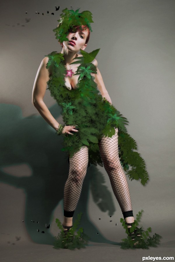
Leaf and Birds brushes. Blending layers
and thanx to http://poorsouls-stock.deviantart.com/art/One-True-Love-3-177140082
for that image (5 years and 3004 days ago)
good job author..
thanks for the comment xD
really cool 
Well done author.
I dont understand the dropshadows on the leafs, now they cast a shadow in the air. I think it will improve your entry a lot if you can get rid of the drop shadow.
thanx for the suggestion i took rid of some shadows
yes thats a great improvement 
All except the fishnets and shoes. What is the source for the star?
Thats not a star is one of those leafs i edit it to look like a flower
Howdie stranger!
If you want to rate this picture or participate in this contest, just:
LOGIN HERE or REGISTER FOR FREE
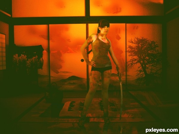
Red brush. Light effects. Copy Paste. Hoping dis time works. (5 years and 3010 days ago)
Howdie stranger!
If you want to rate this picture or participate in this contest, just:
LOGIN HERE or REGISTER FOR FREE
great idea (Do you think you could isolate her a bit?, Outer glow blur or soft dodge on her edges, she's looking a bit flat to me, (But that could be my eyes, they suck).. great Idea and very good luck author (All IMHO of course) (the person in the muck is pretty funny LOL) good luck
Thanks for the comment i add some contrast and saturation also i soft dodge it. I looks a lil bit dif xD
n1ce work author..
If you lighten & desaturate the background a bit, the blacks in the soldier woman will stand out from the background. As it is, there's no depth. The skulls just look pasted on, and kinda silly. This image has potential.
I like the idea author, but it seems you bit off a little more than you could chew with this one. Keep practicing i see a lot of potential, with your eye for the details in the design. you still need to work on your eye for the workmanship. really the only object that looks like it was placed in well is the woman with the gun. all other images are either too blurred, or have some poor masking done. A tip for masking is to always use the pen tool to mask, then to feather your selection by about 2px (depending on the size of the image), and also to contract/expand the selection slightly.
You are right, it was not over i didnt have to time to send the finish image. I got lost 2 days and the edition timing was over! Thanx for the advice
Howdie stranger!
If you want to rate this picture or participate in this contest, just:
LOGIN HERE or REGISTER FOR FREE