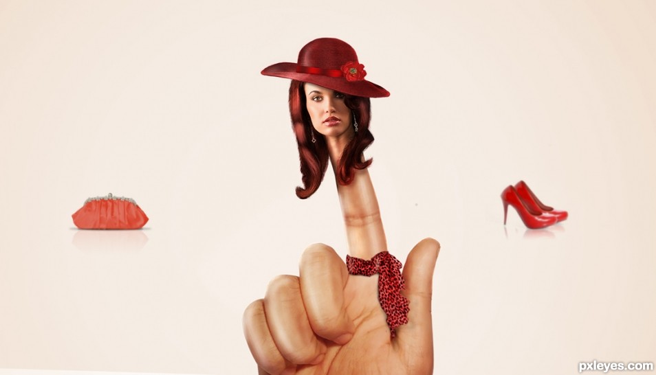
Inspired by the beauty.... (5 years and 2418 days ago)
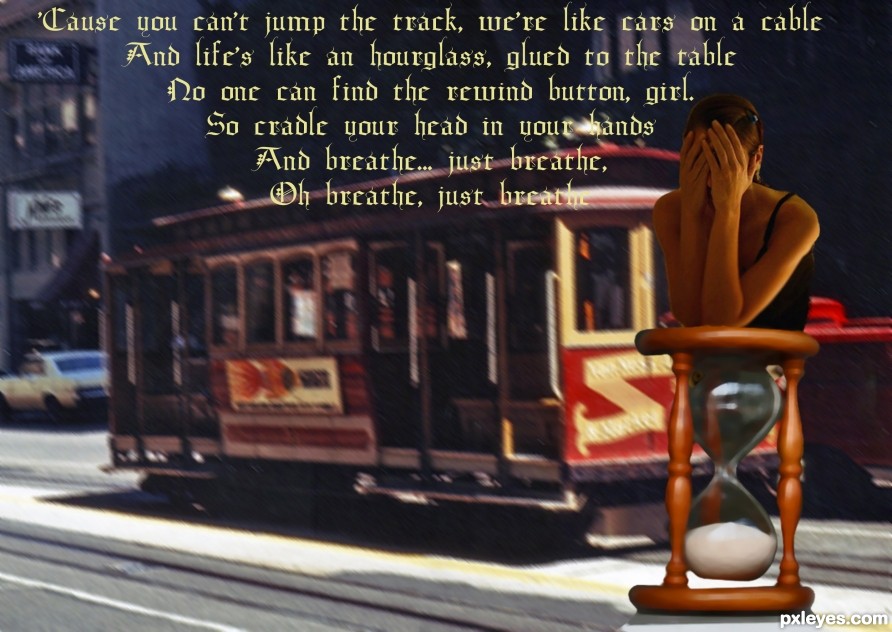
Breathe by Anna Nalick..from the Album 'Wreck of the Day'
One of my favorite songs...and albums (5 years and 2464 days ago)
Might be better to center the woman's torso on the hourglass...this way she's just cut off.
Thanks will fix it
Howdie stranger!
If you want to rate this picture or participate in this contest, just:
LOGIN HERE or REGISTER FOR FREE

After browsing around on internet I found a very beautifully stock-photo-portrait on a site, after that the curious eye of mine had checked the other internet-site-users, how they had used the portrait, their results and further on I was greeted by a big disappointment, instead of embellished the image they had rather done the opposite, ruined it. I felt that the portrait and the woman in the picture was "worth" so much more and therefore I determined that I would give the image a try and here is the result! Enjoy!
The image and its beautiful colors is easily created by repeated and different kinds of blending mode. No big deal really.
(5 years and 2475 days ago)
No comments yet? Hmmm...this is a well made image except IMHO for the composition. GL author. 
Well apparently not! Thank you very much but what does the abbreviation IMHO stands for? I chose to use the pretty-thirds rule, which is a very successful composition within modern photography and design that makes the screen appear to be very stylish. Was that some kind of answer to your comment I didn't really understood? 
IMHO means"in my honest opinion"
Howdie stranger!
If you want to rate this picture or participate in this contest, just:
LOGIN HERE or REGISTER FOR FREE
(5 years and 2488 days ago)
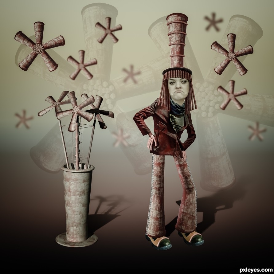
Reminds me of Grace Slick! good luck
Ahhh, Jefferson Airplane (Starship)...
Congrats.
Thanks!
Congrats Randy!!
Thanks!
Congrats
Thanks!
Howdie stranger!
If you want to rate this picture or participate in this contest, just:
LOGIN HERE or REGISTER FOR FREE
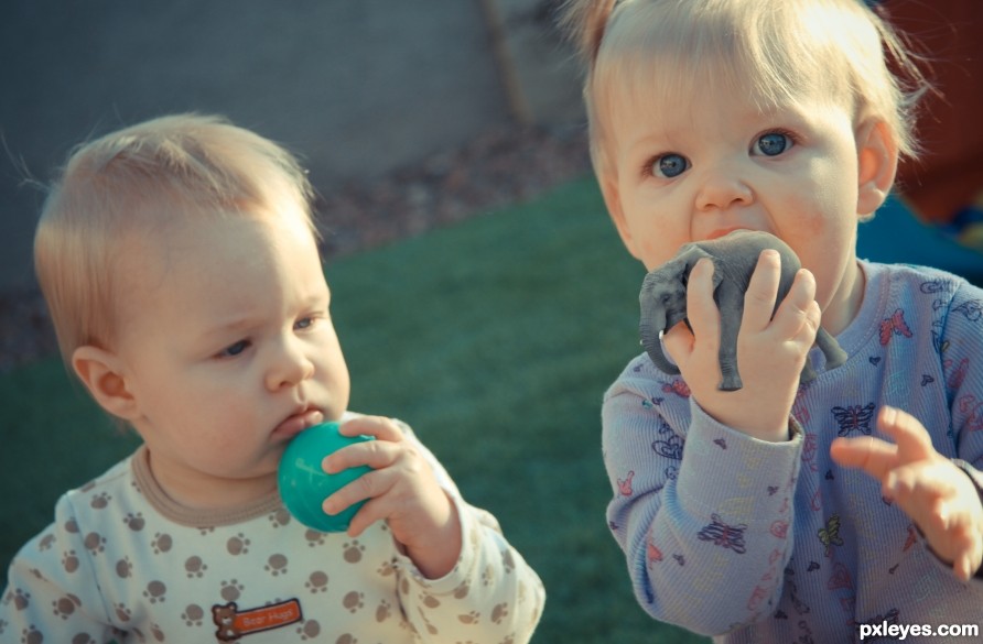
Would you rather lick a plastic ball or a tiny Elephant? (5 years and 2534 days ago)
The shadow of the elephant on the hand is of a color which doesn't fit (give the shadow a darker color of the hand and not gray! A shadow is lack of light on the reflecting object and not a black light projected on that object  ).
).
Another thing which can be improved is that the elephant is way sharper then the hand which makes it stand out.
I do like the photo you used of your children though the expression on the face of the little one fits perfect. Besides that the elephant in the hand is a good find.
Thanks for the comments. Agree with the shadow, adjusted it. The Elephant is actually not drastically different in noise and blur as the hand, it just stands out more. Note the butterflies on the shirt, they look less blurred as well. Blurring that size element at 1 pixel can make a big difference.
I think the issue isn't sharpness it's the levels of darkness/shadow
No.....!!! Don't eat him! I wonder if elephants taste like peanuts? LOL. This is cute. Great idea.
Lol, they taste like chicken, but she's only sucking on him, no worries!
Howdie stranger!
If you want to rate this picture or participate in this contest, just:
LOGIN HERE or REGISTER FOR FREE
HA! Lady Finger
yup right
Howdie stranger!
If you want to rate this picture or participate in this contest, just:
LOGIN HERE or REGISTER FOR FREE