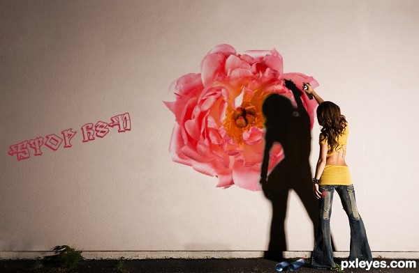
A girl paints a message and a flower.
Lots of masks, overlay, text effects and blending. :-) Enjoy
Step by Step Shows Purchase Receipts. (5 years and 2600 days ago)
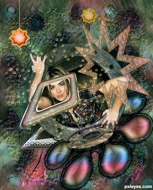
Used only the source given + Adobe Photoshop (5 years and 2621 days ago)
funky cool 
Thank you very much 
nice! psychedelia
Many thanks for the support 
Howdie stranger!
If you want to rate this picture or participate in this contest, just:
LOGIN HERE or REGISTER FOR FREE
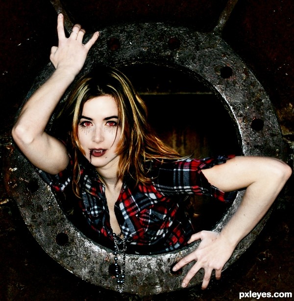
This is pretty rough, but I gave it a go. As the title indicates, I gave the girl a vampire makeover and darkened the colors of the pictures. (5 years and 2626 days ago)
Hi Res would help to see her face a bit more clearly. I can tell there is something under her eyes but not sure what it is.
I think I fixed it to show high res. I'm not sure how much clearer I was able to make it though.
Keiley22 has a good point. According to what I can see, I'd expect her to be more evil and seducing looking. Maybe also a bit more pale or bluish skin. With adding a light (ie from under) you can stress a lot more drama and suspence, vampires like that  . Good luck!
I haven't spent a lot of time here, so I hope it's okay to edit my entry according to the criticism it gets. Thank you for the tips! I tried to take your advice on the skin, although I know it still looks a bit blotchy. I'm not sure, however, how to had a light from underneath. I only use Photoshop Elements, so I don't even know if that's possible for me to do. Thank for the constructive criticism.
I like in high res, definately makes it easier to see what you have done author. Can you give the blood a bit more of red in it, being a vampire the kill would have been fresh and the blood would have been brighter  I lovvvvve vampires lol. And are they meant to be veins underneath her eyes? If so maybe put a bit of purple through them like she if full to the brim after her feast
  If you want to make her look a little bit more evil, use the liquify tool and just move her eyebrows up more into a point, if no liquify in the filter section, try the smudge tool, just be careful with that one. Still holding vote. And don't worry about editing, anyone that gives advice usually waits till the end to vote anyway

Howdie stranger!
If you want to rate this picture or participate in this contest, just:
LOGIN HERE or REGISTER FOR FREE
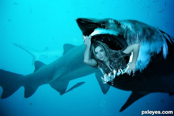
The POWER Girl is back (5 years and 2627 days ago)
Result is pretty ok, imo. Perhaps some suggestions: add more shading to the girl, mostly on her body around the mouth of the shark. This way it will look less flat. Same for the back of her hair, experiment with light and shade. You might want to blur here and there her hair too, gives the idea it has more underwater movement and it's a bit further away (to create some depth of field). Lastly you could try to add a color adjustment layer to make her a bit more blue, that's up to you. Good luck!
LOL 
Howdie stranger!
If you want to rate this picture or participate in this contest, just:
LOGIN HERE or REGISTER FOR FREE
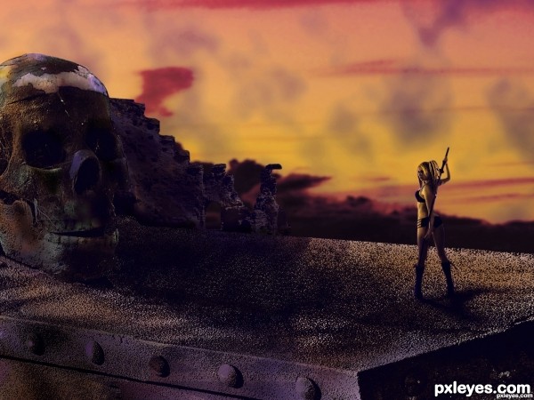
(5 years and 2634 days ago)
Nice idea, maybe a biiiiit lighter here and there (ie by adding some light sources?) would have been nice. Good luck!
Thanks ive a version where i added some light it was late to upload it. Thanks dude.
Howdie stranger!
If you want to rate this picture or participate in this contest, just:
LOGIN HERE or REGISTER FOR FREE
Your shadow is way too heavy imo would also be cool if the message and the flower linked somehow, either by bringing them closer or graphically.....
Try making the shadow less opaque.
Okay, that was the natural shadow, so I didn't want to touch it much. I will work on it. Thanks for the tips, everybody!
Congrats nice work
Thank you.
Howdie stranger!
If you want to rate this picture or participate in this contest, just:
LOGIN HERE or REGISTER FOR FREE