Only Photoshop used (5 years and 3171 days ago)

thanks to Csaba Szilvási
http://www.sxc.hu/profile/cybersb for splash source (5 years and 3221 days ago)
hillarious
zanbrottix, I don;t find flat the glass. And this kind of comment comming durring votting days and not in submmitig days is meant to get down an entry, not to improve the work. Especially when it commes from a person who has an entry in this contest.
was an opinion, but you're right, I had not thought I feel I've cleared
the work is original and funny
The work is original and funny! But I have to agree with the earlier comment (removed) - I find "her" glass rather flat, too. It would also be nice to have had a clearer old man hand to match the sharpness of the glasses and "her" hand.
As for my own comments coming during voting, I apologize (sort of) but I don't have enough time to review, comment and keep checking back during the week, and then come back to vote on the weekends. Which is why I may comment, but rarely vote in contests I've entered. This is not just about winning - it's about learning and improving, isn't it?
her glass is a picture, so you could blame on the light for the flat feeling, not on the photoshop skills...
about the comments I agree with you, there are meant to improve the work, but if it is a nit picking available for a particular work, it should come in the proper moment.
I learnt from many great artist, and it`s not about willing to win, but to a honest approach.
Thank you for you comments!
Howdie stranger!
If you want to rate this picture or participate in this contest, just:
LOGIN HERE or REGISTER FOR FREE
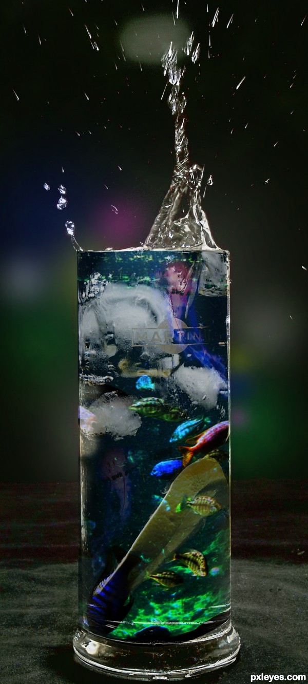
Thanks to uberphot for the fishes and to Neil Barman for the jelly fish. (5 years and 3225 days ago)
The jelly fish isn't in the glass, doesn't work on top of glass.
Howdie stranger!
If you want to rate this picture or participate in this contest, just:
LOGIN HERE or REGISTER FOR FREE
(5 years and 3226 days ago)
Howdie stranger!
If you want to rate this picture or participate in this contest, just:
LOGIN HERE or REGISTER FOR FREE
thanks to
satty4u
night_fate
~MatrixStock (5 years and 3281 days ago)
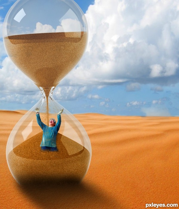
Good attempt!  I'm not sure if this is intentional but the man inside the glass is not proportional to the warrior.. Meaning he is like a hobbit IMO
The lighting seems correct However at the bottom of the glass there seems to be an almost too dark area. Maybe decrease the opacity a bit to try to blend it with the rest of the shadow coming from the glass. 
GL! 
Another thing I noticed.. In your sources list you put (desert) thanks to night_fate
However it's actually night_fate_stock I think you didn't have enough space to type all that in and when you did try to type in .._stock it din't fit. I would suggest putting the credits in the description or just delete the "(desert) and just put thanks to night... or just night......on its own... GL 
wow! i appreciate your comments guys thanks for that... i'll do it later... thank you so much!
good idea ^^
Howdie stranger!
If you want to rate this picture or participate in this contest, just:
LOGIN HERE or REGISTER FOR FREE
SPOOKY OOOOOOO
Really imaginative and cute!
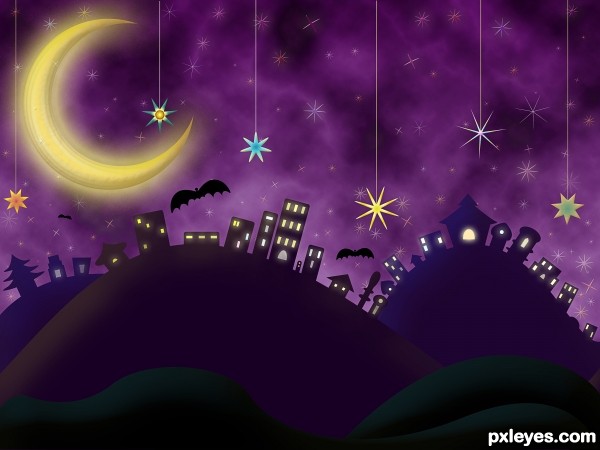
The bats are a bit too dark and distracting, it makes a nice "evening" scene without them.
Well done!
fantastic image author...great colors with so cool details...best of luck
nice mood......
Just love it!! Wonderful use of non-drawing tools. GL
Congratulations..... my friend beautiful work!
Congrats!!
Congrats...
Congrats!!!
Howdie stranger!
If you want to rate this picture or participate in this contest, just:
LOGIN HERE or REGISTER FOR FREE