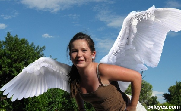
Read the article here...
http://www.nonsensenews.net/2009/07/19/red-bull-linked-to-birth-defects-really-does-give-wings/
(5 years and 3318 days ago)

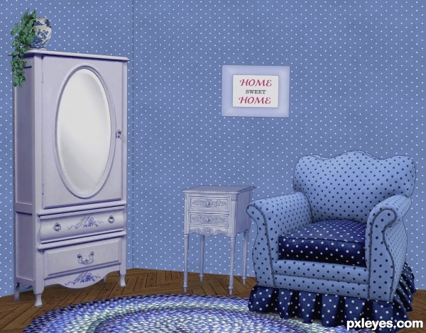
It was easier to put Granny in a home when we could decorate it the way she wanted... (5 years and 3356 days ago)
Nice work on the floor. Wall at left should be darker, as both planes would not receive the same light.
I wondered about that, since the light is striking the armoire from the right, I figured the wall behind it should be illuminated, though. If there was a corner by the armoire, it would be darker once you turn the corner, just as the LH side of the armoire is darker. The surface of the wall behind it is like the front, illuminated.
Thanks about the floor. It was fun making that part!
Agree with CMYK. It also would improve the image greatly if you tried to darken the inside areas of the cushions on the arms of the chair...it might help give some variance to the 'blue look' of the shot. Just a thought. Good job!
I agree, some variations in light around the walls would;ve been nice. It would eliminate the whole 'pasted in' feel.
The shadows the objects are casting look great and your floor pattern is crazy good!
Lovely blue room 
Howdie stranger!
If you want to rate this picture or participate in this contest, just:
LOGIN HERE or REGISTER FOR FREE

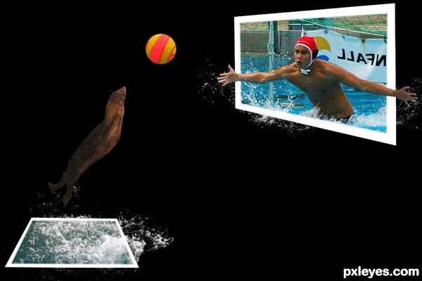
copy and paste the source image into the seal image, liquify and erased the unused parts, eliptical margue tool for the frame, free transformed it, filled with white. Other tools i used: brush tool, clone tool, lasso tool, pen tool (5 years and 3626 days ago)
nice work
i think it will be a goal .............. gud luck to u author ......... 
Creative....GL
Howdie stranger!
If you want to rate this picture or participate in this contest, just:
LOGIN HERE or REGISTER FOR FREE
cool idea and good work author...gl
Are there any sources ?

Edit: Im sorry I didn't saw it at first
SBS Nickk! It's in there...
Very cool!
Just went back and re-read the story... missed the part about the growth being "bat like"
Thanks for the props!
I like that you took your own photos and created something different from them.
Thx pixel, but I can't take credit for them there wings, that's on Red Bull, and the photos author, Arpingstone.!
the story is Terrifying LOL good luck author
Drivenslush, you are right... but the very last paragraph was the deciding factor in my decision to use it.
Great article to pick and well done image!
Congrats
Congrats!!
Thanks spaceranger; hereisanoop! Got lucky again, yeehaww... lol
Congrats on your win
Howdie stranger!
If you want to rate this picture or participate in this contest, just:
LOGIN HERE or REGISTER FOR FREE