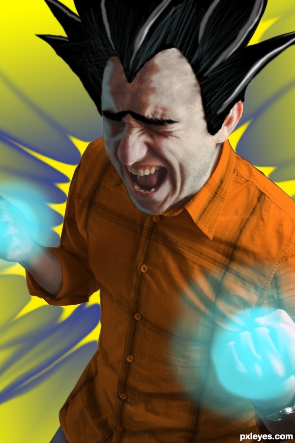
Never watched the show or read any of the comics, the source just reminded me of seeing the "goku" character on commercials... (5 years and 3252 days ago)

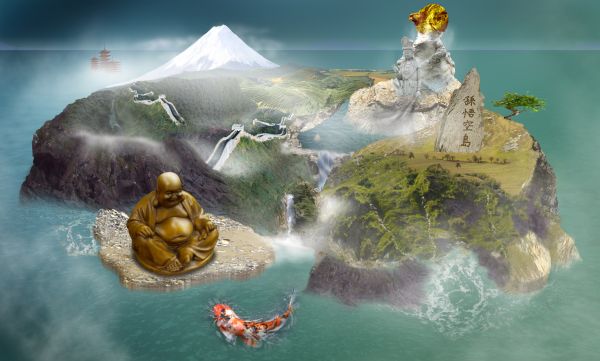
The island (country) of the MONKEY KING!
better view high res
sorry but I have 3 other source images from sxc.hu to include in the production of this image which I couldn't add to the submit page cause there is only space for 10 and as this is a fairly complex piece I needed a few more...
They are:-
Landscapes by 134265
http://www.sxc.hu/photo/673212
Bonsai Tree 2 by ired
http://www.sxc.hu/photo/766548
edit: Also!! Patas Monkey by jungleboy
http://www.sxc.hu/photo/894149 (5 years and 3752 days ago)
this is sweet. what does goku even mean?? i know its a characters name on dragon ball z hahah. i haven't watch it in a long time though. the koi fish seems a little big. it would be amazing if your island was like a ying yang because that would definitly fit with everything. but overal it is a really great image. i like it alot. probably one of my favorites. gl
yeah it's a name... my theme is monkey king... (you know it?) - and dragonball Z was apparently inspired by it hence goku!?! - Yeah the Koi is meant to be big... it's all gods and mythology and all that... lol.
Nice idea & blend of sources. Bad mix of perspectives..
oh ok hahha great job then. i like your work
The wave on the right is not in theright perspective. I understand this is supposed to be abstract and just my opinion, not quite on theme.
CMYK46: yeah it was hard to get the right images. to fit exactly... but hopefully I get the idea across... thanks though... Jawshoewhah: I know the wave looks a little odd... and as for being off theme... I think I have satisfied the goal / brief: I've fulfilled each point; it's new, it's obvious it's a country of some sort, i've highlighted the features, I've given it a name... but I appreciate you understand that its abstract :P
Well at least it's not another planet 
nice but something unclear !
I have made some minor adjustments to the mist layers, thought they were a little too thick; also removed the wave cause I decided I didn't like it!! 
great job 
I think it looks a lot better now. GL to you! 
Congrats for your third place, James!
Congrats
Howdie stranger!
If you want to rate this picture or participate in this contest, just:
LOGIN HERE or REGISTER FOR FREE
love the hair, very nice, good luck!
Howdie stranger!
If you want to rate this picture or participate in this contest, just:
LOGIN HERE or REGISTER FOR FREE