Only Source used... check SBS before vote, please.. (5 years and 1346 days ago)
(5 years and 2465 days ago)
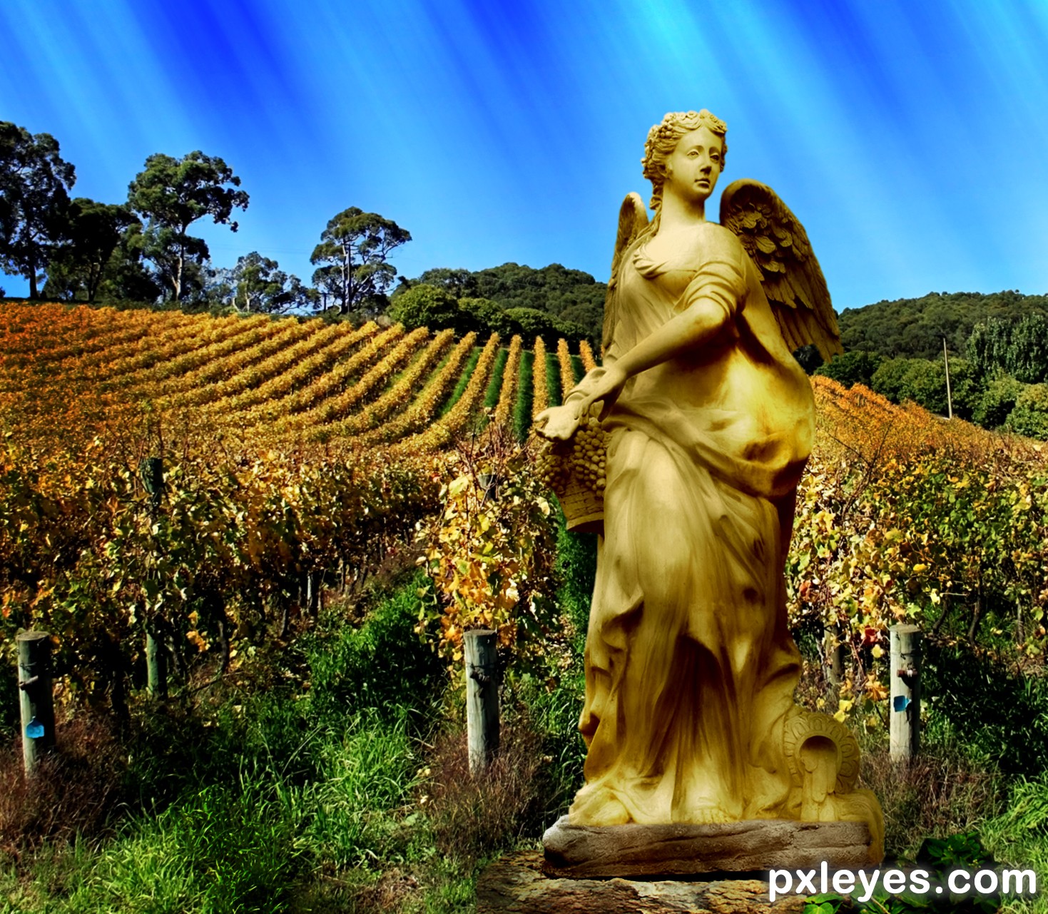
I much prefer the full figure cropping as in step 10 in your SBS. It's a much better composition than what you have now although I would desaturate the sepia tone it's a bit too strong IMHO. I like the base you created but the statue is monochromatic and doesn't match. Having a background that is also monochromatic but in blue doesn't work too well I feel. A normal full color piece would work better IMO. Be cautious over doing filter work, you may not need as much as you have used.
Thanks, appreciate the good advice. I think I will redo this one, use the full statue, maybe less filters and I have a forest background that might work with this. I was going for the gold effect on the statue, so as you said, a varied colored background would be more appealing.
I look forward to seeing the revised version! Full color would set off the gold nicely. Check out some gold statues on Google Image Search to help you out.
Howdie stranger!
If you want to rate this picture or participate in this contest, just:
LOGIN HERE or REGISTER FOR FREE
(5 years and 2553 days ago)
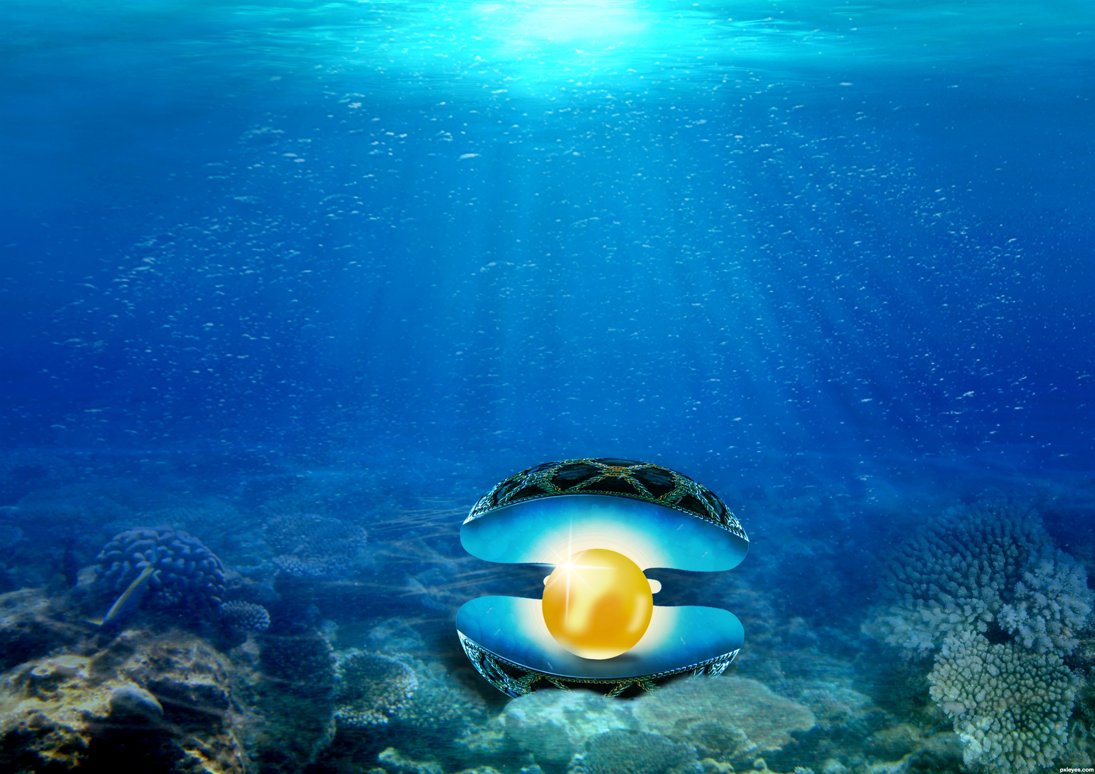
hey, i like the pearl effect... u have done author. good and amazing work..
thank you!
Very nice chop. The composition could be a little bit better by moving the pearl over to either side, rather than dead center of the image, and the white it too bright for being under the water, but never the less, the colors and edges are very clean. Good work.
thank you for your feedback..
wow. very nice. i like this golden pearl! good luck
Good idea, nice color, but the inside of the shell doesn't look right. The pearls is casting a shadow in the air it seems, and the inside of the shell is distorted in shape compared to the outside.
@rturnbow 'i agree. but this is a golden pearl know.  just fun. anyway thanks for your comment.
Real water dulls colours a lot [I think it's something to do with light refraction and impurities in the medium] but it's always tempting to ignore that rule so your subject stands out
PS to get an idea of the effect that ocean water has on colour compare pics of coral both in and out of the water.

Howdie stranger!
If you want to rate this picture or participate in this contest, just:
LOGIN HERE or REGISTER FOR FREE
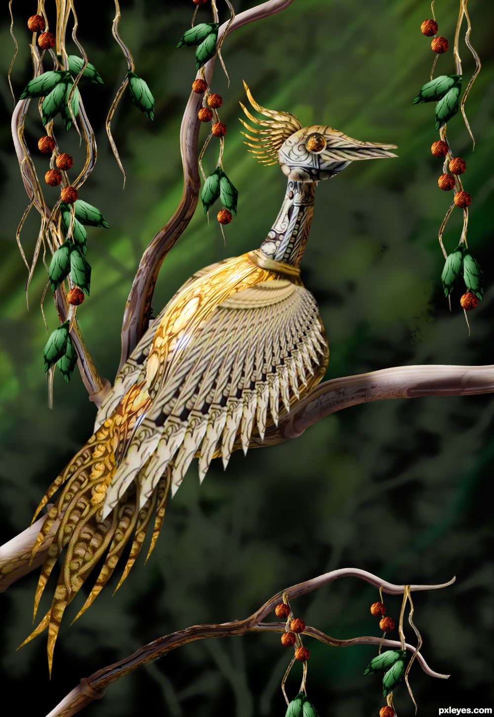
I was thinking of turning this one into a phoenix but unfortunately I got busy and I have to leave it in the middle. Feel free to laugh if you think its tail looks funny. (5 years and 2578 days ago)
Well done. Good luck!
Thanks!
Great blend. Looks like the bird belongs there.
Thanks! Tried my best :P
Howdie stranger!
If you want to rate this picture or participate in this contest, just:
LOGIN HERE or REGISTER FOR FREE

Created this entry in Adobe Illustrator. (5 years and 2598 days ago)
Howdie stranger!
If you want to rate this picture or participate in this contest, just:
LOGIN HERE or REGISTER FOR FREE
Photography and photoshop contests
We are a community of people with
a passion for photography, graphics and art in general.
Every day new photoshop
and photography contests are posted to compete in. We also have one weekly drawing contest
and one weekly 3D contest!
Participation is 100% free!
Just
register and get
started!
Good luck!
© 2015 Pxleyes.com. All rights reserved.


two thumbs up
Thanks.... my friend.
Nicely done!
Thanks my friend...
great work like the detail and sense of depth
Thanks Alan....
Purdy Tweet Tweet
Thanks my friend....
Congrats!
Thanks my friend.
3rd place George55. congrats
Thank you, you did a good job too.
Congrats George!!
Thanks Rein...
Congrats George, beautiful entry!
Thanks Vertigo....
Really nice job, congrats on the medal
Howdie stranger!
If you want to rate this picture or participate in this contest, just:
LOGIN HERE or REGISTER FOR FREE