Inspired by the beauty.... (5 years and 2419 days ago)

yeah..minimal use of brushes...however,i won't deny that i used some. thanks to the artists out there making decay brushes for this sort of application.
some hand painting and overlay...really quite simple manip.
(5 years and 3417 days ago)
It's well blended.
This is really great! 
mmmmm she be purdy!!! in a rotting corpse kinda way 
Creeeepppppyyy! Yikes!
See ya in the crypt 
SPOOKY!!!! Nice work...Best of Luck
cool work author...totally in your style...gl
Gorgeous eyes 
Look at you ... 1st and 4th ... not bad for a night dweller!
Howdie stranger!
If you want to rate this picture or participate in this contest, just:
LOGIN HERE or REGISTER FOR FREE

Just make it simple...
(5 years and 3587 days ago)
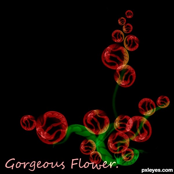
You CBR'd the source. (chopped beyond recognition) You could have made this image with anything. It defeats the purpose of a source image contest. The text doesn't look good either. My suggestion would be to remove the text and try to add more of the source image into it.
It's beautiful, but I have to agree with Jaw. For this work you could have used any other image than this no. 1. And you used the wall... So, when you have a source image, like this contest, you have to work on it, since the image is recognizable (even distorted).
gl
it's true that you could have used other images to achieve this, but I really like the outcome anyway!
Howdie stranger!
If you want to rate this picture or participate in this contest, just:
LOGIN HERE or REGISTER FOR FREE
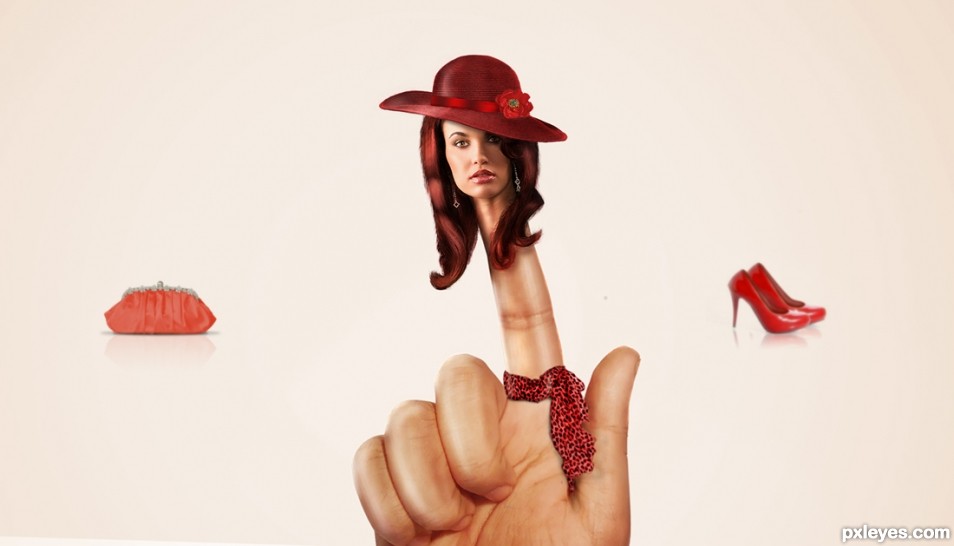
HA! Lady Finger
yup right
Howdie stranger!
If you want to rate this picture or participate in this contest, just:
LOGIN HERE or REGISTER FOR FREE