(5 years and 2462 days ago)

With thanks to:
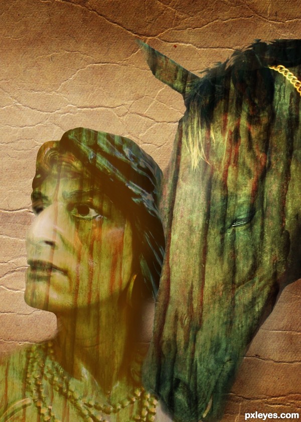
Parchment by andreyutzu
Indian horse by Karmalize (5 years and 3606 days ago)
The indian needs a shoulder...maybe you could lower the horse head to fill that space.
I agree with CMYK. 
Thanks both for the comment - I'll see if I can put it back!
Ooops! too late, it's lost in the ether somewhere! Horse head lowered. Thanks again! 
Looks good with the horse head lowered. But there is this blank area in the bottom. This triangle. But i really don't want to be picky...  Nice one, i like the colours.
nice ..................
Howdie stranger!
If you want to rate this picture or participate in this contest, just:
LOGIN HERE or REGISTER FOR FREE

Michal Zacharzewski-http://www.sxc.hu/profile/mzacha
READ MY RULES. THIS IS STOCK-http://cozycomfycouchstock.deviantart.com/
Mateusz-http://arcatrip.deviantart.com/
Studio Cocopeli-http://www.sxc.hu/profile/miko
chulii.deviantart.com-http://chulii-stock.deviantart.com/
Robert Linder-http://www.sxc.hu/profile/linder6580
Stevie Skik-http://www.sxc.hu/profile/steviebifi
S.a.n.d.r.a's Shadow-http://d0gma.deviantart.com/
Mark Anderson-http://www.sxc.hu/profile/4score
Thanks guys for the great resources...
Please watch high resolution before voting... (5 years and 3639 days ago)
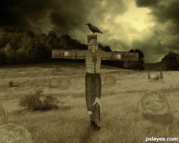
The ends of the straw bales would be darker than the field, because the light source is behind them. Also, all your shadows should rotate to the right.
U are right about the straw bales CMYK but i don't agree about the position of the shadows...i just simulate the situation and most of the shadows goes in good direction and shadow of the pumpkin need to be just a bit moved to the right...
Draw a line from the center of the light source through the different objects & you'll see what I mean.
Thanks Bob,i made some correction's i think now all things fits...Thanks once more...
This cloud looks familiar  . Seem like you just have some problems with the shadows as Bob mentions, the rest looks fine. Good luck
Nice... I think there comes a storm! 
Nice! It looks really good! 
Very good work, the straw bales fit well the image, good luck ! 
nice mood 
GL to you
great entry, author...and very nice idea... good luck 
great work..good luck
Good work.
nice job and good luck
Howdie stranger!
If you want to rate this picture or participate in this contest, just:
LOGIN HERE or REGISTER FOR FREE
fun chop!
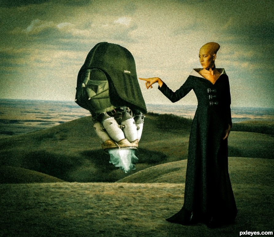
A bit filter heavy, but interesting. Makes us wonder about the woman with the strange head.
Not sure about the grainy look, but creative indeed
Nice one!
Congrats!!
thank you
Howdie stranger!
If you want to rate this picture or participate in this contest, just:
LOGIN HERE or REGISTER FOR FREE