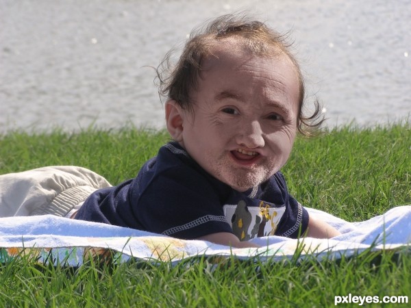
Thanks to manuere and keenanm for the photos (5 years and 2739 days ago)

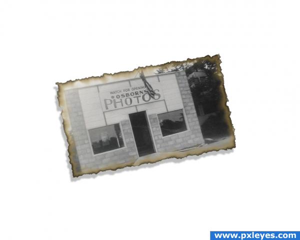
I wanted to have the effect of an old photo, trying to stay with the theme of misleading Names, while keeping it simple (5 years and 3797 days ago)
Good work author... Simple and nice : D.
I must be brain dead. I don't get this one. Maybe PM me? 
Haha, dual meaning. Photo Shop or Photoshop. Nice
very good sundevil356
ahhhhhhhh photoshop... lmao, ive been stumped on this.... i really did think you were a weirdo for a minute there author rofl
Ohhh! Yeah, I didn't get it at first, either. Ok. Good job.
Howdie stranger!
If you want to rate this picture or participate in this contest, just:
LOGIN HERE or REGISTER FOR FREE

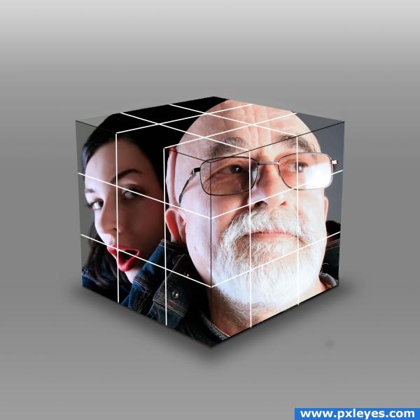
I simply cut the photo into squares, drawn the white lines, added a gradient, shadows and filled in what didn't fit in the cube,
yes i know it looks 2d, it's one of those new products, that measures the distance from your eye and compensates the angles, have you never heard of it???? (5 years and 3808 days ago)
Perspective of the image would be different on all 3 planes...
nice idea
I agree with CMYK46. Even though the cube is 3d, the image still looks 2d. Try taking sections of the image and use free transform to bend the image to match the 3d cube better. I'm sure someone else might have a good suggestion as well to do this.
I´m pretty sure u can dowlnload that filter somewhere, so it gives the perspective, nice idea.
Take sections as jawshoewhah suggested and use Transform/Perspective tool or Vanishing Point.
You have a good start...this could be great! Try the vanishing point filter to change the top and side planes give more of the cube look you are going for. Also, you could change one or two squares to make the puzzle look unfinished. These are just suggestions but the possibilities are really endless!  Good luck
i like this image. i agree with the other posters, the picture needed to be warp or the such like to make it cube like . Adding a little shading to the sides to give a lighting difference may also improve the 3D effect of your image. GL 
Howdie stranger!
If you want to rate this picture or participate in this contest, just:
LOGIN HERE or REGISTER FOR FREE
Nice blending, well done author.
Thank you, Solkee!
Congrats once again!!
Congrats!
Howdie stranger!
If you want to rate this picture or participate in this contest, just:
LOGIN HERE or REGISTER FOR FREE