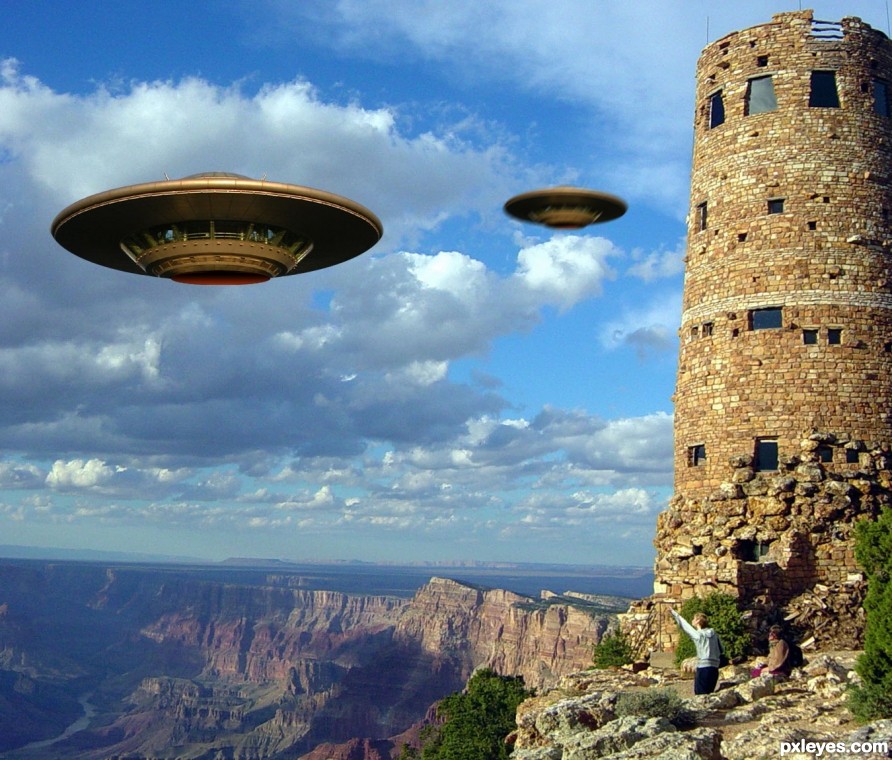
Thanks to Grand Canyon National Park for the pic of the Grand Canyon Watchtower, and to Kurt Groetsch for the pic of the flying saucer, both artists from flickr. (5 years and 2474 days ago)
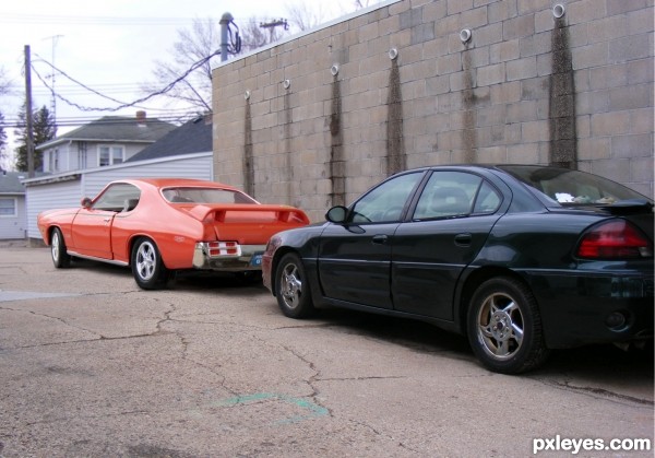
Sources are my own and can be viewed in the SBS. (5 years and 2552 days ago)
Nicely done! IMO the perspective could be adjusted a bit, but that's just quibbling...it's a well made image. GL author. 
Edited. Thanks for the tip!
Pretty good outcome, author! Still, but likely it's just in my head, it looks a bit like the nose of the red car is going up a bit too much (eventhough the perspective of the wheels is in same line as with the black car). If you have some time left, could you experimen a bit with the transformtool and try with distort to lower the upper left corner? Good luck!
Ok, edited....better? Thanks for the tip!
I think the GTO is a bit too small. It was a wide track Pontiac muscle car and pretty big with a 400cid 350 hp engine, 112in wheelbase. Google 1969 GTO The Judge for some idea of size and stance. Overall it's nicely done.
Ok, edited....did I get it? Thanks for the tip!
Have to agree with the ranger about the size of the Goat. But still a nice job.
Thankyou! Hope the edited version's better.
Increasing the size of the GTO did help.
Thank you!
So well made! First didnt even know what is the model of those two cars  you have skills m8
Thank you!
Congratulations! 
Thank you! And thank you for all your help!!!
Congrats Janna  it's very realistic
Thankyou very much!
Congrats, we'll done!
 Thank you!
Howdie stranger!
If you want to rate this picture or participate in this contest, just:
LOGIN HERE or REGISTER FOR FREE
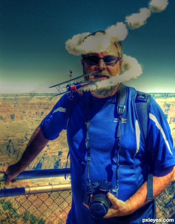
Self-portrait at the Grand Canyon...with fly-by! (5 years and 3074 days ago)
IMO Step 3 looks better. The HDR effect gives the whites a yellow cast. (Why the hairy smoke?)...
this is just SUPER!!! good luck 
I have to agree with CMYK46, step 3 has the look that could have been preserved in the 4th step if you'd have wanted to have the smoke trail spiral around like you did -- still, this is a great composition
Thanks. I think you are right. Probably should have left it alone.
Thanks. I think you are right. Probably should have left it alone.
Howdie stranger!
If you want to rate this picture or participate in this contest, just:
LOGIN HERE or REGISTER FOR FREE
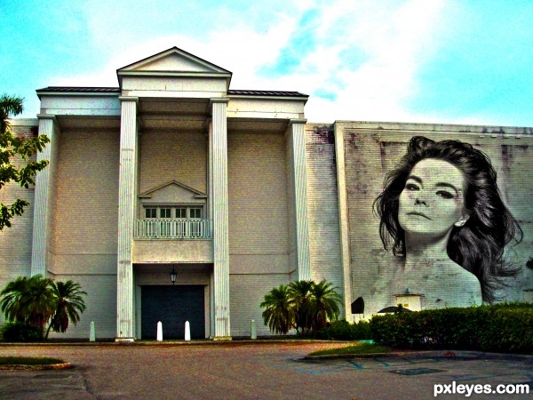
Bjork Quote~
"Everyone is bisexual’: “I’ve always had as many powerful, creative ladies in my life as I have men, and you could probably describe some of those relationships as romantic. I think everyone’s bisexual to some degree or another; it’s just a question of whether or not you choose to recognize it and embrace it. Personally, I think choosing between men and women is like choosing between cake and ice cream. You’d be daft not to try both when there are so many different flavors.†(5 years and 3367 days ago)
The so-called "graffiti" should conform to the surface of the building.
Cool ! Concept is great. I think, graffiti's are usually noisy. Body looks perfect for me, the hair could been noisier (IMHO). I like the color and subtle hues on subject, overall nice effort. GL 
nice thinking author...Bjork is amazing...Nice work too...well done
I never knew about the "everything is bicurious" quote until now.
I guess slapping one image on top of another (badly) is your idea of creating a shrine. (YAWN). At least you could have tried adding an effect to make it resemble graffitti.
lay off the sauce "blob" you're repeating yourself... LOLOLOLOLOL


(and if you forget my name... you will go astray.. like a killer whale... trapped in a BAY!!)
hehehe
Howdie stranger!
If you want to rate this picture or participate in this contest, just:
LOGIN HERE or REGISTER FOR FREE
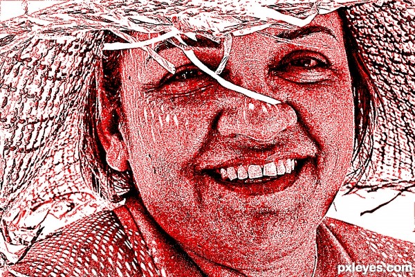
Thanks to sxc.hu & Hector Landaeta for 'Maria Smiles' (5 years and 3428 days ago)
Thanks for the comments greymval !! See this entry carefully & tell me about color scheme.
As the contest rule.
Yes I have much time to explore more, but if you have time to watch this entry again, suggest me how to create the entry with pure black (no gray tones).
I am waiting................


You have done very well in keeping with the theme of the contest!
Agree with Arca - red, black and white - and a great technique to show the colors. Wish there was an sbs, but I'm sure the technique is easy, noise and contrast, right in the ps program. Great job, author. 
I'll remove my comments , they are not doing any favour to any of us.
I'm glad that ppl like this how it is. Good luck!
Howdie stranger!
If you want to rate this picture or participate in this contest, just:
LOGIN HERE or REGISTER FOR FREE
Please fix link 2 and the jagged edges at bottom of the foreground saucer.
Edit: Link works now.
Link 2 fixed...edges fixed too..... Thanks Bob.
I like how you made the fellow point at the UFOs, nice touch.
Thanks Loyd...!
Howdie stranger!
If you want to rate this picture or participate in this contest, just:
LOGIN HERE or REGISTER FOR FREE