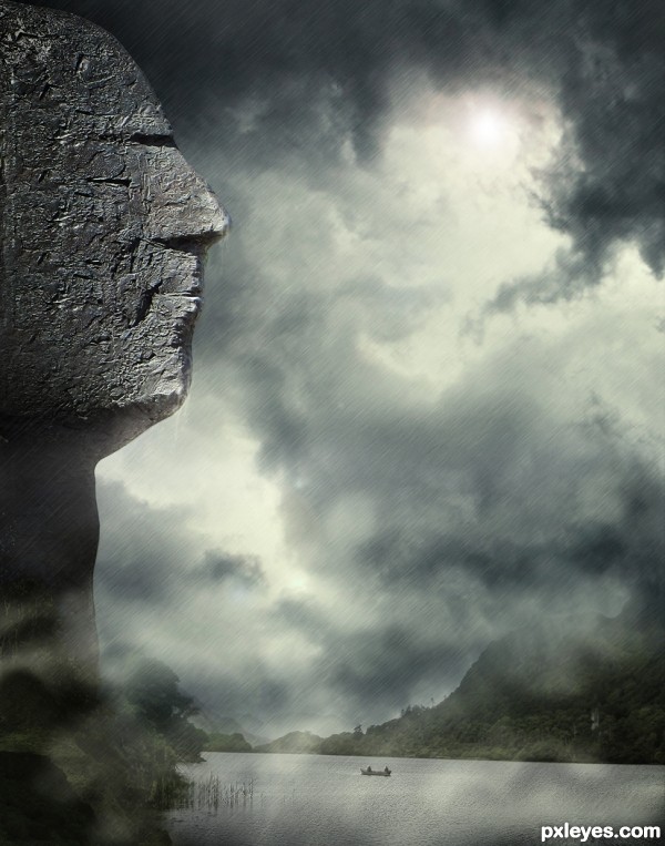
Special thanks to Nicole_N's for the valley/river:
http://www.sxc.hu/profile/Nicole_N (5 years and 3267 days ago)
- 1: Valley/River
- 2: Clouds

Special thanks to Nicole_N's for the valley/river:
http://www.sxc.hu/profile/Nicole_N (5 years and 3267 days ago)

(5 years and 3925 days ago)
nice idea, good luck!
hey good idea...maybe sharpening the wings of the bee will justify it more
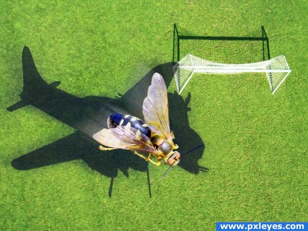
hmmmz well i like the idea very much, tho the shadows of the bee and the goal are off. the goal shadow is goin to the upper left while the shadow of the bee is goin to the upper right.... might be something you would want to check into. other than that GREAT image love it.
It's all a bit too blurry to work, both the forground image and the shadow. The idea is clever, but as a whole, it's missing cohesion.
@ Dragoncide: The contest is WRONG SHADOWS! Get it?  Nice job, author...
Ok, now your rockin! the REALLY blurry shadow before didn't look quite right. (seems like the goal light source doesn't match your new shadow though...)
Author, much better now!  And people, why do the shadows have to match the light source? What's the tiltle of the contest??? Sheesh...
incredible work!!!!! author this image is awesone indeed
wonderful!!!!!
Could there be a slight motion blur on the plane shadow too? Just asking, but its a nice pic anyway.
Great idea nicely done 

Howdie stranger!
If you want to rate this picture or participate in this contest, just:
LOGIN HERE or REGISTER FOR FREE
Now that's something to look up too! Good Luck.
good worl gl
good work gl
Love the feel of this. Nice work, author!
very very nice piece author...Great mood and execution...gl
Congrats for your first place, Daniela!
Congrats on 1st
Congratulations
Congratulations for 1st
Congrats, nice work
Congrats!!
Thank you guys!!!!
Maravilha, Daniela, parabéns! BelÃssimo trabalho...
Nice Job Congrats
Howdie stranger!
If you want to rate this picture or participate in this contest, just:
LOGIN HERE or REGISTER FOR FREE