I hope you like it. (5 years and 3282 days ago)

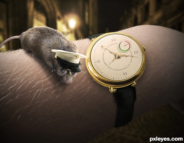
An entry that pretty much evolved as I worked on it. I orginally planned it to be a steampunk-style entry but it turned into something slightly different. Enjoy!
It seems that the mouse was quite the sailor back in its day... http://www.pxleyes.com/photoshop-picture/4bc8696c4f57b/Stop--Please-.html
Let me know if anyone figures out the text on the watch. :) Comments and criticism are much appreciated.
Credits to hotblack for the perfect background image. (5 years and 3537 days ago)
Please fix link 3. Light on hat is from left, so shadow of mouse would be on the other side. Good job on the rest. 
So cute, ya gotta love it!
Thanks alot, CMYK...fixed! 
EDIT: Thank you so much, Erikuri...fixed as well!
Very lovely! I like it a lot. 
Just two things: IMO, I think wrist belt needs a bit of thickness, and looking at your sbs, I noticed that you cut the lower part of your hand. Since your wrist is bent, it must appear.
Cute mouse - captain, Love this image, adorable glasses A+++ to author
cool
Great effort. Good luck,
Very cute work author,great idea and nice execution...i agree about the position of the wrist,now look like cuted out...any how,i like this so much...best of luck
Thanks Erathion, but I already fixed the wrist...if you look carefully, it's the exact same as in the photo I took.
EDIT: No problem!  Thank you again for all your kind words, Erathion.
Very true author...sorry for my previous comment about wrist,when is dark background behind looks a bit odd,but that is the real position of the wrist...work u did with a watch is little master piece,i like it a lot...again.sorry for the previous comment author...best of luck
Howdie stranger!
If you want to rate this picture or participate in this contest, just:
LOGIN HERE or REGISTER FOR FREE
Looks good, I can relate.
this is so cute I may throw up... twice... (holy moly, what a cute Idea.. awesome thinking author.. and the look is marvelous (slick black surface with great binding LOL... )
Nice
nice!
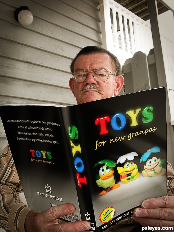
Responsible grandpa Good work! Like the text! GL
Good idea, nice thinking. The presentation of the book looks good, the text is believable. If possible, you could carefully mask the area around where the fingers hold the book a bit more (I see some light outline left and a dark outline right). But for the rest well done! Good luck!
Nice job, author! I like entries like these that sorta tell a story.
Thanks folks!!
I´m glad you like it!!
Hitting the nail on the head! Bam! This is so funny, I always go to the book store, almost every payday, and look for something interesting or for self improvement.... and actually laughing here, this is or will be me in a few years. Brilliant concept and execution!
Creative and very well done!
Very good idea, nice work.
14th addition, lol. R kids are spoiled, lol. Nice work.
Great thinking,cool execution and funny work...GL author
congratulation!
Thanks everybody!!!
Congrats really nice work
Congrats!!
Job well done! Congrats...
congratulations!!!
Howdie stranger!
If you want to rate this picture or participate in this contest, just:
LOGIN HERE or REGISTER FOR FREE