Thanks to minimonst100, for the pic of wood texture.
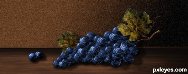
The rest is PS.
UPDATE: Added some veins for texture on the leaves, and reversed the gradient on the wood. (Thanks Drivenslush).
Worked on the shadows. (5 years and 3471 days ago)

(5 years and 3838 days ago)
very strong on filter work.. the leaves look metalic.
Howdie stranger!
If you want to rate this picture or participate in this contest, just:
LOGIN HERE or REGISTER FOR FREE

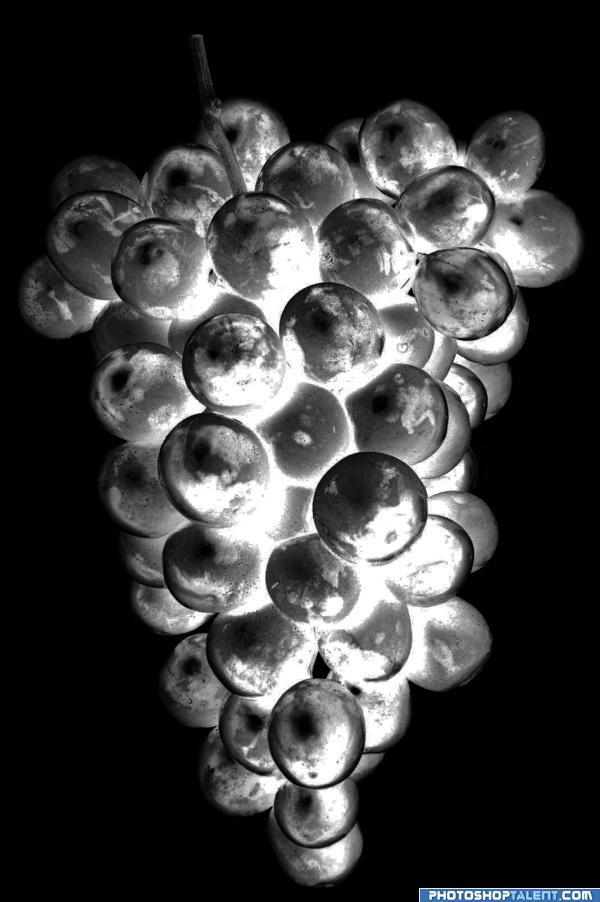
Chrome Grape that look lit from the inside. They just glow! :)
NOTE:
Sorry for the inconvenience but, I submitted the half-way-done photo by mistake...considering they look similar, it hopefully is understandable. Also, the source for this picture was missing the prefix...the http://www...sorry bout that too. (5 years and 3927 days ago)
good work
good work
good
very glowy good luck
The light looks like it's inside the chrome grapes themselves and radiating outward, which does not compute. Cool, but not chrome which only reflects its exterior. (Source link does not work.)
I don't mean to make sour grapes but this is just a negative of a photo! Not really much work. Just bring the image into photoshop and invert. 
cool
Would be a really good entry if it was more chromy 
gl
Howdie stranger!
If you want to rate this picture or participate in this contest, just:
LOGIN HERE or REGISTER FOR FREE
looks very sweeeeet..
yah but dont try it unless u wanna to be a "teethless"
the leaves are really cool author... (maybe add a texture/pattern to the floor, then use perspective to give the floor a bit more depth (or maybe reverse the gradient so the dark starts at the base of the wall and the lightness moves downstage)
Oh hells bells, do what you want author.. it's a terrific image (all in IMHO as always) GOOD LUCK
amzing ,and very sweet
Thanks for your comments and your suggestions.... I added a wood texture to the pic. And reversed the gradient as suggested by Drivenslush..(Thanks my friend). I think this is good way to learn.
Sweet idea...good luck
i really like the idea..but i think there's a couple things that can improve this image a bit..one thing i noticed is that the wall is getting darker towards the right side..that means that the floor should also get darker on that side..another thing, is the shadow..right now it looks like a drop shadow..and it's making the grapes look flat and floating..i think there should be some darker shadows where the grapes touch the ground..but thats just my opinion..if u like it as is..then its just fine
The light source on the grapes does not match the lighting on the floor, or the shadow beneath the grapes. All 3 need to be the same, lighter on the left, darker on the right. The floor is totally reversed, and the grapes show shadow beneath, not angled.
Other than that, though, BEAUTIFUL work on the grapes themselves!
Thanks again for your comments.... worked on the shadows a little more. Thanks MossyB, Fatz8016.
Looks good! GL!
its lovely
I really like that original entry!

Congratulations author!
Great work author Your unique style
Lovely still life very nicely done!
It's really really beautiful! I love the color, it looks real... sweet juice and sour pulp...
Very creative and original ... did not see it before you made the changes ... looks really grape now!!!
Fantastic work author...it looks delicious...well done
Howdie stranger!
If you want to rate this picture or participate in this contest, just:
LOGIN HERE or REGISTER FOR FREE