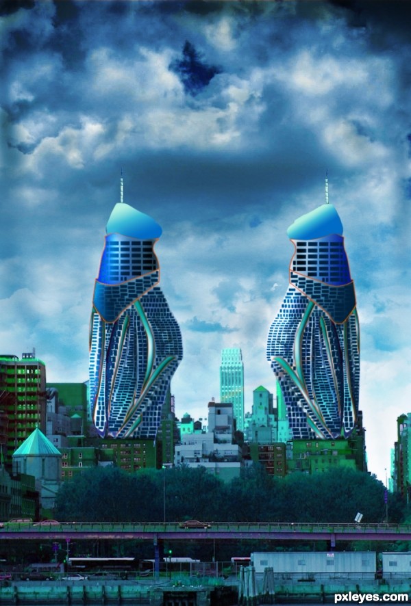
Source image used to create two towers. (5 years and 3370 days ago)
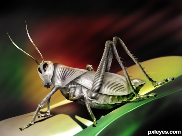
I am used an sxc.hu image as reference to create this entry. It's a beautiful picture by John Boyer. Thank you John Boyer. Your picture inspired me a lot. (5 years and 3509 days ago)
Beautiful
Nice work!  I only see one eye in the reference pic, though.
Wonderful work.  . Nice to see you back

 .
. 
Nice result. CMYK has a point (not sure though if it was meant as eyes), but you can keep it like 2 eyes (as if he's looking at you), but in that case you have to put the antennas a bit different (now the head would look too twisted). For the rest I agree with Nasir  . Good luck!
Hi all. Thanks for the suggestions and comments. Actually the eyes, I deliberately created like that. The antenna position I'll rework ASAP. Thanks again for the useful comments.
wonderful detail -- shadow and lighitng look very nice
color scheme is flawless 
Nice creation of the insect! One thing with the colors, the background is kinda covering the insect, that it doesnt stand out but gets lost in the back ground. I think it will look more powerful if you gave the insect just one color that stands out. Maybe just silver + a little yellow. Good luck!
i agree with Ressiv's comment..IMO, step 11 in the sbs is way better..but nonetheless, good work and GL!
kalaki.....
VeryGood...............
Thank you Ressiv & fatz8016 for the suggestion. I incorporated those corrections. Thank you.
Very nice entry. Is it done completely in photoshop? Whatever amazing end result. Best of luck.
Very nice entry. Is it done completely in photoshop? Whatever amazing end result. Best of luck.
Much better 
This is a wonderful entry! I especially like the spring between the foreleg and wing. There was a lot of careful work done here. Very well done! 
All the things that were said above! Amazing work... 
just....WOW! O__O
awesomeness
Good work.
Great job looks sexy. would be more impressed if you made the image and not used the photo.
Congrats...
Congratulations! If you have the time, please enter more often. I really like your work. 
Congrats! for 3rd place. Great to see your work in top 3. As IDt8r say, entertain us with your more great stuff. 
Thank you all for the support.
congrats
Congrats for a great work! 
Congrats!!
Howdie stranger!
If you want to rate this picture or participate in this contest, just:
LOGIN HERE or REGISTER FOR FREE
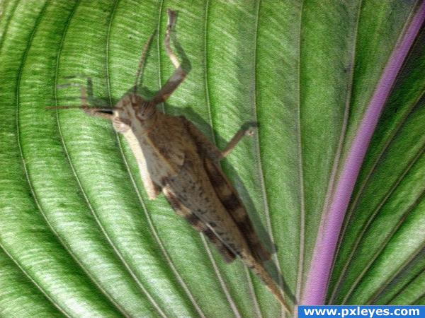
used source picture plus my own photo of a grasshopper. (5 years and 3825 days ago)
need shadow there...
you need to put the shadow layer under the insect!
nice 
Howdie stranger!
If you want to rate this picture or participate in this contest, just:
LOGIN HERE or REGISTER FOR FREE
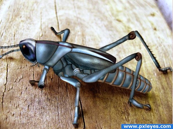
My old entry. GrassHopper is created using only texture from rendered sofa and used http://www.sxc.hu/photo/581192 as background and reference.
Unfortunately I found only merged final PSD and other version of PSD, which has approx 75 layers was deleted, when contest was ended at PST. Therefore I can't able to do any modification.
Thanks to Chris Jones (standardup) at sxc.hu. He has been notified. (5 years and 3884 days ago)
great to see this again
Yes, I agree with Nisha, great work.
i really like it, i just feel like the source is completely unrecognizeable. Good luck though! High marks from me 
wow
Really nice work.
i already start know your style,"simply different and very good",congrats for u and good luck
fine
Niceee!
very different and nice work
Congrats! Great entry!!!
Howdie stranger!
If you want to rate this picture or participate in this contest, just:
LOGIN HERE or REGISTER FOR FREE
All source (5 years and 3957 days ago)
ok...
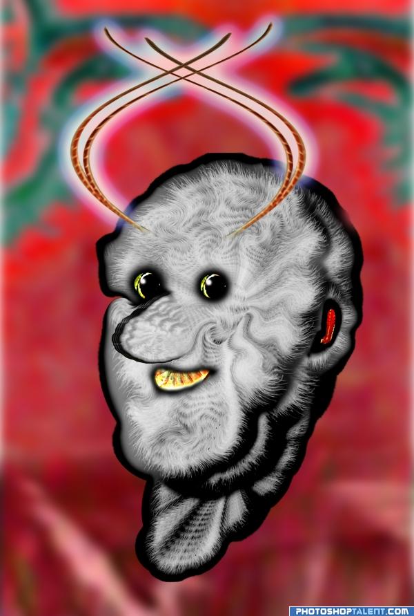
grasshopper man - he is so fleecy, i imagine how wind loves to play with him:P and he is happy as we can see
good
hahah funny
Weird
suits for a children's book good job author
Howdie stranger!
If you want to rate this picture or participate in this contest, just:
LOGIN HERE or REGISTER FOR FREE
this is a pretty neat idea author.. way out of the box.... you may want to try and get rid of that orangy red stroke line around the top... it defeats the realism a bit (IMHO).. you may also want to reverse the burn dodge on one of the towers so that the shading matches the angle of light (it's not really that important, but I've noticed if you don't correct the lighting on a subject many members have a snit)

Good luck.. and great idea..
Thanks Drivenslush. Think, I should get rid of the orange outline. Will work on it. Your advice is to the point. Thanks again.
Yeah, I appreciate your view about lighting. It took 15 hours work to reach here. Maybe, my eyes got color saturated.
very interesting concept...construction is well made and as Ernest sad i will to remove orange stroke...best of luck
Excellent tenacity .. wish you major luck
Thanks Drivenslush !!
As Drivenslush has already pointed out, the lighting on half of your image is wrong. When considering making a realistic style image such as this, lighting is important. Check out this valuable tutorial: http://www.psdbox.com/tutorials/manipulation-secrets-3-shading-and-lighting/
Thanks CMYK46. Link is truly eyeopener.
Not sure if it's intentional or not, but you have a brown outline at the top of each building. If you remove those and soften the edge a bit it would help. Nice image and great imagination too.
Thanks pixelkid for the suggestion.
Cool idea, somehow reminds me of the architecture in Dubai.
Corrected the picture aided by suggested expert comment from Drivenslush about red line. Hatss offf.

CMYK46, I like your critically hurting yet actual comments. I tried to correct the lightings. Hope you think it is ok now.
pixelkid, the red line came through copy layer styles, think now, it wasn't appropriate, so removed it.
Thanks erathion, sweetest and in my opinion, a very creative person in my pxleyes world.
Thanks pearlie, you always shows way to do the better way in a very honest and unhurtingly factual way, you did to me and I also read many of your comments to other pictures
Howdie stranger!
If you want to rate this picture or participate in this contest, just:
LOGIN HERE or REGISTER FOR FREE