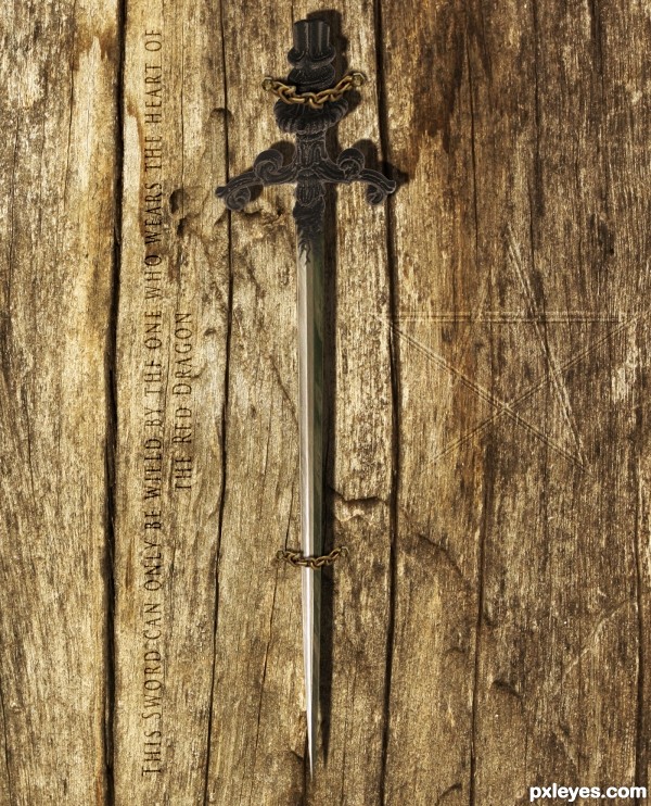
This one took a while to make.. Hope you like it!
Thanks to robby_m for wood texture.
(5 years and 3667 days ago)
- 1: Wood Texture
- 2: Screws
- 3: Sword
- 4: Chain
- 5: Pentagram
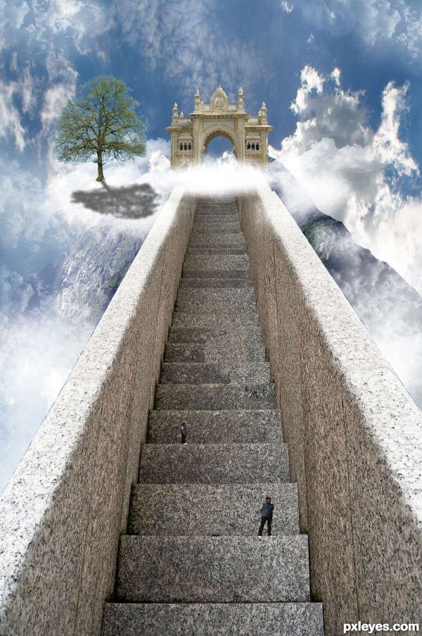
Well, this one took me quite a long time.. But it was quite simple to make..
I gave the stair a right side by copying and then transorming into shape..
I then took the gate and cut that out using the pen tool, did the same for the mountain.
I put it all together and at the end added some clounds and people which I cut out using the quick selection tool.
I also added a tree but I'm sorry but I cannot find the link to the image anymore..
Hope you like it and Thanks to asifthebes for images 1 and 2. (5 years and 3685 days ago)
GO WEST!!! pet shop boys.. hehehe.. 
I think if you move move the gate over to the left a little more and lighter the tree shadow it will look much better. Imo it feels like something is missing but I can't put my finger on it. Overal it is a well thought out entry. gl
I agree about the tree shadow. Maybe give it a gaussion blur and bring the opacity down. I'm a little confused at the clouds that follow the steps to the right? Also, I would get rid of the top guy that looks exactly like the bottom guy. Fix those and this will be very nice!
Thanks for the advice, it was taken on board 
I agree with the shadow, but instead of lowering the opacity the shadow should be broken up with the texture of a cloud. I would also finish masking the arch way and soften the edge of the "mountain" on the right side. Great entry. Good luck!
The brightness of the right front of the tree seems inconsistent with a light source coming from behind the tree. There's an inexplicable notch in the right railing near the top. (Using the Clouds filter to create a mask for the tree shadow might help 'wispify' it.)
This looks great
not to many people getting into heaven lol... nice work author 
lol @Keiley22 I wish I could favorite your comment 
beautiful .... 
Very nice job, only thing that I think of is that the person further up and away is taller than the stair, with perspective in mind, that person must be huge comparing to the person standing closest to us. IMO...Otherwise - really nice job!
sunzet, you are very correct, thanks for the notice ill change it 
GL
Howdie stranger!
If you want to rate this picture or participate in this contest, just:
LOGIN HERE or REGISTER FOR FREE
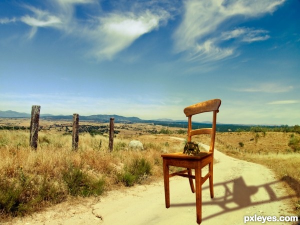
HI everybody, this is my first competition entry and I hope you like my work.
Basicly for this image I got a nice countryside backround. Found a chair and cut it out. Onto the chair I put the competition image, firstly though, I cut it out and puppet wrapped it so it looks like a helmet. Then I added a camo texture to the helmet and played around with the different blend modes. Lasty I put everuthing together by adding some extra shadows, and then I added a nice Brown and Orange gradiend and blended that to look nice.
Take care! (5 years and 3687 days ago)
Welcome to the competition. Just a thought for your entry... The shadow on the chair doesn't match the high noon image it is placed on. It also looks like you distorted the image of the chair (if you hold down shift while resizing the aspect ratio will remain constant thus avoiding the distortion).
Also a high res copy would be nice so that we can see what you did with the turtle shell. 
Cheers and good luck.
Have to admit, the shadow is fascinating  . It's not correct, but on the other hand...who cares
  . A high resolution version would be nice though (if you want that, then go to topnavigation My stuff - My contests, there you see your entry and then you can check the option High Resolution, something like that...). Good luck!
good luck
Howdie stranger!
If you want to rate this picture or participate in this contest, just:
LOGIN HERE or REGISTER FOR FREE
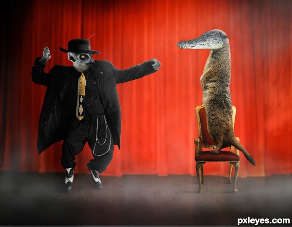
Can doing magic counted as hobby?
This lemur illusionist can turn a meerkat into a monster with crocodile head!
Credits to Marcus Ranum for the stock of the man, nefarostock for the stock of the meerkat, quentinh on sxc.hu for the lemur, bluegum (sxc.hu) for the stage, momotte2stocks for the crocodile, and faestock (http://faestock.deviantart.com) for the chair. (5 years and 3706 days ago)
cool
Cool nice, author! 
 Very creative idea!
I like all those animals BUT the croco! 
meerkat look like the PIMP...great job author...cool mood...good luck
Cool.......gl

hhahaha 
very funny .........
Howdie stranger!
If you want to rate this picture or participate in this contest, just:
LOGIN HERE or REGISTER FOR FREE
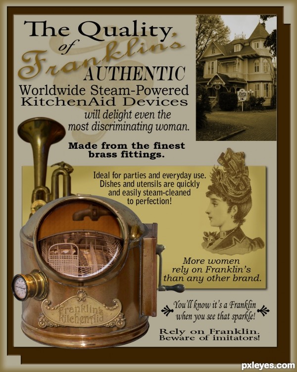
I remember the day well, we were all called to Granny and Grampa's house for the delivery. What a fine day it was, too, when the shiny brass-and-pipes-and-gauges and such was first used after the grand spring party. All Granny had to do was crank 'er up a few times, and it started, sputterin' and steamin', making mounds of suds, and it cleaned all the dishes to a sparkling clean. What a fabulous new contraption! Thanks, Granpa, now Granny's the envy of the neighborhood.
Parts is parts as they say, used shiny brass parts from several vintage items, a couple of brushes and basic ps tools.
The victorian house is a personal photo, this is a renovated house in Gainesville, FL where I had the good fortune to work as a graphic artist in the early 80s for an ad agency whose office was moved there. (original photos are in sbs.) (5 years and 3738 days ago)
most impressive
super duper playful fun!!!!!!
Except for some typography and spacing issues, this is really darling and fun! The copy (the actual wording of it) is great. Love the old ad look!  Oh, and love the description too.

Excellent image.. very authentic! I agree with Annabat about the spacing issues though. Good luck!
Like the thought, only thing bothering me is that the interior is straight (the back of the dishwasher). Can you wrap it so it follows the curves of the whole item. Otherwise - great!!! Liking the typing!
thanks for all the comments. ah, very good boo-boo catch, sunzet! thank you, I have re-tooled the dishrack, also reworked some copy, thanks annabat.

wow, that's a lot of work!
Wonderful entry, very appropriate. You have done a great job on all parts of this. Very creative. GL
Congrats on 2nd.. WOO HOOO
Congrats! 
Congratulations! 

Congrats!! Beautiful work!
I need one of those... Congratulations 
Sweet job! Sorry my initial comment didn't show up!
Howdie stranger!
If you want to rate this picture or participate in this contest, just:
LOGIN HERE or REGISTER FOR FREE
GL
Nice.
Nice old and grunge look
Howdie stranger!
If you want to rate this picture or participate in this contest, just:
LOGIN HERE or REGISTER FOR FREE