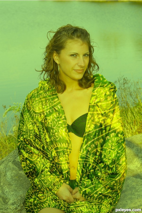
I used one external source of the Model. http://www.sxc.hu/photo/1247727
Author: rickfurb
(5 years and 3741 days ago)
- 1: Model
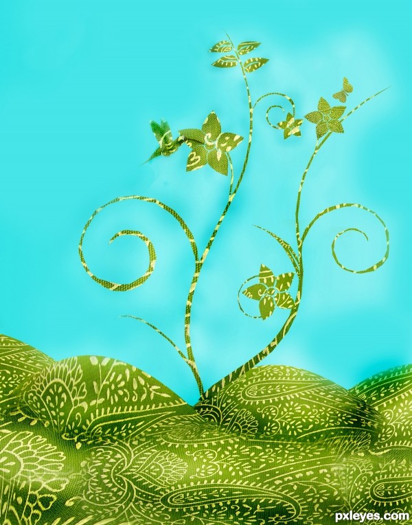
My 101th and perhaps one of my best works :) (5 years and 3744 days ago)
Nice image, but the shapes really need depth, try using the dodge and burn tools to add shadows and highlights to the image.
thanks matt  hope it looks better now
the left side of your image at the bottom needs to be fixed, you can see the blue background. I think you still need more depth and also try fixing the dark blue spots by the bird and flowers
nice design.. but yes ponti and jaescoe are right.. you do need to work a bit more on the depths.. 
U r getting there... author......keep up chopping.... gL 
Good work.....And nice improvements...
Yeah i agree about using dodge and burn tool.And u missed few spots in masking author.But idea is very good,shapes are perfect.Work a bit on this one and u will have very good entry...best of luck
Thanks Matteo , Josh , Imtiyaz , Anoop , Govind and Nebojsa for your comments  hope my work is looking better now, if you've got other suggestions , feel free to let me know
It seems that you're applying the dodging and burning to just one layer, the ffects should only be on the object (not spilling over into the sky)
improving  good luck
this looks better.. I was just thinking that if u can add a small shadow of the birds beak on that petal?
very nice entry! GL 
Very good ! 
i like it
Nice work!! GL
Howdie stranger!
If you want to rate this picture or participate in this contest, just:
LOGIN HERE or REGISTER FOR FREE
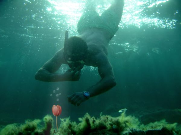
Can you find this on the bottom of the ocean? I don't think so :)
credit to source 1 by "manolo" (5 years and 3755 days ago)
Very interesting idea... Don't you think source image a bit sharp comparing to the background? 
Yup, erikuri has a good point, the flower & bubbles can do with some blur. You also may wanna experiment with a blue-ish photofilter for the flower, so that the colors match better with the background. Good luck!
yes the points above r to think about.. now it looks as if you pasted it.. needs to blend with the rest of the image..
Very very nice work author...
good rework.. its looks better now.. 
the blend is better now 

Howdie stranger!
If you want to rate this picture or participate in this contest, just:
LOGIN HERE or REGISTER FOR FREE
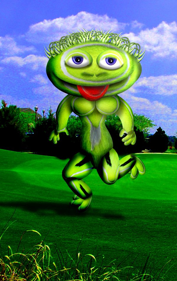
my photo and source (5 years and 3759 days ago)
Great...110% fabulous...well done author
amazing ! 
BOOBIES!!!!! 
i like the idea is really good, but it looks distorted cuz of the extrem liquify and warping, maybe try to manipulate the form of the ball instead of the liquify..cuz it makes loosing quality, great job 
Awesome with the provided source, you've used so much of it.
Sky is incredibly pixelated...you should at least blur it a bit.
It's not INCREDIBLY pixelated.. it's just over saturated (DONE ON PURPOSE) (and we all know what happens to blue skies when you over saturate them) and the pixelation is ONLY visible in High Res.. which means when I send this to print It will be just fine and I'll sell lots of her because she has boobies)... lighten up CMYK.. I'm not trying to win.. and you know I never take your suggestions. Out of Principle.... SMOOCH
manboob!!!!
Well, I'm a woman, and I have to admit... she has a gorgeous pair of headlights!!! 
It has to be you...
The pixelation is plainly visible in low res, which is why I mentioned it.
CMYK no it isn't.. print it you goob...LOL...(without back light from a computer screen the print version is quite lovely) I'm an unique creation... (pixelation would never be a hangup) print it and learn.. heheheh
and thank you J0sh and Erik..you are both inspirations smooches galore
 this is disgustingly funny
eeekkk !! it's a gherkin monster
Howdie stranger!
If you want to rate this picture or participate in this contest, just:
LOGIN HERE or REGISTER FOR FREE
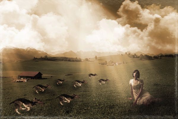
Model: Reyna Zullo
Taken in my make shift studio. (5 years and 3761 days ago)
nice mood your making there. there seems to be two lightsource from the clouds; it's too bright for the stars to be seen yet and some of the clouds seems to be behind the stars. lastly, a lot of dogs running syncronously is a bit odd. nice image though and i like the mood here. 
You mean you've never seen a pack of synchronized dogs run wildly through a field on a dimly lit day with the stars shining brightly? haha... Well the stars were supposed to be more of a borderish thing, not really supposed to elude to night at all, so oops on that one. The two light sources were intentional to imply a cloud breaking the light source into "two"..... and I like synchronized dogs...lol
the lightrays wouldn't supposed to be on the same angle then, and the dog would have stronger shadow with that strong light...just my observation. good work though! 
nice work... didn't under stand the dog's intention there.. are they going to attak her... the three dogs seems like that but the other dogs that are far dosent look like so...and the lights are still strange.. looks like they are coming from two different angle.. else is very good and nice mood created... very well done and Gl. Author..
I'm agree with hereisanoop
Thanks for all the input! I can see I could definitely have made the lighting a little better, directionally and more shadows, I was just trying not to overdo it with the shadowing actually!  Anyways, thanks to all, your critiques are very valuable.
Howdie stranger!
If you want to rate this picture or participate in this contest, just:
LOGIN HERE or REGISTER FOR FREE
Nice jacket! ;D gl
the overall green tone to the piece is disturbing. i think it would have been better if you'd changed the hue and saturation, gave her more of a fleshy tone, and then emphasized the green in the jacket only.
Great job!
Howdie stranger!
If you want to rate this picture or participate in this contest, just:
LOGIN HERE or REGISTER FOR FREE