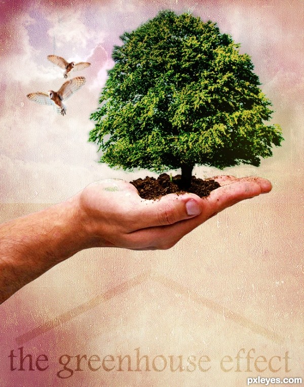
Used blending and masking to create the final image following the tutorial.Create a Nature Inspired Photo Manipulation in Photoshop from Psdtuts+ (5 years and 3354 days ago)

all the imgs are from the stock.
thanks to mymy - tapiona - golemaura - fmdartdesign for the beautifull photos (5 years and 3856 days ago)
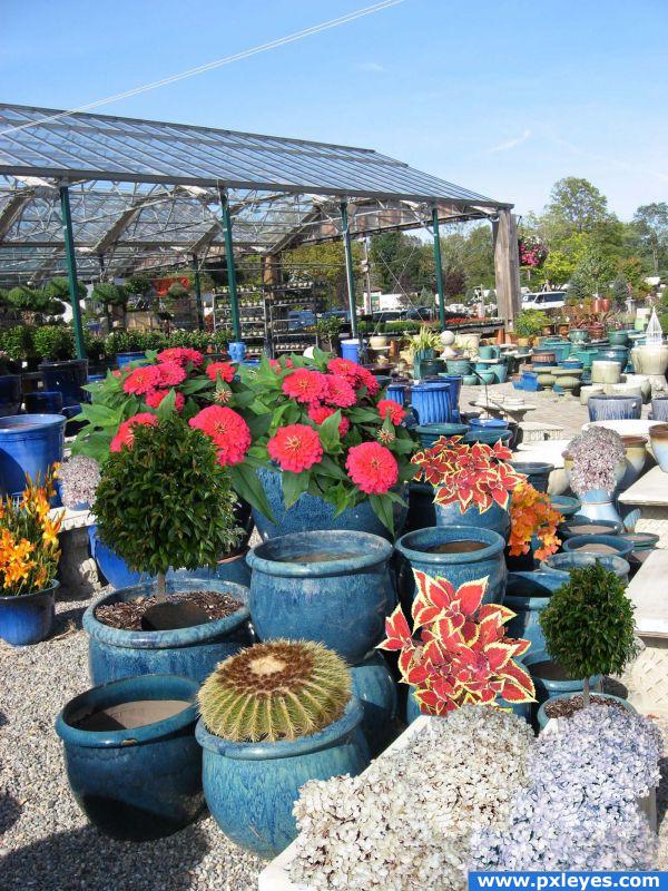
Very sweet work i like the flower adds.
Very nice flowers and work using all stock from the site!
and thank you right back for using those photo's.. glad you could use them (Now those blue pots look like a proper nursery) good luck!!!
good idea
Howdie stranger!
If you want to rate this picture or participate in this contest, just:
LOGIN HERE or REGISTER FOR FREE
You almost need a third owl to balance the effect (and since you have the ability I would turn the owl to LOOK INTO the image and not off the page.. old newspaper layout rule LOL..).. the middle finger got slammed pretty hard in the masking process.. but it's only visible in the high res... Your overall design is quite nice... (watch the distort when enlarging the OWL.. hold down the shift key when resizing.. his head is a tad bit squished... Puppet Warp would be best but gentle liquify and/or warp can work as well... (when repeating the same image it's important to alter the images slighty so they don't look like perfect clones.. unless that is your goal then go for it...

Good Luck Author.. and welcome to PXLeyes
Thank you so much for your feed back......the best way to learn in my book......i will try to look at it again if time allows. Thanks for your welcome.......must say entering my first contest made me quite nervous :0 lol
Your color tones are a bit off, with your tree somewhat yellow and sickly looking, and the hand too pale. You can (if you wish) correct both of those with Image>Adjustments>Selective color, choosing yellow adjustments for the tree (increasing the cyan and decreasing the yellow) and the reds (slightly increasing the magenta and black) if you have the hand and tree on separate layers.
Your overall composition is somewhat compromised because you have the background lighter areas too large, resulting in a whitish "halo on the RH side of the sickly tree, and too much light above the hand on the LH side. This subtly pulls the focus outwards.
The owls are also now a bit too large and distracting within the overall image.
A very nice tutorial you found, the effects used can be applied to many other types of images.
Thank you MossyB for your feed back, have made a few adjustments along the lines suggested.
Ooooh! MUCH better!
Now you've improved upon the tutorial with the sky behind the owls, and the eye is drawn to the tree, and then moves around the image.
Nice work.
Looks good, not sure about the green bit on the palm.
Thank you MossyB I agree that it looks much better now with the changes, the feedback was so appreciated.
Welcome and nice finished image!
Nice work, the message is strong. Very effective use of texture
great work...gl
Howdie stranger!
If you want to rate this picture or participate in this contest, just:
LOGIN HERE or REGISTER FOR FREE