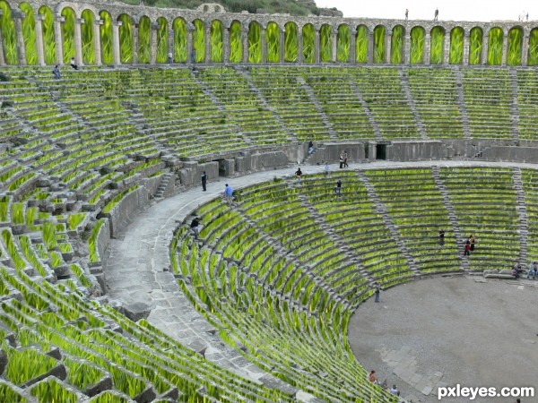
ITS FULL OF MASKING (5 years and 3398 days ago)
1 Source:
- 1: source1
Photography and photoshop contests
We are a community of people with
a passion for photography, graphics and art in general.
Every day new photoshop
and photography contests are posted to compete in. We also have one weekly drawing contest
and one weekly 3D contest!
Participation is 100% free!
Just
register and get
started!
Good luck!
© 2015 Pxleyes.com. All rights reserved.

I can see that this would have taken you quite a long time to create with putting the individual sections of grass in, so I applaud your efforts.
Unfortunately this is extremely difficult to make look realistic. It works ok for the further sections where you cannot see the detail of the blades of grass, but the closer sections look really pasted on.
I think if you removed some of the closer sections and the parts behind the arches, you might have a nicer result. Some vines or plants to help give it an overgrown look might add something too.
The grass is out of scale compared to the people in the image, especially at the very top section. In the sections you've masked, some grass is in focus & some is blurry...also we can see abrupt cut lines in many places.
would look better i think if you removed the grass texture on the very top where the arches are, and if you lowered the saturation on the rest of the grass, and darkened it a bit. would make it look less fake.
What they all have said.

But it is a nice idea, and with some more execution it will be a great entry
its very hard to do but your great
its very hard to do but your great
Howdie stranger!
If you want to rate this picture or participate in this contest, just:
LOGIN HERE or REGISTER FOR FREE