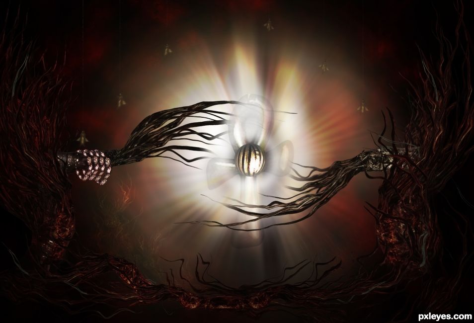
Maybe this is a reflection of what I'm feeling - grim. Very unrealistic but surreal and dark. (5 years and 1656 days ago)
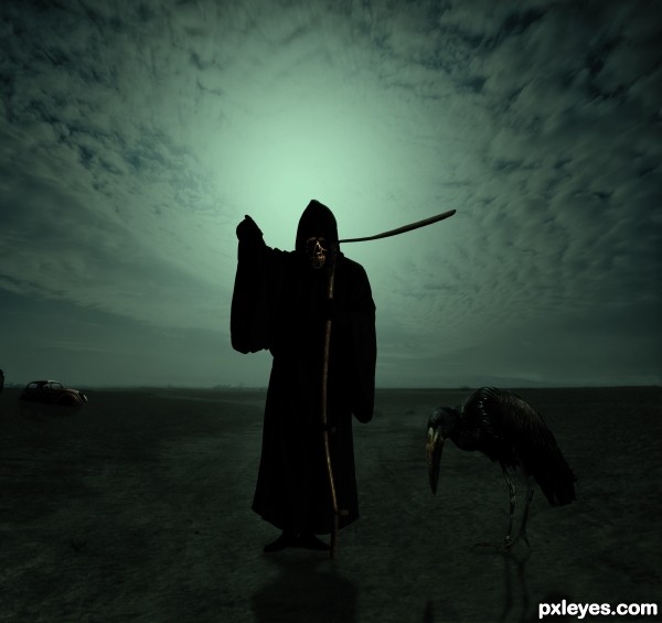
(5 years and 2944 days ago)
Love the contrast around the head and sickle (
it took me a while, but I thought the sickle was coming out of his ear LOL.. now I see it.. LOL damn my eyes.. good luck author
Howdie stranger!
If you want to rate this picture or participate in this contest, just:
LOGIN HERE or REGISTER FOR FREE
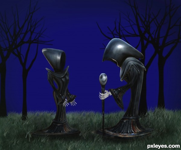
check high res before voting! comments and critiques are always welcome! Thank you!
*sbs will be posted today. (5 years and 3708 days ago)
ZOWIE KAPOWIE!!!!!!
beautiful ! cute entry , well done 
Have more grass overlapping the bases so they don't look like they're floating...otherwise, nice job! 
i like em floating.. always imagined grim reapers floating.. jusy my opinion though. Great work Author
agrees about what cmyk said but still a very creative and unique take on the theme. GL!
wow 
I like everything except the background. I would've liked to see something with more details in the background, like some tombstones or some eery clouds or something. Nice entry regardless.
hey thanks everyone for your comments. i'll work on that "floating" thing. and i messed with the background a bit before i decided on this more "plain" setting. i really wanted the focus on them...too much in the background really caused an issue.
 Thanks again!
Creepy romantic, author! GL... 
Just one thing, only noticeable in hi res: beside bones still are white spots... 
@Slushy: what language are you talking? Or who is he/she? 
great and nice...... a little suggestions, the edges of the palms are a little sharp... and they need some shading too...... good luck 
I agree with westfall I like the floating look also
Great work author...good luck
Love this, very clever use of source. Agree with erikuri, her hand bones need erasing. LOL @the shadowing on his staff - reminds me of Nightmare Before Christmas character! 
Okay, good thing i forgot my external drive with the update on it, i now have just a final tweak to do to the image and i'll update my entry.
Thank you all for the suggestions. Should have an updated version before the contest ends. 
ya know, now that Westfall has pointed it out, it does kind of add a better effect to make them look like they are floating.
HOLY CRAP! 8 favs? You must me, just delighted with that. 
wow ........... great ..............all the best to u ..........
I absolutely love this...great job with the skeleton hands and looks awesome in high res...GL
top job
Very Gothic !! good luck author
Good work.
What can I say that hasn't already been said..........terrific work......Best of luck to you on this outstanding usage of the source image!!
Gravely romantic! Very creative work 
Congratulations on your placement! I just knew this would place. 
Congratulations for 2nd
Congratulations... it's still creepy romantic! 
congrats 
Congrats!, very nice work 
Congratssssss on 2nd!!! woop woop !!! 
congrats... keep working...
congrats!!!!
congrats!!!!
interesting characters... congrats...
Congratulations!!!!! 
Howdie stranger!
If you want to rate this picture or participate in this contest, just:
LOGIN HERE or REGISTER FOR FREE
Dimitri Castrique-http://www.sxc.hu/profile/dimitri_c
xdilemmas stock -http://so-hood-stock.deviantart.com/
insert something clever here-http://phoeebstock.deviantart.com/
Marcus J. Ranum-http://mjranum-stock.deviantart.com/
dmitry-http://dmitry-stock.deviantart.com/
Stock Gallery-http://nitch-stock.deviantart.com/
Thanks guys for the great images that i used for this project... (5 years and 3880 days ago)
uuuuu spookie... nice work
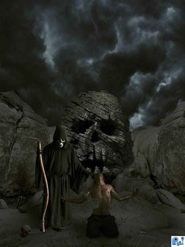
You need to darken the skeletons in the background. There's no light source to shine on them like that.
Thanks guys,i made some corection's....
Yeah, much better. ONLY thing is the skull on the reaper seems a bit bright, considering he's wearing a hood. For what it's worth this is still one of best entries I've seen so far. 
Great blend of lots of different sources... good luck!
nice creativity
love the sky, great blend.. fantastic finished image.
Beautiful........Good Luck Author.
Howdie stranger!
If you want to rate this picture or participate in this contest, just:
LOGIN HERE or REGISTER FOR FREE
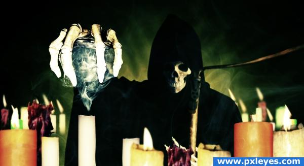
Forgive me for my lousy naming convention and for this entry being similar to an another entry here...
Anyways I haven't chopped in a while, so I think my chops will be choppy for a while lol... It's like I am back from hibernation lmao...
Anyway this took me a full week, not coz I spend lotsa time on it, coz I kept procrastinating it and kept playing sims 2 lol...
Thanks to da freaksmg-stock...
Thanks to da seiyastock...
Thanks to da qroot-stock...
thanks to da *mjranum-stock( http://www.ranum.com/)...
thanks to da falln-stock...
thanks to da annfrost-stock...
thanks to da wild-stock...
thanks to da hjoranna...
Well wouldn't have took that long but I made a really stoopid mistake... I took candle with no flames and then added flames to it lol... *slaps forehead*
There are 12 stock and can only enter 10 in the fields... So listing all 12 here...
http://freaksmg-stock.deviantart.com/art/freaksmg-stock-new-skull-1-9171158
http://seiyastock.deviantart.com/art/Skeleton-Hand-3-91823143
http://qroot-stock.deviantart.com/art/Skeleton-Hand-Stock-1-63256761
http://mjranum-stock.deviantart.com/art/The-Grim-Weedwhacker-2-66205205
http://hjoranna.deviantart.com/art/Candle-1-109100443
http://www.sxc.hu/photo/788872
http://www.sxc.hu/photo/1159815
http://www.sxc.hu/photo/634959
http://www.stockvault.net/Portraits_g93-dark_self-portrait_p7788.html
http://wild-stock.deviantart.com/art/Retro-Candle-81160661
http://annfrost-stock.deviantart.com/art/Candle-transparent-file-87848293
http://falln-stock.deviantart.com/art/Candle-1-16160415
Anyway enjoy... (5 years and 3971 days ago)
This is really cool except that the white of the hand is too sharp; the lighting should be a tad less on the hand so you can make out the shadows and don't see spare pixels floating out.
Thanks... About the white on his hand... I know it way too white... Leveling it doesn't make it look it any better nor does brurning... Looks bad... Could have done something but then it does attract attention... So I kept it like that so people looks at it first and then the soul...
Wonderful image 
NICE!!!
Howdie stranger!
If you want to rate this picture or participate in this contest, just:
LOGIN HERE or REGISTER FOR FREE
Author, please provide all source links you have used to create your entry.
No external source used. Everything is from the given raw image.
Author, you need to post a step-by-step Guide (SBS) if you've only used the given source.
Oh no!!!! I so forgot.... OMG!!!
Uploading...
Solid work here very nice image
thanks
Cool image, love the things you extracted and especially the creepy 'hands' you made.
tnx
CONGRATS!!!
Congratulations...
Congrats!
I wasn't happy with the result of this art actually. This is not what I had in mind... But I didn't have time to improve it... Gosh I won!!! Thanks all!
Congrats ! Great job !
congrats
Howdie stranger!
If you want to rate this picture or participate in this contest, just:
LOGIN HERE or REGISTER FOR FREE