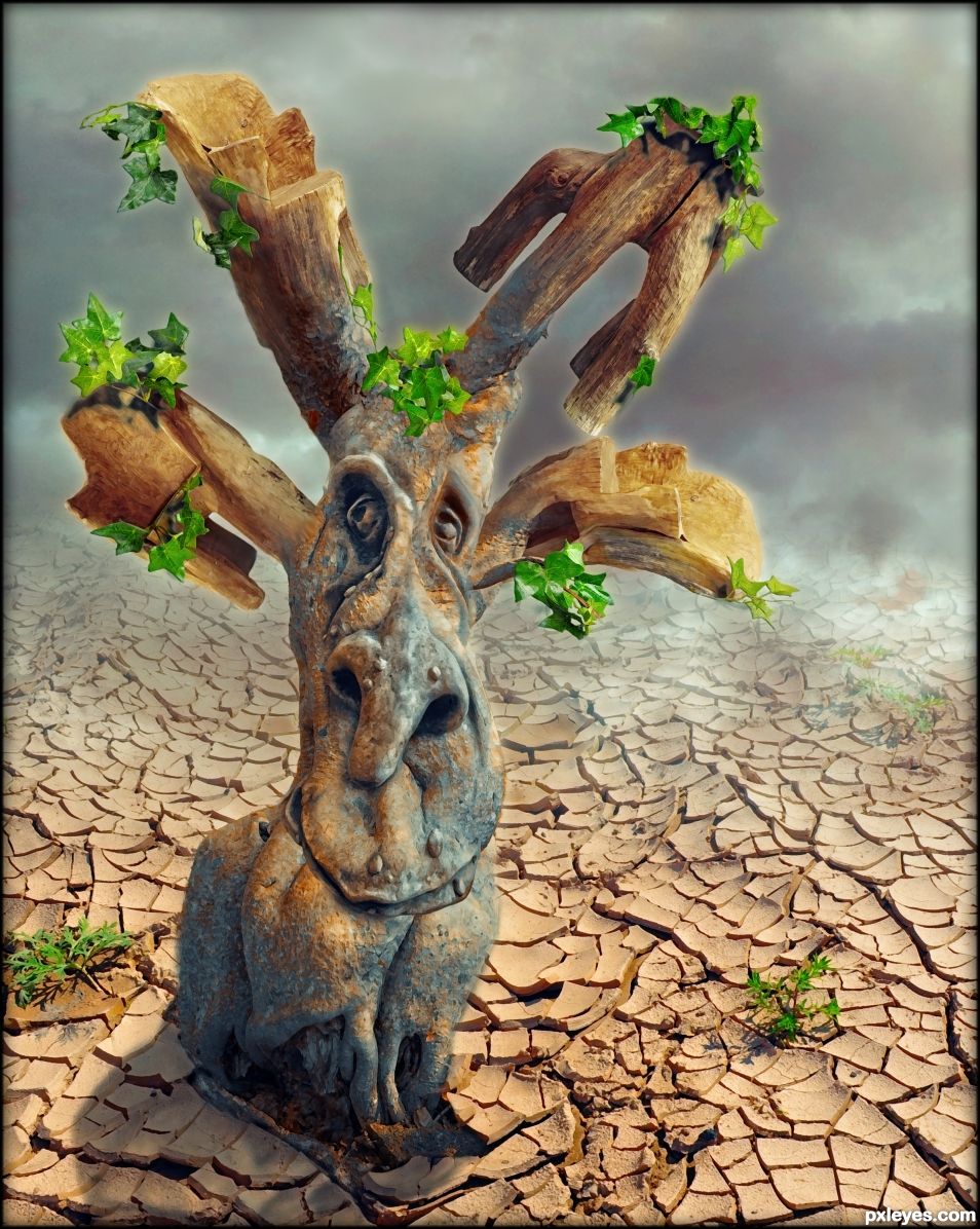
Rustic furniture growing on an alien plant in a drought stricken planet. (5 years and 663 days ago)
- 1: dry ground
- 2: clouds
- 3: tree
- 4: face sculpture
- 5: ivy
- 6: furniture

Rustic furniture growing on an alien plant in a drought stricken planet. (5 years and 663 days ago)
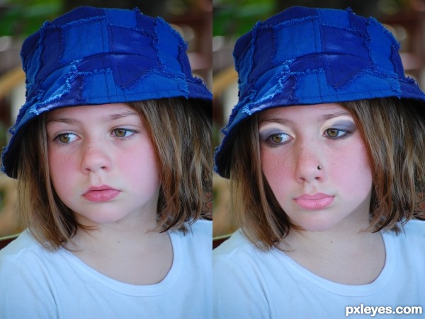
Just playing around so have no sbs and it's not as pretty in hi-res as in small. (5 years and 3254 days ago)
SBS??????????????????????????
Read txt under pic please 
I could make a couple of pics so there you go 
playing but..........nice. GL
Thank you 
stretching the nose was a very smooth move author.. very convincing.. GOOD LUCK
Thank you 
well done author, you seem to have understood the contest well 
she definately looks older  I like that you thinned the ckeeks and spread the nose....
It sucks that our nose keeps growing, i use to have a cute little thing on my face, im worried i will end up looking like the witch of eastwick lol
Hehe my nose is not one of the smallest in the world either, so feel with you. 
... And thank you 
Hmm, they could be mom and daughter! Very convincent and well done! 
Well done author, GL!
Nice work!!!  Good luck!
Thank you all 
good work gl author
Howdie stranger!
If you want to rate this picture or participate in this contest, just:
LOGIN HERE or REGISTER FOR FREE
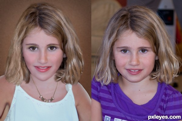
used 2 own images
Have made some minor changes. (5 years and 3255 days ago)
you nailed it! Looks convincing The left one looks matured than the other.Good luck
still looks like a child to me..try adding more wrinkles around the eyes, not dramatic old lady wrinkles, but some wrinkles to show adult skin
still doesn't look older. Just looks like a pointier chin. Head proportions need to change or the body size in the older image.
Certainly not bad, I do think she has grown up features in the face but maybe some points to improve.
For a grown up she has huge front teeth, if you can make them some smaller (or perhaps close her mouth more, then they'd be better in proportion with her face.
Her chin, go back to he original chin and remove some from the (little bit of) double chin from the girl. Try not to make the edges too blurry, the way she has her head, you'd see a more sharp contour around the chin. Lastly is her body. If you see your original pic, the head is higher, the way you put the head makes it look like she misses a neck and instead it's put straight on the shoulders. I'd put her face more on the place from the original photo and if needed make her hair longer to cover the original hair or just blend the yong girl's har with the older hair. Good luck!
Very nice! I only think that, because of the angle of the body, her head looks a little big. Maybe enlarging the shoulders a little more could solve the problem. GL!
Nice work, like the gentle change.and believable
Howdie stranger!
If you want to rate this picture or participate in this contest, just:
LOGIN HERE or REGISTER FOR FREE
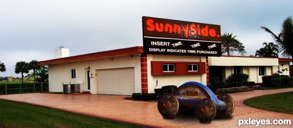
There was an insane asylum near my college and it had Sunny in the title, I used to watch a woman who's head would pop up and down in one of the barred windows and she would crack me up. I found out from my roommate who had worked there that she was well into her 50's even though she looked like a little girl. Her favorite thing to do was to jump up and down on her bed to look out the window.
When she was caught, they would punish her by taking away her catalogs. (One of her peculiar habits was to look through the various catalogs and dream of what she would buy and how much it would cost.) Sigh. My roommate said she would cry and cry when they took away her catalogs.
Created the image from the source and combined with my own photo (5 years and 3313 days ago)
That's quite a story! Love the mobile unit in the driveway - no real front or back, how appropriate. 
Howdie stranger!
If you want to rate this picture or participate in this contest, just:
LOGIN HERE or REGISTER FOR FREE
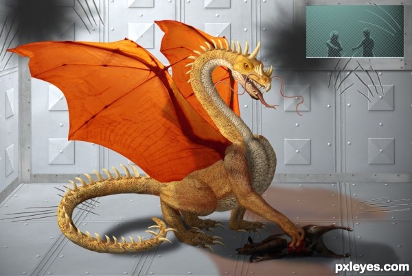
Thanks to sir chalky, Killian Tuor, Don Coyote, memoossa and marshalgon (5 years and 3325 days ago)
amazing 
Fantastic and the SBS is really good too! Best of Luck
Not so cute anymore is he! Great work but I think I like him when he was a little guy better ... if I was going to have one of my own he was just sooo cute when he was young!  )
)
Amazing work and a SUPER SBS!!! 
IMO the people in the background take away from the dragon, which is beautifully rendered. With a nicely done creature like that, you don't need a story line or backup characters. Regardless, nice work and good score!
This is great and really well done. One small suggestion though...it seems the blood is a bit too bright for where it is. I realize that you don't want to lose it if you go too dark, but perhaps lighten the dead creature a bit. If you could add some cyan or black to the reds of the blood...it will help deepen it. I guess what I'm trying to say is a deeper, darker red for the blood would make this great entry really complete in my book.  !
!
EDIT: Looks 
Thank you, pixelkid. I didn't know and hadn't even thought about adding cyan to red to darken it. Seems counter intuitive somehow.  Anyway, I made the changes and it does look better. Thanks again!
you've toiled much! nice result!!!
Fantastic work! I like the claw marks on the walls.
wow! This is amazing. Love how sharp and detailed it is 
Congratulations!
Thank you for your votes and comments. 
Hi, congratulation...
Congrats on the 3rd place on a very tough contest.., super fav from me
Congrats!!
Howdie stranger!
If you want to rate this picture or participate in this contest, just:
LOGIN HERE or REGISTER FOR FREE
Howdie stranger!
If you want to rate this picture or participate in this contest, just:
LOGIN HERE or REGISTER FOR FREE