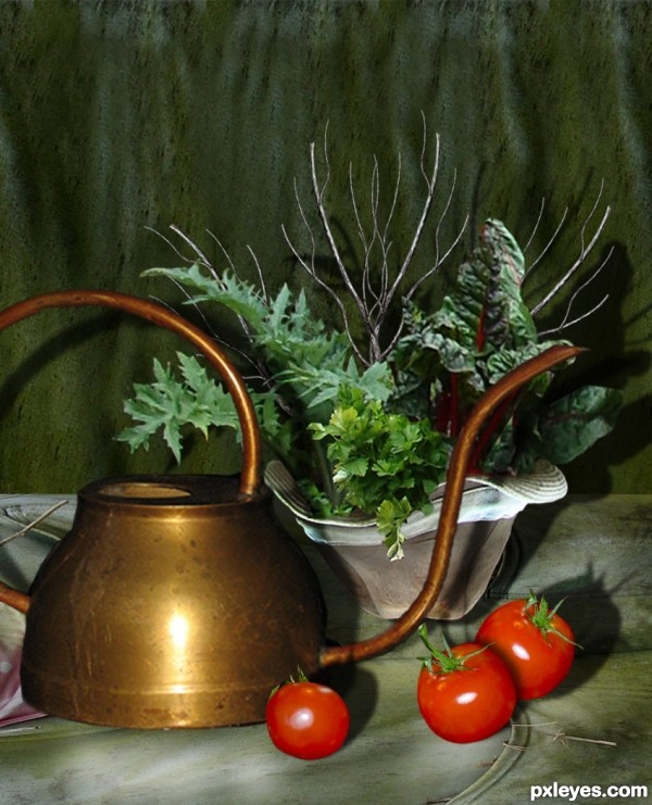
Thanks to Nellista, for the pic of the water pot.
Thanks to ea8322, for the pic of the tomatoes.
The rest is PS. (5 years and 3665 days ago)

(5 years and 3700 days ago)
Very clever!
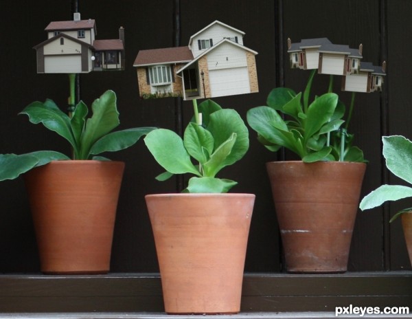
Very creative. I think there should be some shadow where stem meets house, and the center house might also cast some shadow on its leaves. The three-house thing seems odd. If it's three blooms, then having the front bloom cast a shadow on the back blooms would make it seem less flat (although the stems kind of seem like they're all on the same plane). [I'd go back to your flower-pot source for inspiration and make it two blooms: big house in back, smaller (still growing) house in front on right.]
Oh, I'd like to cultivate one of that for me... 
Ya me too, Erikuri. Along with a Toyota Tundra and an a Hasselblad HD2-39 the most expensive camera that is commercially available. 39 mega-pixels and roughly 40,000 dollars, and hell why one a million bucks on top of that.  Only on photoshop for now.
nice idea
Howdie stranger!
If you want to rate this picture or participate in this contest, just:
LOGIN HERE or REGISTER FOR FREE

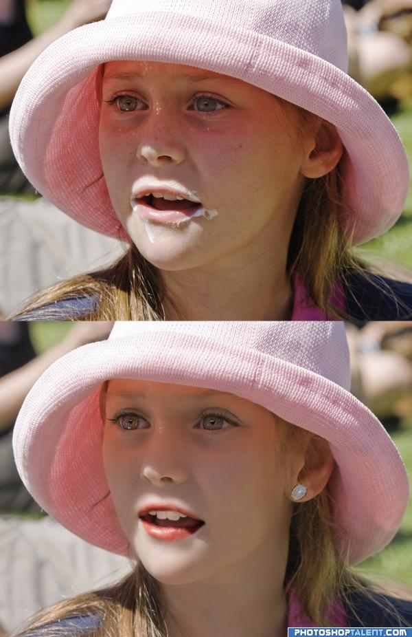
2 images use, both my own.
1. girl
2 opal (5 years and 4037 days ago)
perfect!!
reminds me of the baby beauty pagents.. beautiful but a bit peculiar... very dramatic
You should work a bit on the eye browns and the eyes.
she looks great.....nice work.....
Good work...
great
nice one
great 
Nice work, but she looks no older to me. 
I like the work done with one exception, the shadow passing over (her) left lower lip seems too dark, making it look like a substance, rather than a shadow.
nice one, I would try and remove more sparkle from the eyes, and the shadow in the corner of the mouth looks too dark.
very nice job!
wonderful : )
Howdie stranger!
If you want to rate this picture or participate in this contest, just:
LOGIN HERE or REGISTER FOR FREE
Nice take on the source pic! The watering can looks kinda small, and the shadow beneath it make it look like it's floating. Also, it would be casting shadows on the leaves as well as the hat & background.
Very Cezanne... ... I'm sure if you turned this image upside down the tomatoes would fall out of the image... hehehe
UPDATE: Thanks CMYK: I made the water pot bigger, and worked on the shadows.
Drivenlush: Thanks, Cezanne would be jealous...he,he,he.
And you, author, can be proud of a very beautiful compo!
Absolutely beautiful still life
Howdie stranger!
If you want to rate this picture or participate in this contest, just:
LOGIN HERE or REGISTER FOR FREE