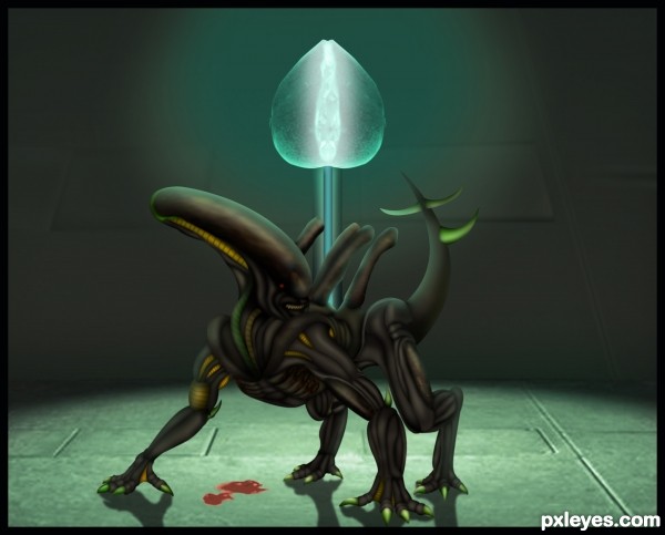
Only source image used...For making this entry i created 586 separate layers,personal record....:)
Please watch high resolution before voting...Thanks (5 years and 3618 days ago)
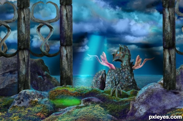
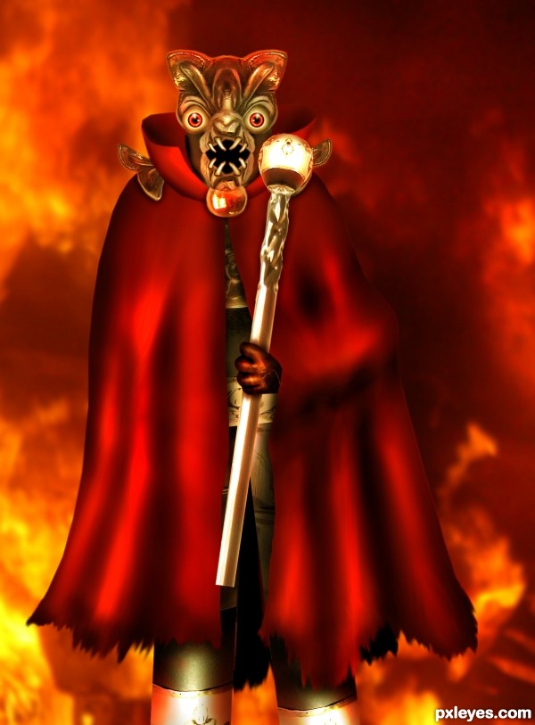
The creature remains at its position, constantly guarding the gates so no enemy shall pass. (5 years and 3678 days ago)
chopping aside (which is quite excellent) I must say the color palette you've chosen is stunning...
I now Know what it's like to be blue jean 
Thanks for your comment Drivenslush! 
nice idea .......... nice coloring ......... and a beautiful entry .............  :
:
Thank you all for your comments!
Pure fantasy! 
Howdie stranger!
If you want to rate this picture or participate in this contest, just:
LOGIN HERE or REGISTER FOR FREE
all my photos
Warp Tool
Flood (5 years and 3680 days ago)

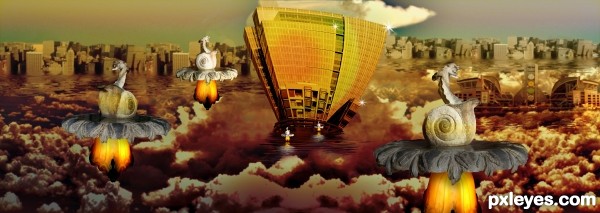
Good collection of source pics. Not really a cloud city, though...more like a waterfront city with clouds. Best of luck, though...
Interesting collage of multiple levels of lakes and their waterfront property in the clouds with snail fountains and sparkles all in an appealing color palette, but I guess I'm personally more into fantastical realism -- which is just me, so good luck!
A lot of imagination. Good Job! ツ
Interesting idea author...best of luck
nice entry ........ gud luck .......... 
great and excellent
Wonderful! 
Note: Steps 16 and 17 are the same... 
While I like the image in low rez ...I think the snails and light are too focused compared to the rest of the image and dont blend that good especially if you look the high rez
thank you moderator!!!!!

ROFL
? guess I missed it  Nice chop Author
Really unique 
Howdie stranger!
If you want to rate this picture or participate in this contest, just:
LOGIN HERE or REGISTER FOR FREE
Edit:
- Fixed some masking problems.
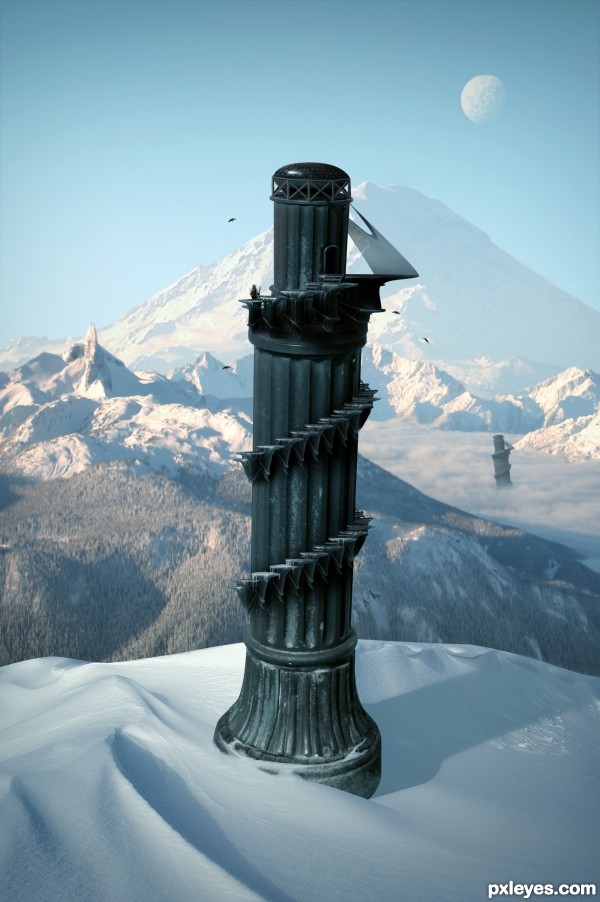
- Decided to go with a colder climate than the last image. (5 years and 3704 days ago)
Beautiful work... 
great great work 
Pretty fast submitted entry! I like the idea, you may want to mask the top of the pawn a bit better (some white edges here and there). Good luck!
Pretty good, but room for improvement!
Im not entirely certain, but wouldn't the shadow be bent outwards over the slope rather than inwards? - the shadow from the furthest tower is too dark in relation to the closest - and - maybe a little addition to some shadows from the terrain would help place everything better - especially from the mound covering the foreground tower as it's casting nothing...
Oh and the glare fom the bottom of the 'tower' it's not true to where you're placing your shadows from, so maybe get rid of it and add some highlights to the relevant side
Thanks for the comments.
Cool over all. I personally don't think the duplicate background towers add anything, however. Also, the palm trees look fake. And the hi-res version highlights the white edge around the tower's top and the fakiness of the tower-bottom and sand-dune edges.
The top of the tower still remains sharp and white spots are there . but this is a good image... you have to make some touches there... good luck...
Great but as above you could just try the matting controls, use the "layer" / "matting" from the top drop down menus and remove white matt or defringe to get rid of them, Then quick select and feather those edages slightly.
nice creation ................ i like it ........ Gl to u ..........
Thanks for the helpful feedback. Image is now complete.
Very nice, like the Pizatower, but in the mountains 
I like it! GL!
yeah a much better image!?!... GL 

i like the colder climate version!! great job!
This is why I don't participate in this contest 
Nice work, and well done, gl
Very nice, good luck 
Fantastic work author...IMHO u don't need other tower...any how this is great,high marks from me...best of luck
nice
Good.
GL
Thank you.
Super! It looks like the tower will fall out of the image at any moment 
Howdie stranger!
If you want to rate this picture or participate in this contest, just:
LOGIN HERE or REGISTER FOR FREE
(5 years and 3724 days ago)
That mask looks pretty good, I'd definitely do something about the hand and (folds for the) arm. Good luck!
I HATE HANDS!!!!
thx a lot wazowski but i think this is the best i can do. 
Very nice work. 
Love the head on this guy! He's scary!
It's great! Goes to my favs! 
excellent job.... 
I hate hands too  . Author, if you make some more red highlight on the sides of your character, especially the mask, he will look better. Your creation is very impressive
Nice imagination, great work.
Great creature...good luck author
You got taking a creepy face from a chimarrão cup! 
great job author ! very well done 
the hand need work, but this goes to my favorite
lol i also hate hands,nice work author the face is amazing 
great entry! GL
gl
Scary thing. The eyes are so nicely done 
Congratulations Oana!!
congratulations!!
congrats...... for the 4th
Congrats!
Congrats!!!! 
Howdie stranger!
If you want to rate this picture or participate in this contest, just:
LOGIN HERE or REGISTER FOR FREE
One of your best . The anatomy of this creature is just awesome! I suggest to do a bit more lighting, especially the side highlight, and darken the center part of the creature (which should be in the shadow area), so it will look more 3D. Also the shadow on the ground is not really accurate, but it's difficult to explain, it should be distorted more and straighten along with the light direction. This image is very potential, good luck my friend
fantastic entry, & I agree with langstrum .... slightly darker shadowing on the body near the back leg will make it pop out nicely....very well done author!
a great entry.am envy by ur creation...it really nice..
I do like how you take the source and create stunning new images. Not sure if the creature is a touch too sharp for the background? The blood is blurred but in the same focal plane? I would also tweak the shadows that are not touching the feet close enough. Still very very well done! Keep up the good work.
amazing! great colours!
W.O.W. That's all I can say. I agree with Langstrum...the anatomy here is awesome! Amazing work!
Wonderful work author . Some lighting and contrast work will boost your character
Great job, but there are a lot of parts with jagged edges and/ or white edges that need blending and smoothing. Also, one of the tube things on the creature's back is in front of it's face, and they don't look convincingly attached to the body.
I am very happy that it's you my friend., it's a brilliant and clever stuff.., hat's off for you..,
very cool work!
Thanks a lot for the nice comments and great suggestions guys,i made some changes,damn slight changes take me 3 hours... .....Again thanks for very very and helpful advices...
Simply fantastic! It seems it can walk on 4 and 2 legs as well. The anatomy is perfect (according to our imagination). and the crystal... the glow of the crystal is very realistic, it looks like a real gem for me. Amazing work, I'm sure it's top 3! GL!...
Great job......... wish u high marks ........
well done !! great work .. good luck
excellent perspective, amazing floor work, high marks to you.........
AWSOME ENTRY......!!!! WELL DONE AUTHOR....!!!
I'm probably missing it, but where does the source image come into play? Great job, btw. =]
Source image is used for some body parts of the creature and for the crystal...all is in SBS...
Oh my goodness, lol. I'm so sorry. I read the guide, it was amazing. You have such a beautiful talent. =]
Nice
Very nice! The floor is a good construction (minot thing; it's little pixelated). The shadows on the ground are all 100% vertical, but for example on the left paw the light comes from the right top, so the shadow should be pointing towards the left bottom, not straight down. Overall the creature is a very nice construction!
I want the crystal so I must get into battle
nice
(from the movie ALIENS)
Bishop: Not bad for a human.
Hudson: Let's just bug out and call it even, OK? What are we talking about this for?
Ripley: I say we take off and nuke the entire site from orbit. It's the only way to be sure.
Hudson: F#ckin' A...
Burke: Ho-ho-hold on, hold on one second. This installation has a substantial dollar value attached to it.
Ripley: They can *bill* me.
Ripley: [referring and looking into the empty doll head] Look, no bad dreams there.
Newt: Ripley, she doesn't have bad dreams because she's just a piece of plastic.
hehehehe
Congrats! for 2nd

Neb, didn't I say this work would be in top 3? Congratulations!
Congrats ...........
congrats erathion.

Congrats!!
Congratulations! Good job!
Howdie stranger!
If you want to rate this picture or participate in this contest, just:
LOGIN HERE or REGISTER FOR FREE