All source entry, given image and PS only.
Uploaded a High Resolution for your viewing pleasure. (5 years and 3866 days ago)

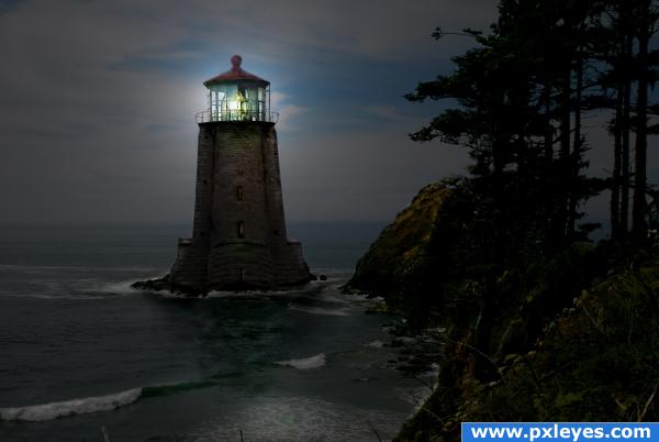
Resubmitted with a little touchup, pictures I took on the Oregon coast. (5 years and 3979 days ago)
Because the source pic is an up shot, the perspective is off, but the mood & color of your image is good. 

Nicely put together. Indeed, there are some perspective problems. You could reduce them with warping & carefully liquifying the top part of the light house so it will fit better with the birdhouse (the perspective from the birdhouse as part of the background is not impossible, who knows maybe it's some tower of Pisa  ). And I might have made the lightblue darker so you get more an idea of a nightscene. Good luck!
Beautiful image. Good luck.
Thanks for the comments everyone, wish I had more time with my schedule.
awesome!
Howdie stranger!
If you want to rate this picture or participate in this contest, just:
LOGIN HERE or REGISTER FOR FREE
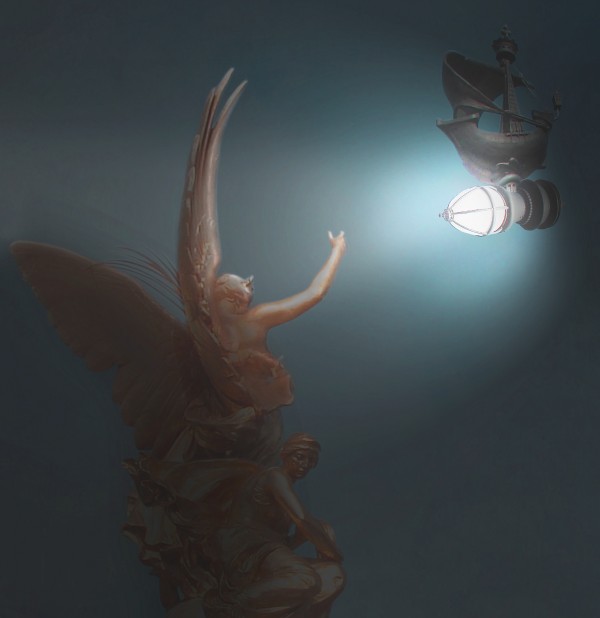
Such a great idea, but the angel part of the statue doesn't match your light source now. it's lighted from the left, it should be on the right. The actual placement is very nice though. Also everything is very washed out, if you exaggerate some lights and darks you would create a much more dramatic mood. And your new light should be the brightest part of your image, it doesn't seem to be the light source. I really love this idea, so seeing it evolve would be great!
I've made adjustments as per annabat's suggestions, hopefully it has improved the image. The changes can be seen in the step guide. Thanks for the helpful advice.
Added a little more contrast to the front of the standing statue Nator. Thanks for the advice.
congrats Rob!
Congratulations for 2nd
Congrats for your second place, Solkee!
congrats! for 2nd place.
Congrats
Howdie stranger!
If you want to rate this picture or participate in this contest, just:
LOGIN HERE or REGISTER FOR FREE