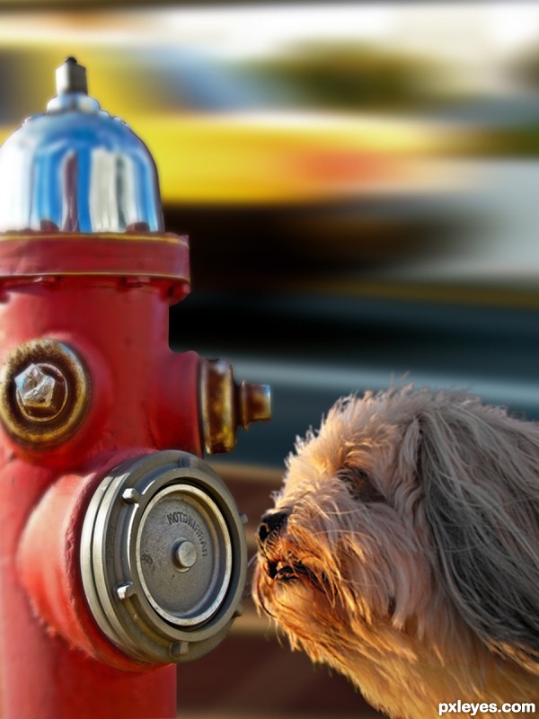
Gave a dog's photo near the hydrant. She smelt a new guy.
(5 years and 3357 days ago)
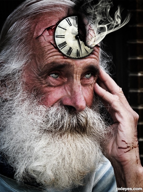
Can't provide SBS due to the fact that I forgot to turn the History limit up. Sorry!
Elements:
Smoke Brushes (Licensed)
Action essentials 2 crack textures (Bought/Licensed)
Clock Second Hand (Created it myself with Photoshop)
Please vote and comment. Thanks :D (5 years and 3365 days ago)
Very original!
Thanks ponti55. I appreciate your kindness.
Nice one!
Very nice concept author....best of luck
Thanks people. Actually I never knew that this would reach 300+ votes. Thank you so much! 
is that Father Time?  creative idea, maybe next time a Mother Nature would make us smile
Howdie stranger!
If you want to rate this picture or participate in this contest, just:
LOGIN HERE or REGISTER FOR FREE
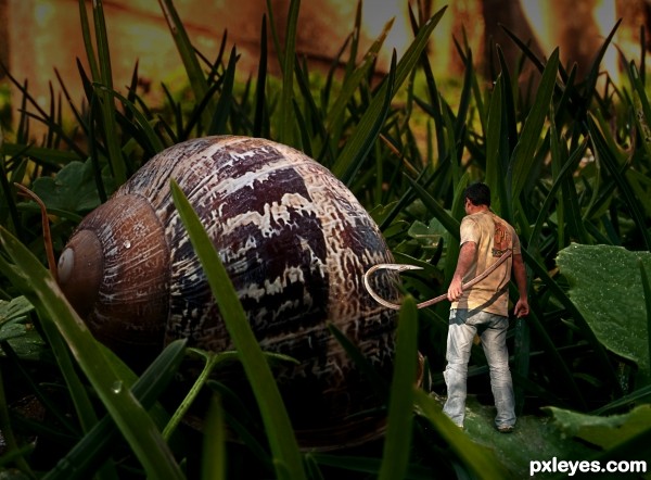
Own sources used (5 years and 3370 days ago)
Love the compostition here!
Interesting. I think your title may be missing a word, i.e., you meant 'Looks LIKE a tough guy' in recognition of the fact that attacking a snail is never a sign of toughness even if you are small. The snail does seem lit from the upper right while the guy is lit from the upper left, however.
very nice excecution.. good luck
Nice, so we're having escargot for dinner =)
Thanks for the comments  Title updated
I might have nestled the hook a little deeper in the fingers for the grip, but the piece is well chopped. I like it!
great piece of work author...mood is very good and feel of movement on a guy is so realistic...best of luck
Congrats again Abe 
Congrats man,great work...
Congrats for 2nd too
Howdie stranger!
If you want to rate this picture or participate in this contest, just:
LOGIN HERE or REGISTER FOR FREE
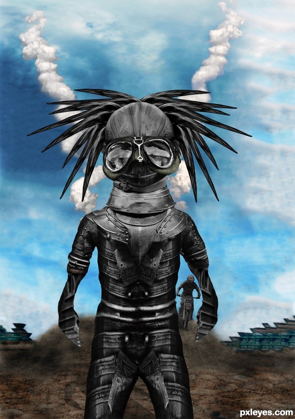
See SBS
The buildings in the back where created with the Content aware System in CS5 Extended on the Rusty Metal Picture
A good example of Content Aware in CS5 can be seen Here http://www.youtube.com/watch?v=NH0aEp1oDOI
;) (5 years and 3403 days ago)
Head's kinda big, arms are kinda short, hands look flat. Source link for sky is missing.
Not bad as creation, and if you wanted to distort the proportions on purpose, well done.
Is just that, when you do difformities, is better to explain in the description that it was by artistique choice, cause well intended people like CMYK might try to help and get undiserved thumbs down ( not that he cares, but you get the principle). Good luck man - i'll check Content Aware, thx 4 sharing.
EDIT: CAS looks like a Really Smart Healing tool, you should check that out folks
Head and the body are well made IMHO...love the background too very much...i know its to late now but would be great if u had the chance to do something with the hands...they look to flat now...any how i love this positive crazy creation...best of luck author
Cool black-beatle headed monster 
Howdie stranger!
If you want to rate this picture or participate in this contest, just:
LOGIN HERE or REGISTER FOR FREE
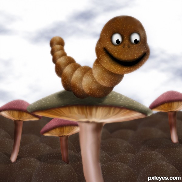
Just source used (5 years and 3524 days ago)
Cool!.... nice job on the shrooms.
ahaa..... it's you,.....you always have smart ideas and good PS skill to execute them.... this one is cute...
Very nice. Not sure if it needed the dark vignetting.
Wormington... hehe... nice name too! 
Very cute entry, I like the softness of the image. 
Great hob author...Wormington is very very cute...good luck
Cool job author 
ahhaahhaha awesome entry as usual author!
Cutie! 
Howdie stranger!
If you want to rate this picture or participate in this contest, just:
LOGIN HERE or REGISTER FOR FREE
nice chop but the blur doesn't really work for me...gl..
Author I think you should give the hydrant the same blur as the dog, they are about at the same depth in the image. Another tip for the dogs hair: they look a bit hard edged... maybe try if this works: open a new layer on top, select a small blur brush (3 or 4 pixels) then check "select all layers" on top in PS and go over the edges of the hair. You'll see they'll blend much nicer that way, it's worth the time you put in it.

But it's up to you, it's your image.
Thanks Toothpick134 for the suggestion.
I think you are mentioning hydrant cause the car with road and footpath without blur grabs away attention from dog. I tried hydrant mouth without blur, the prespective wr2 dog goes bizarre. Moreover that mouth becomes too prominent.
Suggestions are most welcome.
Don't blur the hydrant, blur the dog just a bit.
Thanks robvdn for a good suggestion on dog hair. I did changes using select-modify- contract and inversed it, then gave it a blur. It blended nice as you suggested. Toothpick134 intended depth correction, yet perspective remained same, out of match with hydrant. I tried to give hydrant's shadow on dog, then dog no longer looked the hero of image. Enlarged hydrant and perspective changed for worse.
 (
(
Changed shadow angle of hydrant and dog using soft brush, then car source image had to be changed because of its shadow angle. As CMYK46 suggested, I tried to keep hydrant as it is and blurred the dog a bit, it seemed the dog is looking at somewhere else and not at hydrant. also the hydrant becomes too prominent. Thanks CMYK46.
I couldn't find a good background better than this car at such angle as hydrants used to be adjacent to road and regrets, couldn't find a better angled dog smelling intelligently.
Finally, I think, oopps, was it wrong compilation
dog hair edges have green color no need that, beter same background color.
[only edges]
Idea is nice and images fits together but u could make it even better...Blur is still to big IMHO, and u should work on that a bit more...As for the dog,use small smudge brush ,strength around 80 to create basic fur on hard edges part...be free and loos your hand when u do that...then u will get the best result. After basic fur play a bit with the size of the brush to make fur even more realistic. Now is good but with few adjustments this could be very very good entry...best of luck
I am with CMYK on this one
If it was up to me I would scrap the background and use the original background of the dog. I would expand the background a bit horizontally and finish the base of the hydrant and place it in the background. Making sure to match the depth of field to the surrounding area where the hydrant is placed. Good luck!
Thanks Chalty for the suggestion. I appreciate that.
@robvdn. I saw and realized, then decided.Thank you very much, I done the changes as you suggested.

@Toothpick134, hope the reduced blur confirms your comment. Thanks for pointing it out first.
@CMYK46, you suggested an altenative, thinking I may accept any one. Thanks. I did changes with first and for me, it came out nice. Thanks CMYK46.
@Sanjugs, Thanks for the minute observation on hair. I did the work as you and robvdn suggested. Hope the changes are satisfactory.
Hi! erathion, thanks very much for your ideas. Best was your 80 with smudge. robvdn, I think it is about version.
@Mario, Thankss for pointing out.
@Chalty669, Thanks. I wanted to put my hydrant on roadside. So I didn't try the grass.
Howdie stranger!
If you want to rate this picture or participate in this contest, just:
LOGIN HERE or REGISTER FOR FREE