
All made up from source, agree after seeing it posted that the inside needed to be darker. (5 years and 3665 days ago)

as well as using the source`s, I added the red and blue channels in spotlight, lighting effects & added shadow to the tape.
set water brush layer to overlay and added gausssain blur to make it more realistic. (5 years and 3669 days ago)
I like the idea very much....
nice idea...good luck
...and was on the phone with them when she got butchered?
Great idea......GL
Howdie stranger!
If you want to rate this picture or participate in this contest, just:
LOGIN HERE or REGISTER FOR FREE
(5 years and 3708 days ago)
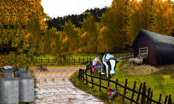
Compared to the size of the fence the rooster looks enormous. You might want to resize it.
cool...
Thank you - I re-sized it 
Oooh! Another cow! I wish that I'd seen the huge rooster before you resized it!
Do you have stolen the other idea?
Nice try....
looks better
On the left, cloning stutter is extremely obvious on the trees, try to work on that. Good luck.
Howdie stranger!
If you want to rate this picture or participate in this contest, just:
LOGIN HERE or REGISTER FOR FREE
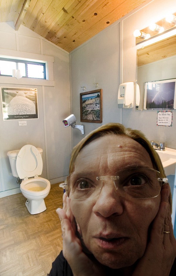
STOP the spread of toilet cams. (5 years and 3748 days ago)
I don't think the person in the room really fits. It seems like the image would be better without her.
I think it's kinda funny!
the title would certainly be meaningless without her..........
superb dada..with a twist on the surreal... great job author
Thanks for the comments everyone
Ha-ha-ha, what a funny expression! 
lol funny
nice 
Howdie stranger!
If you want to rate this picture or participate in this contest, just:
LOGIN HERE or REGISTER FOR FREE
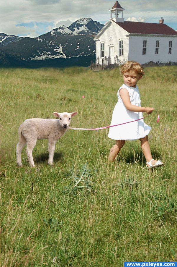
This will be stuck in your head forever. :)
This was mostly just blending.
thanks melbia for girl pic, and has been notified.
Thanks general2 for school photo and has been notified. (5 years and 3857 days ago)
Great, sweet image with excellent blending of sources. One suggestion...either change shadows of lamb and girl to match direction of shadow on steeple or remove roof shadow and match that to light source on girl and lamb. Might be easier to remove roof shadow and create new one. Does that make sense??! In other words, make ONE light source casting ONE directional shadow. 
EDIT: Looks 
good catch thx
How sweet  That was the first english song I learned
  Just a few things: Maybe you can work a little bit more on the leash, it looks broken and on that place, where it looks broken is a strange blur. It's between the lamb and the girl. And maybe you can also try to cut out the lamb a little bit better. You can see the former background around the lambs legs. There's a piece on it's foreleg and a big piece on it's hind legs. But other than that it's a really sweet composition
  Good luck!
Other then the break and the wierd blur in the middle of the ribbon its cute 
extremely cute
 Great piece and some nice blending. The perspective is a little off on the building, mostly noticeable on the wall closest to us. If you're using photoshop you can warp it into shape. Also the top edge of your mountain is too sharp. Add some haze over it and blur the top edge to give the piece more depth. You can use an eraser with low opacity and high falloff to blend the top into the sky more and get a little color bleed/light wrapping going on. The back edge of the meadow is also too blurry. Try breaking that edge up a bit more. Keep up the good work!!
granted you have been given some very grand suggestions from some of the best of the best of this site... but you know what.... you captured the image of the song in total perfection... (I'd give you 100 score but I'm a bit of a bastard LOL) great work (don't worry.. high marks ... giggle snort)
wow!its so adorably cute.wat a cute tot.u need to blend the background properly
This is so cool! Right on theme. High marks 
Great work..so clever 
Good improvements! Looks much better now  Good luck again!
Sweet image.
Congratulations 
Howdie stranger!
If you want to rate this picture or participate in this contest, just:
LOGIN HERE or REGISTER FOR FREE
good idea -- the cut edge needs some thickness and I think a bit more shading would give the inside some more depth
very different
good
For some reason, i love this..Gl
nice ... cool reflections
Howdie stranger!
If you want to rate this picture or participate in this contest, just:
LOGIN HERE or REGISTER FOR FREE