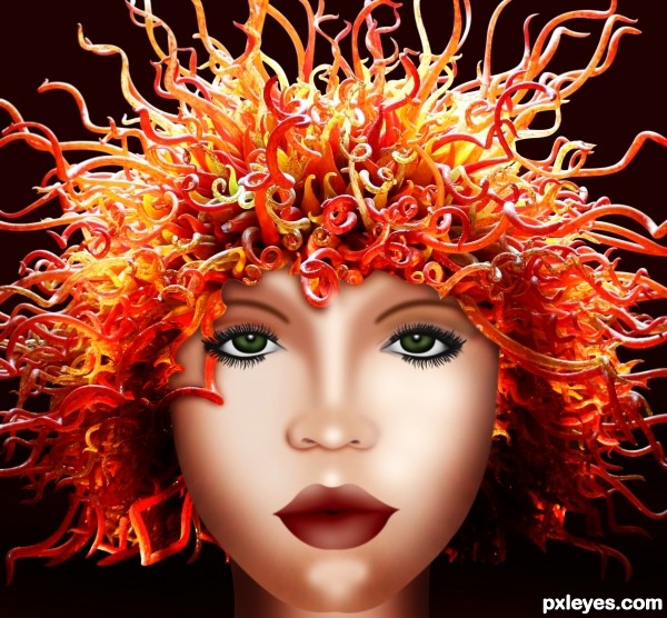
(5 years and 3323 days ago)
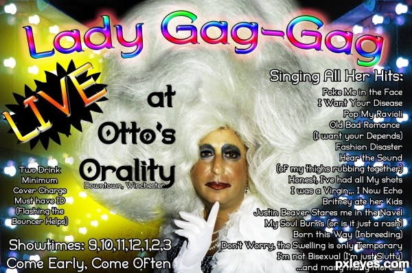
Really must be viewed in High Res (5 years and 3440 days ago)
Pretty funny.  I like some of the songs. ("inbreed" is one word, though)
Thanks kyricom, CS5's spell check doesn't work all the time.. I'm on it 
EDIT: Spelling error corrected all done
Great parody, but too much text.
Less is more...
Fabulous humor author...If u put this poster on a door of some night club i am sure that will be crowd that night...
LOL, I can tell MossyB you've never been to a drag show, It actually doesn't have enough text or pictures, the busier the better, (If you can include an entire story on the advertisement you get extra point  .. I used to have to make wall banners 6 feet long and 4 feet tall, and they would have more text then a Best Buy advertisement
  (Drag queens HATE any blank space) THANKS!!!
Hilarious and just too precious for words! Oh la! That hair .... oh that hair!
OhMyGawwwwwwwwwwd!!!!!! Too funny, and that copy on the right - I'm sure it's perfect! LOL, who does "herms" hair?!!!
really good
really good
Howdie stranger!
If you want to rate this picture or participate in this contest, just:
LOGIN HERE or REGISTER FOR FREE
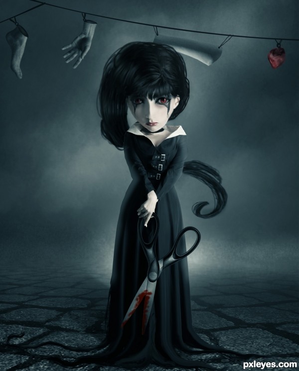
(5 years and 3441 days ago)
The neck area looks kind of wonky - The really dark shape beneath the head makes it look like the head is floating, and it doesn't look at all like a shadow...Nice job on the background!
Very good 
The general mood, the colors and theme is nice, it's some details which could make the entry more finished. That's imo mostly the hair, that looks a bit too roughly drawn compared to the more clean rest of the images. Pay a bit longer attention to it, perhaps you can add a blending layer (with mode multiply) to make the dark parts a bit darker so the hair looks somewhat more smooth. Or just use a tinier brush to get thát detail which make the image more like a whole. Same story would be for the strings. Perhaps here and there the edges from the suit can be a bit softer too. But for the rest I'd think that Tim Burton would like this  .
.
@Mossy: not sure, but maybe the dark shape you mention is not necessarely a shadow but some kind of necklace?
Author, good luck!
Other than maybe make the right side of the head the same shape of the left (since she's staring strait out) it looks like her head is deformed but other than that, this is still one of the best entries I've seen. Fix that and I think you just might have a winner. GL!
I tried to fix the most critical parts, really thanks for you guys for making me know.
with few little adjustments this could be a fantastic image(mostly the hair)..but having said that, i really like it..the mood is great..goes to my fav's..good luck!
I really like this image! I couldn't really tell what was on the right side of her untill about the 5th look. Also not sure why you added an sbs with just one background image?
like the concept very much..., good luck author
love this, good luck!!!
Gruesome little thing isn't she. Has a very doll-like quality to her which makes it more impressive considering the scissors and the clothsline! Love the concept!
congrats on a well deserved 1st place
Congrats for the first place !
Congrats, this is really creepy 
congrats very nice work.
congratulations...
Congrats!!
congratulations...
Congratulations darling, you deserve it!
Howdie stranger!
If you want to rate this picture or participate in this contest, just:
LOGIN HERE or REGISTER FOR FREE
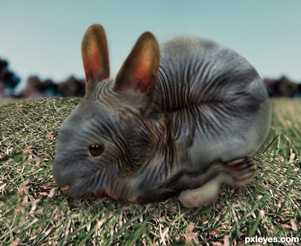
(5 years and 3479 days ago)
Not bad with using the cat skin for the bunny, but I'l strongly recommend you to get rid of the shadow-ish outline. It makes the bunny flat and not part of the background. Good luck!
Nice idea author...Also u could use big soft black brush to create some shading on the skin to create some body curves....gl
Howdie stranger!
If you want to rate this picture or participate in this contest, just:
LOGIN HERE or REGISTER FOR FREE
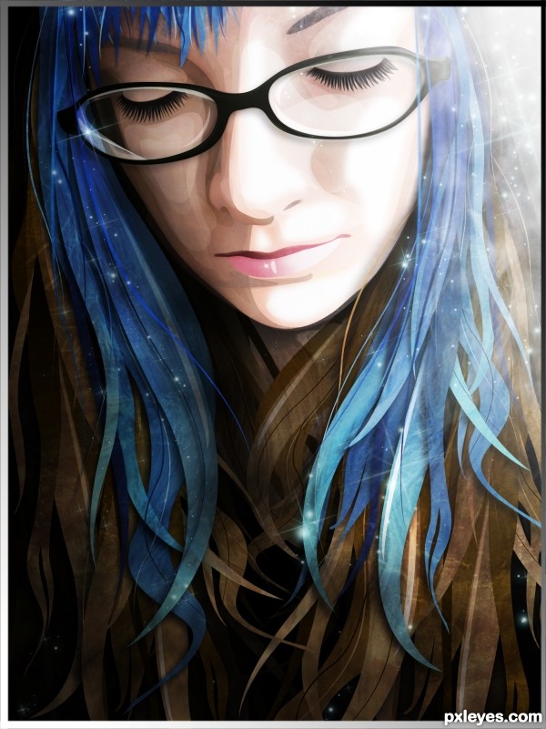
I took a picture of a friend of mine and made a vector of it. Lots and lots of pen tool used to select areas and fill them with color. The only source used was the picture of my friend that you can see in the step by step. (5 years and 3531 days ago)
GREAT!!!! I love it! GL 
This is really sweet! Good SBS, too...but IMHO step 10 is overkill. Step 9 looks great.
Stunning work. All that time with the pen tool paid off, this is awesome!
Really great job! Very nicely put together..
great first entry, good luck!
siuper!!!
Stunning, love it...x GL
it is amzing and so sweet ,good luck
Stunning work and amazing finished image. Your friend is a very lucky person to have someone create a lovely image like this for her! Hi marks from me and a fav! Very good SBS too ...IMO.
Wow! Just curious, how much time did it took you to so this? Seems like hard work.
Thanks everyone, Arca yeah my friend was very excited! and Greymval it definitely was a lot of work! I kept coming back to it for about three days before I was satisfied 
fantastic work author.... Superb entry
WOW, Great work!
That is awesome!
Wow!!! Love this creation. I will have to try to do this with my picture one day. The little stars are a perfect touch, and I like that her eyes are closed, just magic all around.
This is absolutely beautiful. I love how it looks like she's porceline. Its so smooth and shiny looking! The colors are magnificant. Great, great job, author. I too want to try this someday 
mind blowing...very high marks from me
great .......... 
Very well done anime! Fabulous design. GL! 
Congrats, a stunning piece of work 
Congrats for your first place, Robart!
Oh YAY, Congratulations, definitely deserving 
Congrats...
Thank you for the high marks guys 
Congrats!! Beautiful work!
Howdie stranger!
If you want to rate this picture or participate in this contest, just:
LOGIN HERE or REGISTER FOR FREE
very cool work author...is she new r'n'b star?...lol...best of luck
very well done, great sbs
Howdie stranger!
If you want to rate this picture or participate in this contest, just:
LOGIN HERE or REGISTER FOR FREE