(5 years and 2846 days ago)
(5 years and 2863 days ago)
Lol funny entry :P great blending as well! Good luck.
Thank U very much 
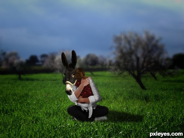
Nice idea. I like the fact that the tree trunks have the same inclination as the man's body.
Just pay more attention to your masking. The man's edges seem transparent, at his legs there is a white rim, the donkey's head where it meets the sleeve looks transparent too. Also, do a better blend for the girl's head where she touches the donkey.
thanks for the advice' now it's better? 
very funny 
thanks
Yes, it is much better now. As a final touch you can add little shadow where the girl's hair meet the donkey's face. You can also use the smudge tool to add some hair there, so they look more natural.
now it should be OK right? 
Very good!
thanks
Howdie stranger!
If you want to rate this picture or participate in this contest, just:
LOGIN HERE or REGISTER FOR FREE
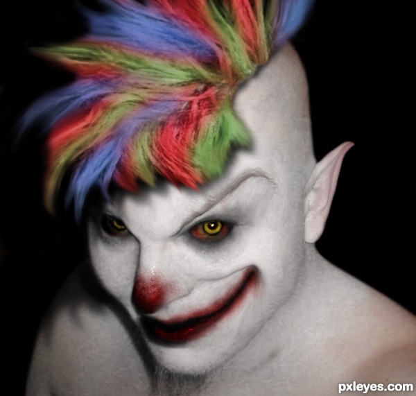
Mr. Happy, the evil clown. (5 years and 3035 days ago)
The skin texture by the mouth and eyebrow look too obviously liquified. You might try cloning the skin from other areas back in there to minimize this.
No, its ok.
Wanted it to look that way. Obviously deformed. Evil.
Thanks anyway
what he means is, the stretched pixels look like they have been stretched in Photoshop a little too far, it actually distracts from the images creepiness
that and general burn/dodge on the hair could be used
This is creepy good!
love how you made the eyes, Congratulations on third 
Howdie stranger!
If you want to rate this picture or participate in this contest, just:
LOGIN HERE or REGISTER FOR FREE
(5 years and 3066 days ago)
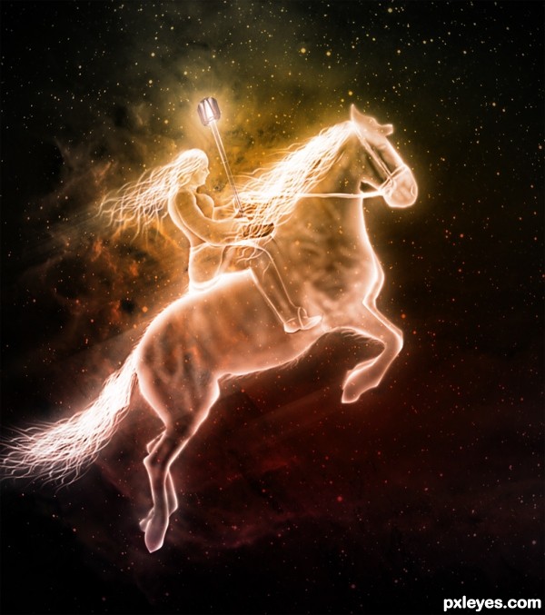
nice work. i think that might use a tint of blue
awesome...really nice to see what you came up with using an image most would find useless...great job and good luck
Sbs!!!!!!! Good job
ohhh I love it...though I would get a heart attack seeing this rider on the sky from my window :P
Is really nice but so a poor usage of the source image...
Lots of work here, nice outcome, author! 
Howdie stranger!
If you want to rate this picture or participate in this contest, just:
LOGIN HERE or REGISTER FOR FREE
(5 years and 3074 days ago)
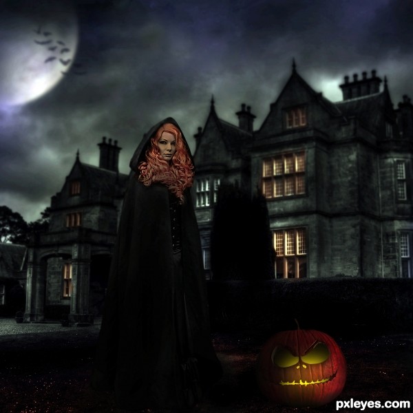
The lighting is too dark and inconsistent. What light source illuminates her hair and face so much, yet everything else she's wearing is matte black except for the tiny buttons? Moody is one thing, but the lighting needs to have some small modicum of realism...
Dear Mossy, i have followed your advices and hope the light is better now !
very nice love the scene just one thing.. the pumpkin has no back? its just a mask looks like it... because u see the background right thru it.. other then that very nice and high marks.
edit: thats better author 

Thanks Eladine, oups it's true i made a mistake !! I come back with a real big pumpkin !
nice work although I do find the shadows conflicting
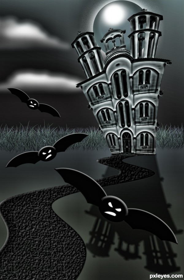
Beautiful witch castle 
Howdie stranger!
If you want to rate this picture or participate in this contest, just:
LOGIN HERE or REGISTER FOR FREE
Very clever use of source. I like this, and I was surprised to see it was U for reasons I can't say just yet =)
I loved this one!
Very spooky and ready to trick or treat....... gl author.
Very clever, love it, but love the colors in step 8!
Howdie stranger!
If you want to rate this picture or participate in this contest, just:
LOGIN HERE or REGISTER FOR FREE