(5 years and 3320 days ago)

(5 years and 3378 days ago)
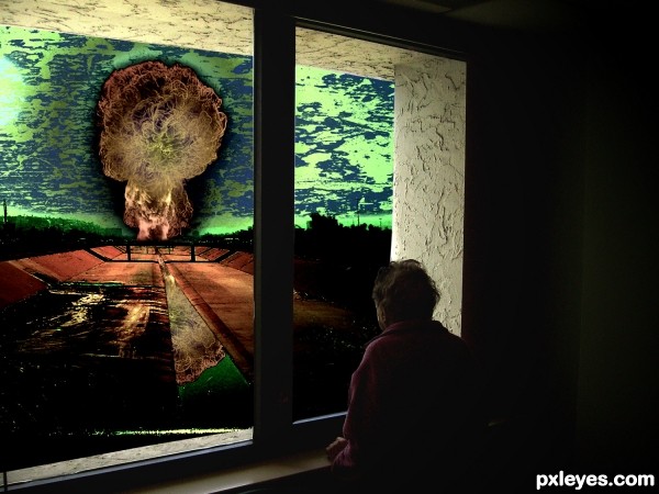
Good concept. The black outline around the explosion detracts from the impact of the image IMHO. It should be a glow.
Try to fix your link so it leads to the brush or brushes actually used.
Story:
"The old man was looking through the window and he was seeing..nothing, cause he was already blinded by the flash explosion a few seconds ago." 
Imo, windows would be broken from the exp. at that range - but anyways, i like the concept- imagine staring at an incoming tsunami.
agrees to greyval.. hahaha lol 
very very nice work author...reminds me on inevitable...Val's plot gives depth to your creation author...best of luck
It's a creepy story... and mankind is not far from there if we continue acting against life.
Looks like you color inverted the window part ?
Hmm not sure if it helps the image but anyway good luck  !
!

Howdie stranger!
If you want to rate this picture or participate in this contest, just:
LOGIN HERE or REGISTER FOR FREE

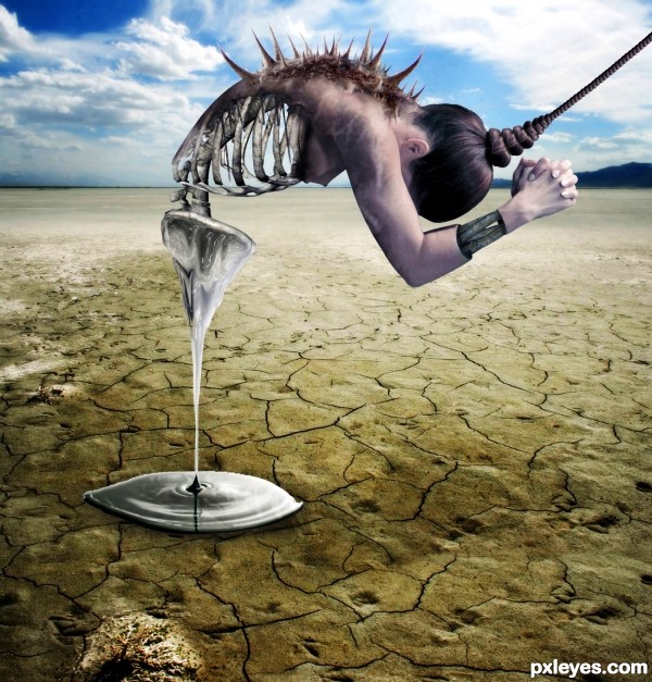
- I want to thank to Marcus Ranum (mjranum-stock) on DA for the nude model image
-Thanks to thank to markopolio-stock on deviantart.com for the skeleton image
- Thanks to http://night-fate-stock on deviantart.com for the desert image
- Thanks to sabinki on sxc.hu for the ripple image
-Thanks to dreamweaver69stock on deviantart for the crow image
(5 years and 3460 days ago)
Soften the hard edges on the figure...otherwise it's a fine image. 
Ok thanx:]
Very nice...Great imagination, but the blurred crow is distracting
I was not sure about the crow too..got rid of it...thanx
I think you should have done the arms the same way you did the back (symmetry).
Other then that....... IT'S AMAZING!!!!
highest score for me :3
ohhhhhhhh i love this  geesh some of you have incredible minds
just my opinion...this needs a little more color...saturate it a little and it will really stand out more
great i loveit
Thanks for your opinion...I changed the saturation
AWESOME !
 GL
GL
Lovely work, imaginative concept and great compostition! Definately high points from me!
Terrific composition, the top edge of your puddle is a little jagged 
Very good scene. Think you should remove the hole on the bottom left.
Whow!! GL 
I can't find any credit given to the nude model author... other than that... great image!
Opps! u r rite. Actually I put it in the wrong text column..Ok, just changed it..thanks for reminding
Amazing imaginary author...idea is top notch,and execution is perfect...I like a lot dripping substance...well done
superb creativity........
thumbs up for u
Nice 
just amazin n superb conceptulization out of the sources ..... the sliced n ripped handzzz r cool ..
the best part i luved is the drippen sub frm the creatures pelvic n d puddle beneath
gud job author
gl
truly terrific job.., Good luck
great work ........ 
Very innovative and truly awsome.....how on earth can u imagine such creations....keep it up 


great job  nice blending, gl
superb 
What I said on your "other" entry! Wow. You are really dangerous with sharp objects
Great work. You aré a winner
Sadness.....Pain.... Creativity....everything is here. Author, you have the imagination of an Artist. Thank you for posting....good luck.
Amazing! Great idea with making the back thorny! 
very good idea, good luck!
Congratulations for 1st..... Good luck in your future entries...
thank you
Gongrats on first place
Huge congrats buddy... lookin good 
thanx m8 :]
Congrats on a great win!
Congrats for all 
congoooooooooooooos 
Congratulations for 1st place
thank you :]
congrats on ur win...u really deserved it
Congrats, awesome work 
Congrats!!
Howdie stranger!
If you want to rate this picture or participate in this contest, just:
LOGIN HERE or REGISTER FOR FREE

(5 years and 3534 days ago)
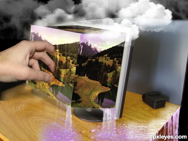
There are some very good parts, but the overall image looks quite messy and it's difficult to grasp the concept. I would lose the ground from the 'roof' part and leave only the clouds hanging there. Could also help, if you would blend only a finger or two of the hand into the 'screen' .. Cover the black background with something and fix the blurriness of the table and screen from the left side - and the perspective for the table - and this will be a good one.
ok widiar i have make the changes that you adviced me to .thanks for taking the time to give advice and not to criticies like many are doing here instead of helping and learn from eachother .thank you
Whoa, that was quick. There are still some minor tweaks, but let's wait what others have to say. Looking a lot better into my eyes already, now it's easier to grasp the idea of your box and screen. I like how people are innovative and try new ways of creating OOB images, this is one of the good tries. Remember we only give suggestions according to our taste, thou sometimes there are some 'laws' like with lightning and shadows. I always appreciate when ppl try and improve the pictures. You can always say 'I tried, but it didn't work or made it worse' for my comments, I'm sure some of my/our ideas sucks totally when we see the end results 
I know you made a kind of popup image from the monitor screen. But IMO I think the flat image would be better, now it's a bit confusing to me. The effect of the hand get inside the screen is very good, but as Widiar said, the top is noticeable only in hi res. Of course, it's your entry, and doing (or not) the corrections is up to you. GL! 
I really like the idea here, but I didn't really understand what was happening until I went to full view. I think its because you used different angles from the same shot. What I'm trying to say is it might look better if you didn't do different picture angles and instead used the normal shot and tried to make a glass box instead. I can visualize it in my head and would love to try it, but it was your idea and I wish you luck with it.
ok im gonna try to fix it i do not understand the glass box butt ima try som thanks
wow, this entry is getting ripped to shreds by comments...gosh, give the author a break...very interesting idea author
Just trying to help.. for me this is one of the best ideas so far on this contest. It's a sign of a good entry usually, if people comment it a lot and give ideas to make it even better.
thanks widiar thanks to every body for taken the time i hope its better like this
Howdie stranger!
If you want to rate this picture or participate in this contest, just:
LOGIN HERE or REGISTER FOR FREE
Woow Really nice effect!
  Do you mind sharing how you got this nice golden effect?
 Good Luck! Great Entry!
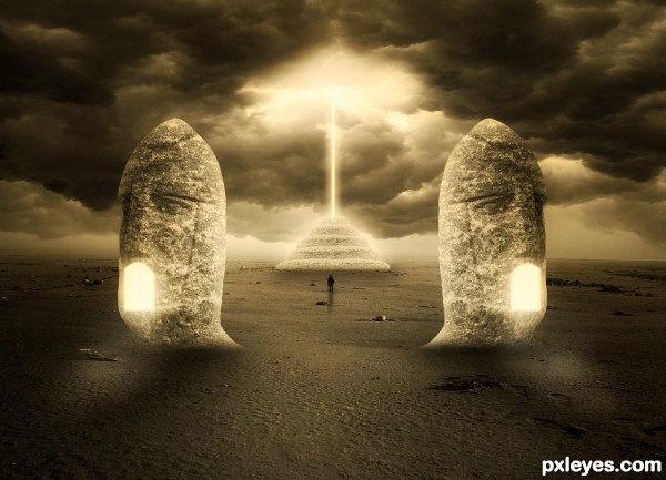
IMO I think this would look allot more professional and simply better if you smoothed out the edges on the 'mouth' of the statues where the light is coming out... I just think they look really sharp and therefore not that realistic.. but hey that my opinion
good eye..Patrick(Toothpick) Your opinion is very good. Thanks !And I made changes.
@Do you mind sharing how you got this nice golden effect?
-Umm I do not mind. I want to make SBS for this. But...I'm little lazy for this. So sorry.. mate.
Nice image... 2 time fav
Ohh thats much better Good Luck and one day when you're feeling extra hard working make a SBS
  Good Luck!
Really nice effect, but the "light" emanating from the mouths SHOULD be casting some illumination on the ground shadows in front of the statues...Light is funny that way, it spreads.
Thanks MossyB for your suggestion. I fixed it.
Ohh I'm shocked.. this entry should have gotten higher marks.. Ohh well better Luck next time! Keep up the good work!
Thanks Toothpic for the appreciate.
Howdie stranger!
If you want to rate this picture or participate in this contest, just:
LOGIN HERE or REGISTER FOR FREE