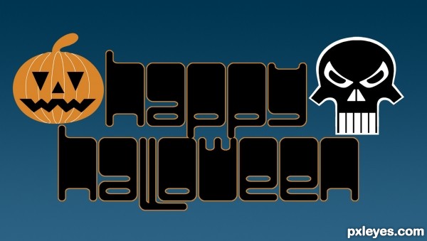
This was supposed to go into the Typography contest, but there was no room. Everything in the image was created from the fonts shown in the SBS. (5 years and 3438 days ago)
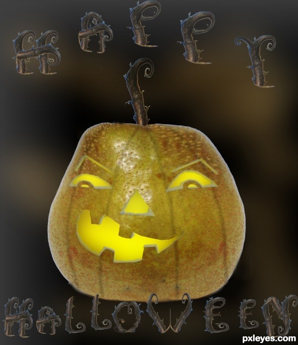
I have not been around here for a while so please let me know if I missed something critical (5 years and 3447 days ago)
Give the pumpkin some thickness.
thanks I did that
Looks better...GL! 
well done for trying to keep the source colours in tact but I think it needs a little orange boost to make it more "pumpkinyfied" (I have the patent on the word) ...... at the moment it looks a little "appleyfied" (also my word) lol..... best of luck author 
Now that is creative thinking! good job
thanks! 
Howdie stranger!
If you want to rate this picture or participate in this contest, just:
LOGIN HERE or REGISTER FOR FREE
(5 years and 3493 days ago)
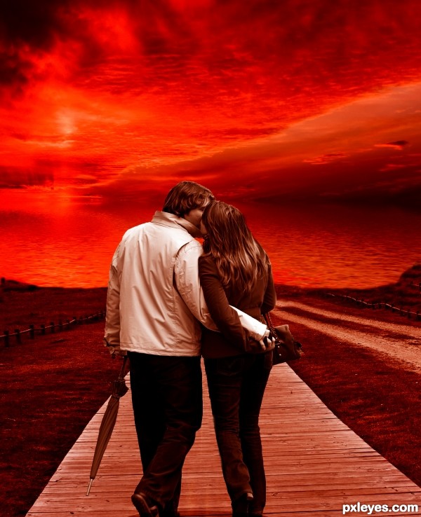
I completely loved your picture.
Perfect mood. the colors are amazing.
Congratulations
Great job author...well done and good luck
Nice But no shadows ?
sigh chuck
look careful then u wil see besides try to answer where is the light coming
Howdie stranger!
If you want to rate this picture or participate in this contest, just:
LOGIN HERE or REGISTER FOR FREE
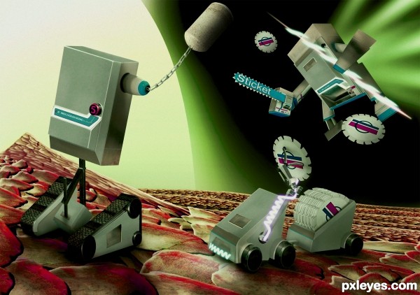
Source only used
Have to see in high res the smaller one looks kinda funny. (5 years and 3501 days ago)
Detail is flawless....
(LOOK AT THE HIGH RES PEOPLE... THE LOW RES DOES NOT DO IT JUSTICE)
love the wacky bottle cap thingies 

As slush said., watch high resolution before voting..,  author.., well done
amazing job author...great details ...very well done...
Really great work! Amazing - as others have already said. GL
Oh man, this is so so so so good...it's perfect! I love how you managed so well to keep the general form of the ticket machines...
very nice work 
I like your idea.... good luck.
This is great! Perfect and funny! 
superb .......... 
awesome!
Very whimsical usage of source, I love it!! You did an awesome job with this a definite favorite with me!!
great idea & great work author . i like it ... g l
Thanks for the comments  ya the low res pic makes it look like crap lol Doh
robo specialist....  .., congrats for ur 4th place
LOL 59.8 I need to re-think even starting a image for this site. Sorry to say but its vote by numbers here the winner is R2D2 with ref. the ref being google image search from google. lol well I guess I know now that WTH why make a image when I can just puke up a old one. the voting needs to be looked at.
Aww man...this is way better than the second and third placers...  Sorry, ironcow.
Well, the third place is actually deserving, pardons to nasirkhan. But this definately deserved second.
Howdie stranger!
If you want to rate this picture or participate in this contest, just:
LOGIN HERE or REGISTER FOR FREE
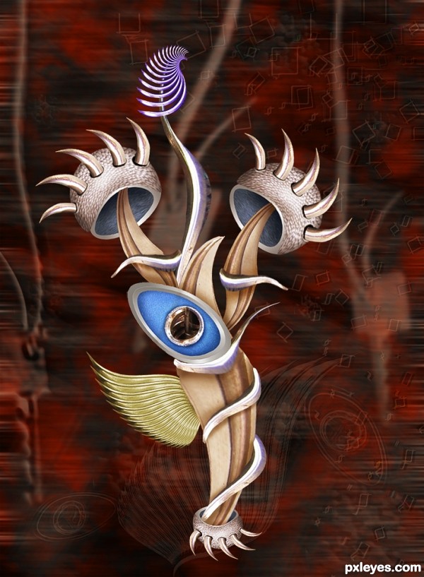
Only source (5 years and 3510 days ago)
very nice work, love d background
It's a very wonderful abstract masterpiece! If I were a sculptor, I'd make a sculpture right now, based on it (crediting you, of course). 
very cool shapes author...best of luck
Well done, I like the contrast between hard edged shapes in the background and the more organic shapes of the object.
very abstract....nice work!
Nice, looks like a strange dangerous flower! 
wow i love this image looks great
i like it and i don't know why ,good luck
Great Job! Abstract - my favorite :- ) All the bsest and Good luck!
Howdie stranger!
If you want to rate this picture or participate in this contest, just:
LOGIN HERE or REGISTER FOR FREE
Great creativity on creating the pumpkin and skull!
fab fab fab fabulous !!!!
I like it, very nice.
Fun. However, the white on the skull makes it really pop out and overpower the text which I think should really be the focus. I would replace the white with the pumpkin's color and maybe replace the stroke around the text with a brighter (and possibly thicker) color.
Howdie stranger!
If you want to rate this picture or participate in this contest, just:
LOGIN HERE or REGISTER FOR FREE