(5 years and 3229 days ago)

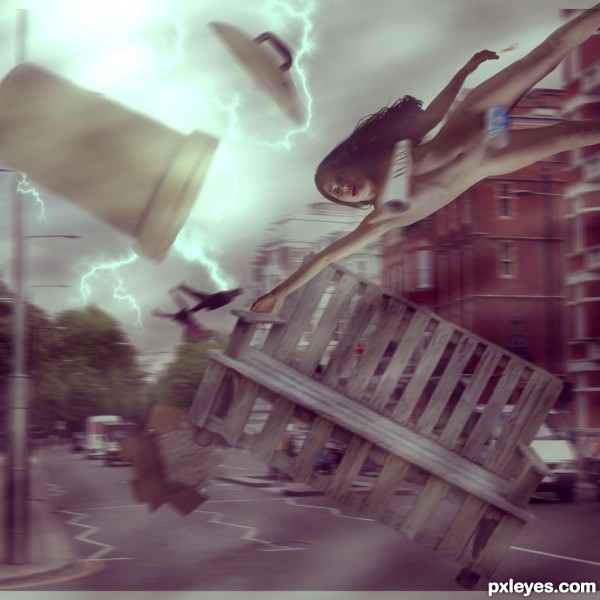
skimpy clothes in a tornado/hurricane is a bad idea... and remember it's not the wind that kills you it's the stop sign going into your splean! (5 years and 3568 days ago)
idea is good. more sharpness needed( now all the objects are bit blur)
If a truck or even a cow can be carried away for a tornado, imagine people! We are nothing against the power of Nature... 
think hair shud have been more disturbed n flowin
blow away some vehicles too(not necessary ..jst a suggestion..if it wrks!)
nevertheless idea is good
nice description 
gl author
Howdie stranger!
If you want to rate this picture or participate in this contest, just:
LOGIN HERE or REGISTER FOR FREE

source and my photos (5 years and 3632 days ago)


Who? You? 
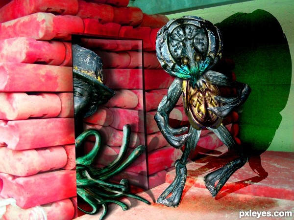
 good but there is something strange with the door
hahahahah very cool author
Shadow at right is wrong.
Yikes.. does anyone else smell the HUGE scent of "Auto-epistemicism?
There is a gap in the arm of the figure one the right, it's particularly obvious in high res, i don't know if it's deliberate or not. Good imagination.
Anyone smell the equally noxious scent of DENIAL? The shadow is wrong. It does not show the open space between the arm and body. Elementary.
There's that smell again.. smells like booze and dirty socks
Wrong. Shadow. Period.
Now where did I put that Febreeze... I should have a left over citronella candle around here somewhere... PU
FANTASY. Period. which means I can do anything I want.. so.. 


Is he gonna be normal?!?... ...fabulous head u made for the poor thing author...
Great entry !!! all freekyDeeky!!!!!!!!!!!!!!! G/L
Howdie stranger!
If you want to rate this picture or participate in this contest, just:
LOGIN HERE or REGISTER FOR FREE

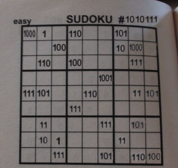
a sodoku puzzle from a book. i got the 0 from the page number. i can't put another pic of the original but i can tell the numbers.
8, 1, 6, 5 on first row
4, 2, 8 on second row
6, 4, 7 on third row
9 on fourthrow
7, 9, 6, 3, 5, on fifth row
7 on sixthrow
3, 7, 5 on seventh row
2, 1, 3 on eighth
7, 5, 6, 4 on last row (5 years and 3740 days ago)
I suck at regular sudoku - this must would kill me....aaahhh....very clever  GL
GL
you need to work on some numbers there.. they got white color in '0's and some show a background.. use stamp tool to clear the old numbers and write the new ones and then play with blending modes to make them look natural... then it'll look good..
and yes.. this would be the toughest sudoku of all times.. 
I love sudoku, but I don't know about this one... 
The number after # needs more warping, and I agree with Iquraishi about white color behind the changed numbers.
Clever idea, I would have never thought about that. I like this one, but I agree with the background of the numbers, maybe if you had cut out the numbers and then used color selection to get rid of the white it would look better. And with the 111 at the top of the page, underneath you can tell where you covered up the numbers, maybe try using the clone stamp and going in a straight line from the top of the page down over the numbers to give it a better blend. But like I said, love the concept and I do like this entry 
Howdie stranger!
If you want to rate this picture or participate in this contest, just:
LOGIN HERE or REGISTER FOR FREE

(5 years and 3827 days ago)
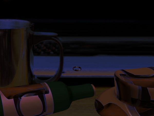
What's the floating ring thing? Handle of cup needs better edges...
I can't really see anything.....
Howdie stranger!
If you want to rate this picture or participate in this contest, just:
LOGIN HERE or REGISTER FOR FREE
The lower part of the worker seems transparent.
nice work author
good luck
Lovely work author! best of luck!
Howdie stranger!
If you want to rate this picture or participate in this contest, just:
LOGIN HERE or REGISTER FOR FREE