(5 years and 3846 days ago)
(5 years and 3866 days ago)
Very nice.
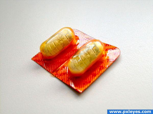
MUST be seen in high res. I didn't see what was inside until at first. Wonderful idea!
Good job, but the capsules and casing look blurry when the image is viewed in high res.
omg... I'm woozie just thinking about what would happen.. OY!!!! great IDEA
lol, wouldn't want to swallow one of those 
lol
Funny idea and good blending! They help for sure against headaches... There's nothing that can hurt, when you don't have a head at all anymore, right?  Good luck!
Good
There have been times, when I've had a migraine, I might have considered these. lol
Howdie stranger!
If you want to rate this picture or participate in this contest, just:
LOGIN HERE or REGISTER FOR FREE
(5 years and 3870 days ago)
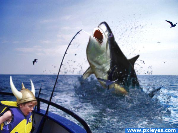
Its an interesting idea - but the shark is a little too blurry in my eyes. I would have another go at cloning out the part of the sky next to the sharks head. You can see the pattern forming there.. GL.
Boy's expression is perfect! Shark is too blurry. Bet you could find a better one to use with better lighting too. Good luck! 
Mummy, get the frying pan ready!  Idea is good, but I have to agree with the others. Maybe look around for another shark that's not so blurry?
the kid's face is priceless 
Howdie stranger!
If you want to rate this picture or participate in this contest, just:
LOGIN HERE or REGISTER FOR FREE
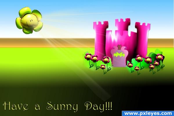
This is for all the people on here that use DA images..... it shows just how bad we are at drawing lmao...
I have used only source for this image and gradients in the background.... not one of my finest images but with such a debate going on at the moment about people using DA arts, i thought i would show why I use them :) (5 years and 3882 days ago)
very cool!! i love it
Good luck!
Very nice!
and what if its raining... XD
I've never been a huge fan of text in the entry...it cheapens a nice image. You already have it as your title. Try removing it...for it will give the image more integrity. 
@pixelkid i looked at it without the typing and honestly it looked stupid. It meant to be like a card and my seeing is that most cards have a text on the somewhere. Thanks for the tip though, and i did have a look, but i shall leave image as is  i kinda like it now ;p
I love it as a card! I would send it out to my friends and family  The only thing is the green around the flowers don't blend in with the green gradient grass.
its not meant to ;p lol but im glad you would send it out to people lmao
Howdie stranger!
If you want to rate this picture or participate in this contest, just:
LOGIN HERE or REGISTER FOR FREE
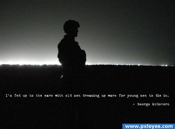
My Photo (5 years and 3886 days ago)
nice design. very simple, but with a great result.
..that's beautiful.
Nice - but all you have added is the text??
Orders were submitted in Vietnam in ordinary typewriter facing, so many letters of draft and death notices were issued in a font of worn out simplicity... just thought I'd keep it that way, out of respect for the dead and those in harms way (didn't see any reason to go crazy, especially on this subject)
wow! this says a lot. It is simple, yet it has so much emotion.
Strong message,it should have placed higher(IMHO)...
Howdie stranger!
If you want to rate this picture or participate in this contest, just:
LOGIN HERE or REGISTER FOR FREE
excellent work.. put some more steps into the SBS and submit as a tutorial.. it's excellent as well
I remember this very good job ....
Great idea..lovely work!
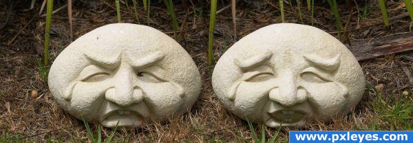
Perhaps remove the tears on the happy face and it will complete the idea...or maybe its tears of joy...
Oh I remember it too. And it's still as great and funny as before And from now on I truely believe, that rocks have feelings
  Good luck again!
Images that stays in mind are good nice to see it back.
neat!!
Congrats
Howdie stranger!
If you want to rate this picture or participate in this contest, just:
LOGIN HERE or REGISTER FOR FREE