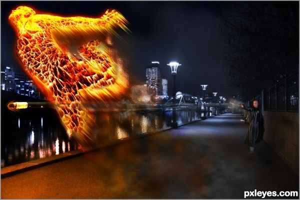
(5 years and 3396 days ago)
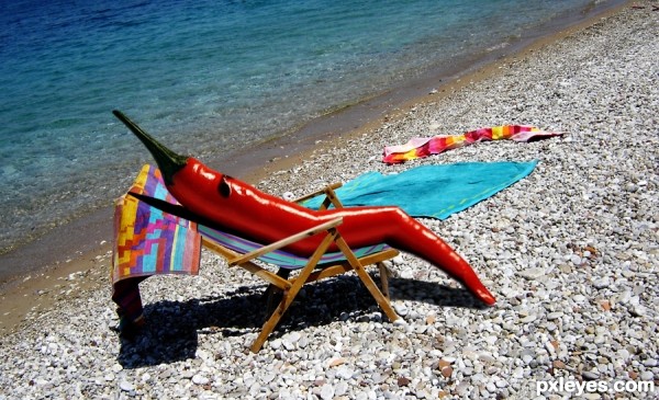
Cut out and duplicated the chili 3 times and moulded it to the chair. Masked out the arms of the deck chair, used a little of the shadow under the chair to use as the "leg" shadow, and added the glasses with a clipping mask.
Images by: Float of sxc and vnoel of flickr (5 years and 3485 days ago)
OOps.. I accidentallz deleted mz comment.. Anyway.. I made a mistake in my comment.. I wanted to tell u that u had to soften up the shadow at the head. And at the tail, it had less opacity, so you could have put a gentle increase in opacity of shadow at its tail.. But i screwed up in the punctuation marks.. Apologies..
In the change u made, i feel u have overdone the opacity change at the head.. its better if u do not do any change in opacity.. just make the shadow softer in the head from the previous image..
EDIT: the opacity looks great to me  .. like nator and blindscientist pointed out, the shadow is now a bit too soft .. i know i am annoying u now.. try to match the shadow softness with that of the chair.. i leave it to your judgement
  good luck..
hsbee - thinks this is what you were suggesting! 
I love this idea! My only input would be to make the shadows a bit sharper, like the shadow of the chair. Also (nit pick alert), based on the angle of the light/shadow from the corner of the towel, I would expect to see a small shadow from the top of his head on the sand/rocks. Nicely done though author. Good luck.
nice work
very very very well done.. good luck author
Funny!  I think chilli's shadow can be less blurry (look at the chair's shadow). GL!
I really really like this one author.... super duper job!
A very good entry, great Idea and execution, well done and good luck 
This is so cool...funny work,nice mood and good execution...well done author
HAHA 
Nice execution of the idea......Good job Author and Good Luck.
And congrats for another second place! 
Congrats!
Congrats!!
Congrats 

Congrats
Congrats!!
Howdie stranger!
If you want to rate this picture or participate in this contest, just:
LOGIN HERE or REGISTER FOR FREE
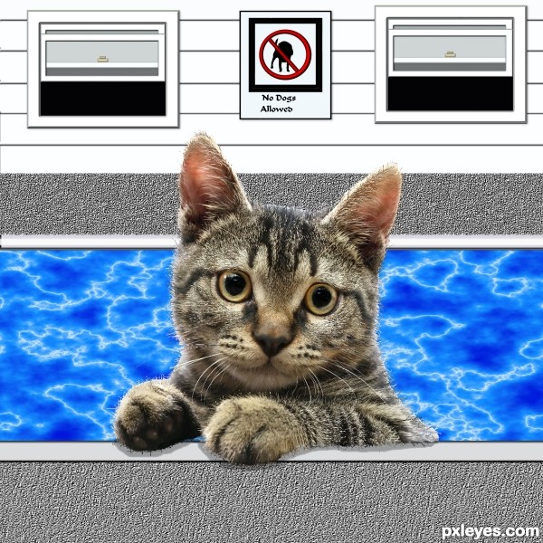
water source by Mura's Meister plug in can be down loaded from source link (5 years and 3564 days ago)
Howdie stranger!
If you want to rate this picture or participate in this contest, just:
LOGIN HERE or REGISTER FOR FREE
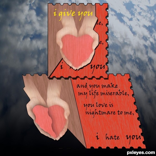
i said she make my life miserable ,it was mistake (5 years and 3626 days ago)
It should be I hate you :/
right!!!
i heat you too...
kewl!
You should lean the "I heat(hate) you" a little bit more so the perspective gets aligned with the card.
Pretty good.
thanks for all and i correct the mistake
The hands and the hearts (whole and broken) are virtually invisible, yet I believe they are an important part of the message. I think they need to stand out much more. I like how the front edge is cut in such a way as to lull the recipient into thinking that the message inside ends with "I love you." (I wish the interior of the open card looked like it were truly a perfect match of the partial interior seen with the closed card.)
EDIT: Cutting out even more of the lower front around the left side of the heart so the underlying "i" and a bit of the following long stroke on the start of "hate" is revealed to really mislead the recipient as to the conclusion of the real message would be even more compellingly evil and on-theme.
thanks for all thye give me advice and specially for (DanLunderg)
GL
great entry.. gl 
good luck
Howdie stranger!
If you want to rate this picture or participate in this contest, just:
LOGIN HERE or REGISTER FOR FREE
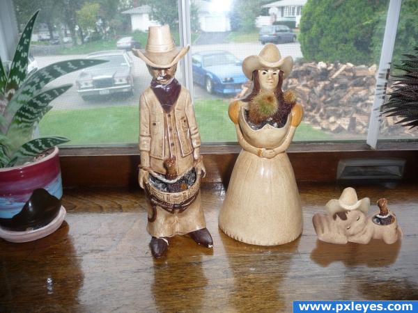
Thanks to bonvivant at sxc.hu for picture of baby.
Cut out image, placed on original, used textures and elements from the other pots to create their baby!
Thanks for advice, edit: changed shadow... (5 years and 3876 days ago)
oh my.. LOL definate high marks for humor 
Baby needs a better reflection, otherwise this is great! 
I agree with CMYK46, look at the reflection of the two original ones....try doing that by duplicating the baby and flipping it and then fixing the color from there.
I like it.. good job.
nice fix!
Congrats for your second place! Such a cute picture 
Congratulations for 2nd
Congrats!
Thanks guys...
Howdie stranger!
If you want to rate this picture or participate in this contest, just:
LOGIN HERE or REGISTER FOR FREE
Great idea & SBS...good luck!
nice imagination..............
i dont think it blends well with the background, if the fire man was leaving the earth's atmosphere on fire like he was a human missile would have been amazing! i love his pose
I would expect more reflected light on the pavement behind the figure, BUT it's a really cool idea and well presented .
Fantastic work author...Bullet movement is made perfectly...well done
Howdie stranger!
If you want to rate this picture or participate in this contest, just:
LOGIN HERE or REGISTER FOR FREE